
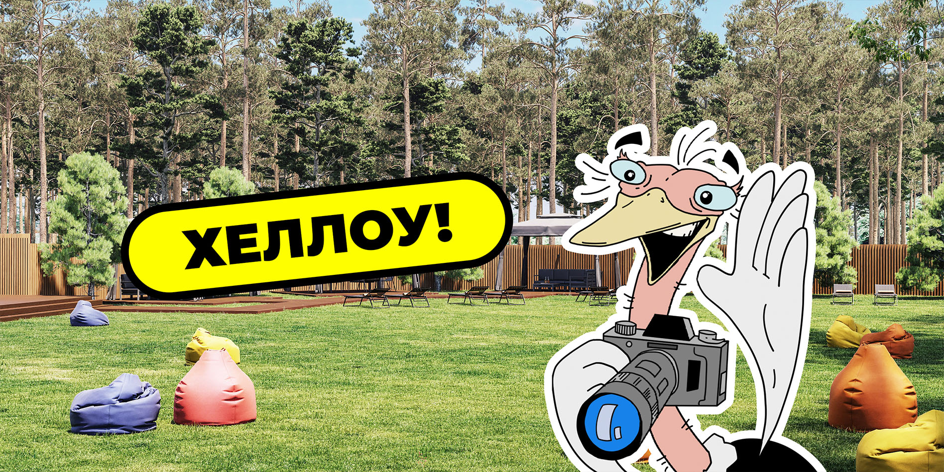
When a park evolves, it must find its unique character. Our challenge was not just to update the visual style, but to forge an emotional bond with visitors. Thus, Yasik was born — a charismatic ostrich who became the soul of the new Yasnogorodka.

Yasnogorodka is a comprehensive recreational ecosystem that goes far beyond the concept of a typical park. It is a sanctuary from city noise, where nature feels closer and a weekend turns into a genuine journey. Every corner here — from the ostrich farm to the local winery — holds its own story, which we aimed to narrate through a fresh visual language.
Our goal was not merely a design update, but the creation of a unique atmosphere felt at every step. We developed an identity that harmoniously blends wild nature, modern comfort, and the philosophy of family leisure.
The core idea of the project was to forge an emotional bond with the guest even before their arrival. Through vibrant outdoor advertising, tactile packaging of craft products, and thoughtful print materials, visitors fall in love with the place in absentia. The design ceased to be just an aesthetic addition; it became a functional tool: helping to navigate the space intuitively, simplifying the user journey, and making every detail of the park part of a unified, unforgettable experience.
Yasik is far more than a static mascot; he is the true host and ambassador of Yasnogorodka. He has evolved into a key communication element, guiding guests at every stage: from a warm welcome at the entrance to interactive assistance on the park map.
To bring the brand to life, we crafted a fully fleshed-out personality for Yasik. We designed not just his visual appearance but a unique character: he is friendly, energetic, and slightly mischievous — embodying the spirit of a perfect weekend.
Yasik actively "converses" with visitors through information boards and signage, breaking down the barrier between the brand and the guest. Thanks to detailed work on his expressions and poses, the design feels emotional and alive. This creates a genuine interaction: children adore him for his openness and playful communication style, while adults appreciate the wit and original graphic execution.
The park's style goes far beyond a basic logo and color palette. It is a comprehensive visual ecosystem where every element works in synergy to create a unified harmony within the space. It is the language through which the brand speaks to its guests without words.
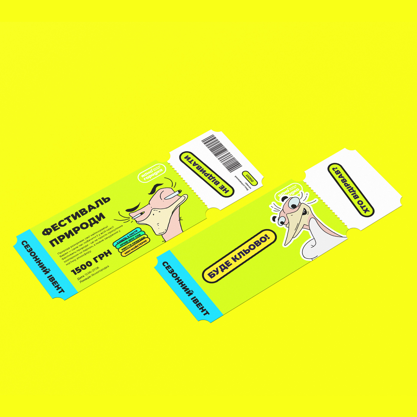
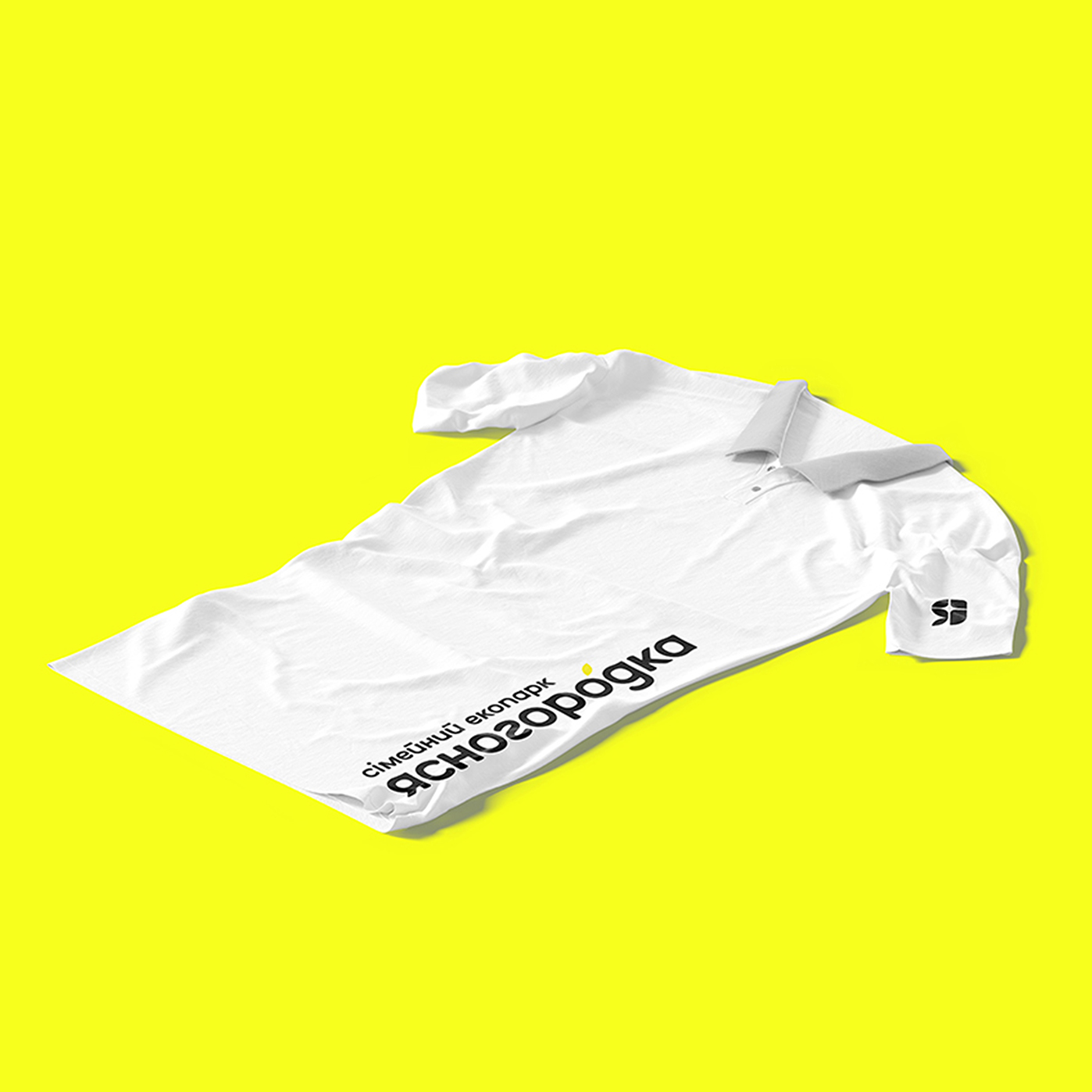
We developed an identity that is instantly recognizable and conveys the authentic spirit of Yasnogorodka. The style comes alive in the details: branded staff uniforms become part of the welcoming atmosphere, while entrance tickets turn into small keepsakes worth preserving.
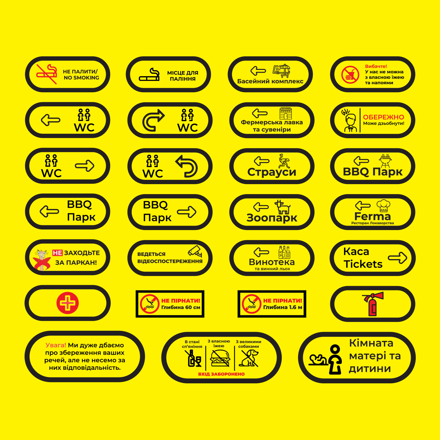
We paid special attention to developing a wide range of print materials. Information brochures, wayfinding signage, and restaurant menus are stylistically unified into one family. This gives the park a polished, professional look, where every detail underscores a high level of service and care for the visitor.
To transform a regular stroll through the vast territory into an exciting quest, we developed a detailed navigation map. It serves not merely as a technical directory but as a full-fledged visual guide, immersing guests in the diverse world of Yasnogorodka’s entertainment — from the ostrich farm to the wine cellars.
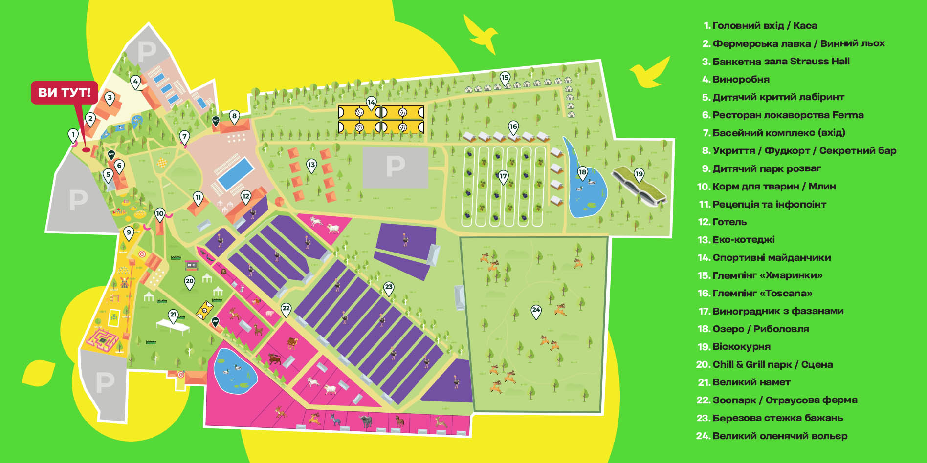
In developing the design, we abandoned dry topographic schematics in favor of a vibrant illustrative style that is intelligible to both adults and children. The map is constructed on intuitive UX principles: clear color-coding of zones (purple for the farm, blue for the aqua zone, yellow for entertainment) allows visitors to orient themselves instantly within the space.
We enriched the layout with lively details, clear pictograms, and distinct location numbering. As a result, the map has ceased to be just a wayfinding tool, becoming part of the game and interactive experience, where finding the desired location turns into a small adventure for the whole family.
To make the character truly alive, we didn't limit his existence to just a logo or social media. Yasik is integrated into every corner of Yasnogorodka, accompanying guests from the parking lot to the park's most remote locations. He has become the voice of the park — joking, guiding, and setting the mood.
We embedded the hero into the physical space through a series of situational illustrations and witty micro-messages. Yasik appears at vibrant photo zones, "comments" on rules via information boards, and points the way on navigation signage.
For children, we turned communication into a game: the character pops up with exciting suggestions and challenges in unexpected places, motivating them to explore the territory. This transforms Yasik from a mere graphic element into a real friend one wants to take a photo with, and whose phrases are remembered long after the visit.
Signature products are the taste of memories that guests take home with them. We transformed local farm goods into stylish gastronomic souvenirs. The packaging design broadcasts the brand's core values: 100% natural ingredients, handmade quality, and honesty with the consumer.
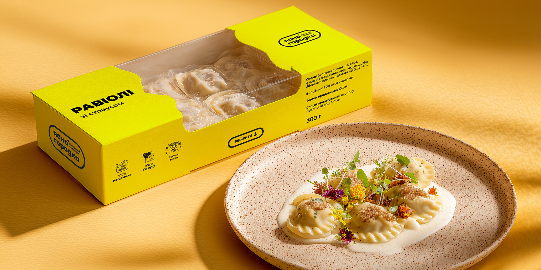
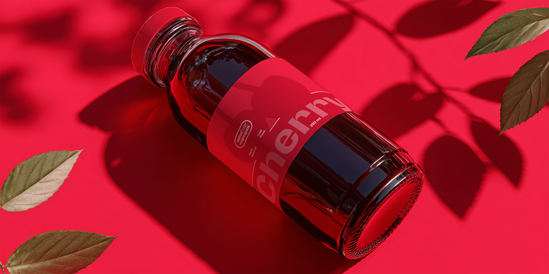
We developed a vibrant visual system for a wide range of products: from exclusive ostrich meat ravioli to refreshing berry mors and cold-pressed juices. The design is built on "juicy" color blocks that instantly highlight the product and stimulate the appetite.
For semi-finished products, we used a sunny yellow color and large transparent windows, allowing the customer to immediately assess the quality. The beverage design is executed in a minimalist style, focusing on bold typography and deep natural shades (cherry, berry). It is more than just a label; it is a seal of quality confirming that inside lies true craft from Yasnogorodka.
Outdoor advertising became the brand's loud voice within the metropolis. We developed a campaign that pierces through "banner blindness" thanks to radically vibrant colors and ironic copywriting. It is not just information; it is an emotional trigger that instantly sparks the desire to escape the office for nature.
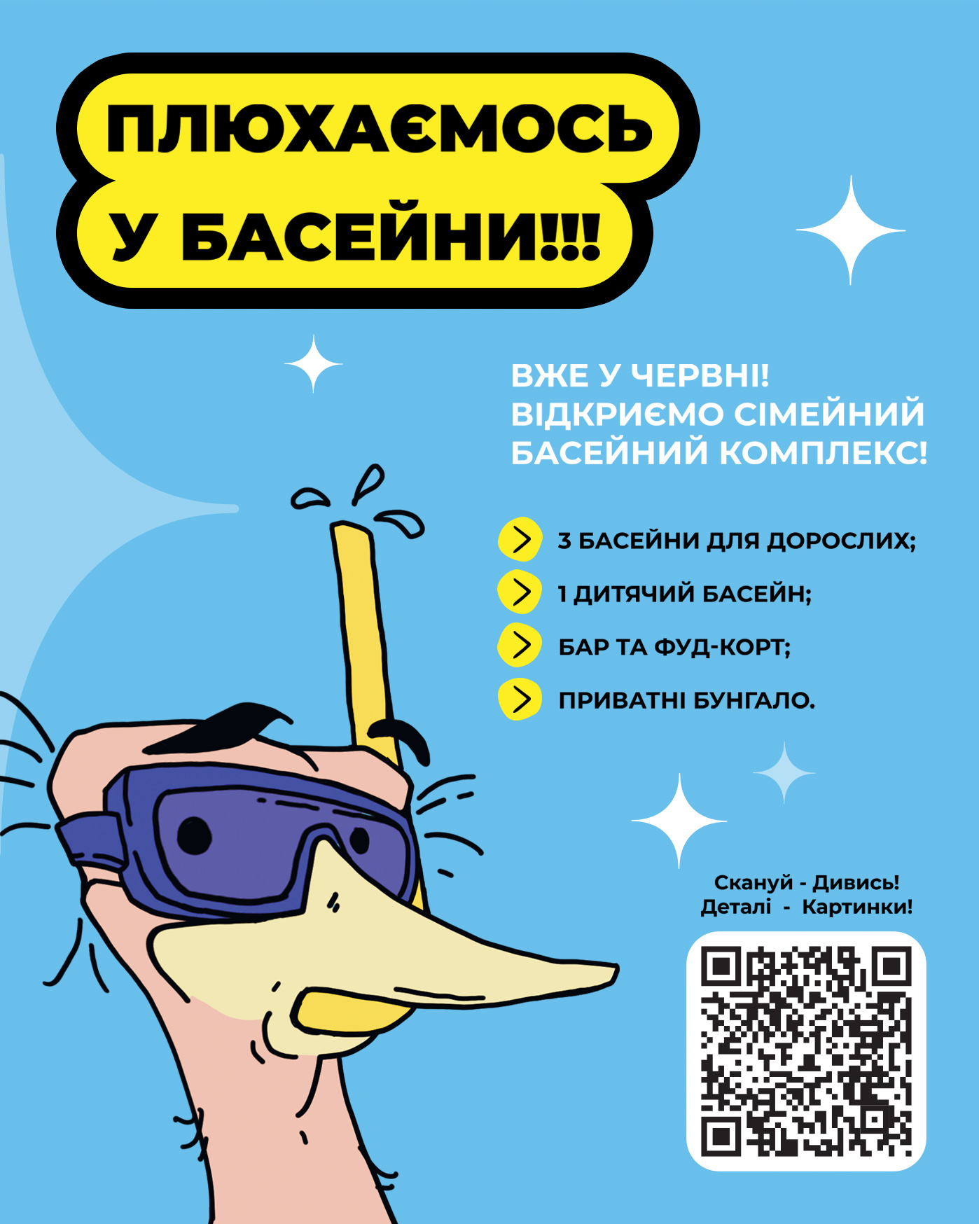
For the streets of Kyiv and the region, we created a series of dynamic billboards featuring Yasik as the protagonist. Using high-contrast combinations of sunny yellow and sky blue, we made the ads visible in any weather. The narratives address the target audience's "pain points," which Yasik solves with humor: whether it's a plan on "how to get a child off a smartphone" or a call to "splash into the pools."
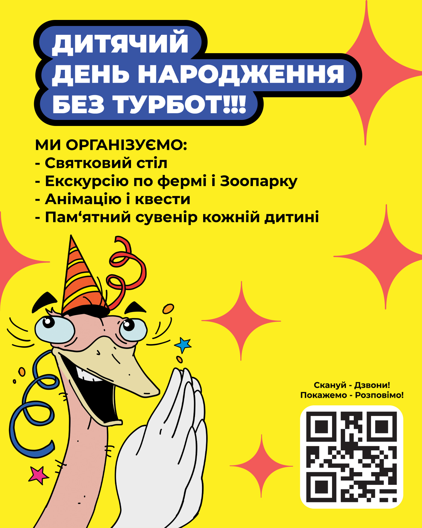
Inside the park, advertising communication continues through a system of branded citylights. They serve a dual function: acting as navigational landmarks and informing guests about additional services (birthdays, tours), making the visual environment cohesive and welcoming.