
To stand out on Lviv's saturated coffee map while avoiding the classic clichés of the "old town." We needed to create a lively, emotional brand that visualizes the process of "mood moving." The identity had to combine coziness for a slow morning with an energetic impulse for starting an active day, turning the chaos of details into a recognizable style feature.
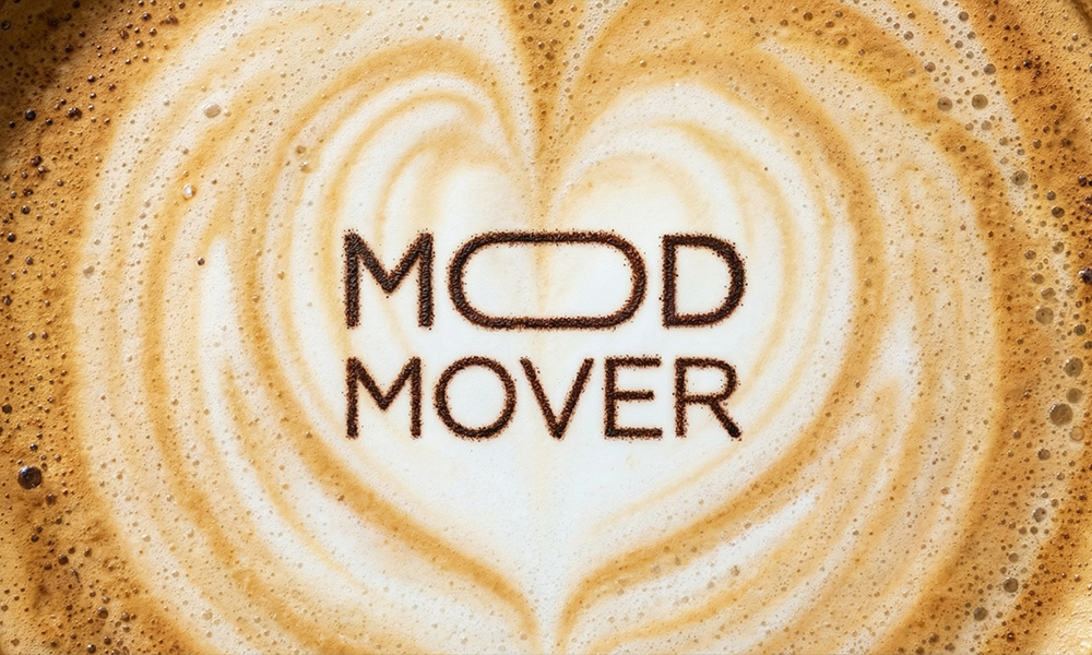
Mood Mover is a Lviv-based space with no strict rules, save for one: the morning must be delicious. It is an ecosystem where the aroma of freshly roasted coffee, soulful breakfasts, and that specific "right" mood intertwine — a feeling you want not just to experience, but to take with you in a to-go cup.
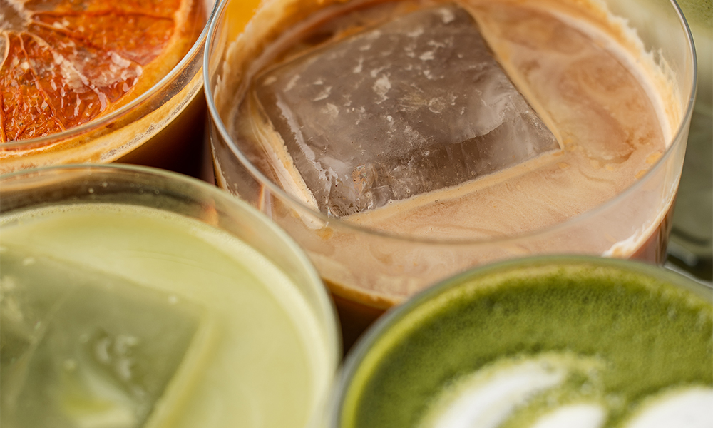

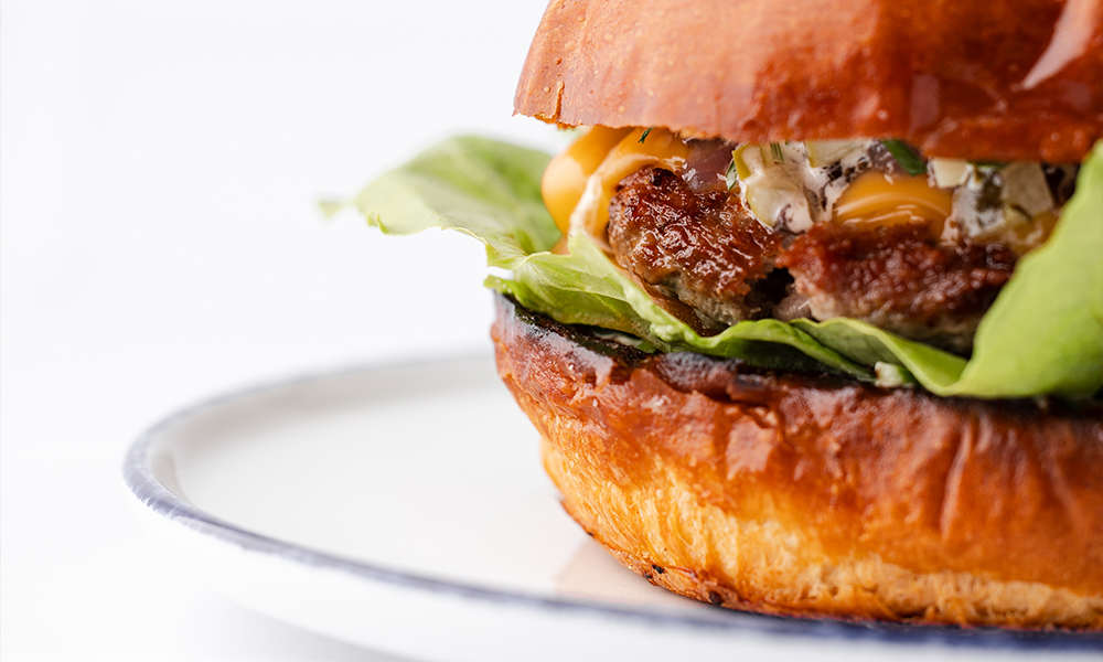


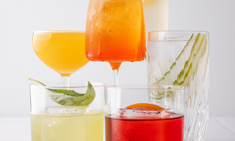
In crafting the identity, we aimed to convey the venue's atmosphere—simple yet emotionally saturated. Every design element embodies freedom of form and handmade lightness. We defined this style as "chao-minimalism" — visually ordered chaos that always leaves room for creative impulse, genuine feeling, and warmth.
The brand's color scheme is built on an energetic dialogue of contrasts. Saturated Orange is responsible for the morning charge, drive, and positivity, while Deep Turquoise acts as a stabilizer, adding balance and calm. Together, they create a unique visual rhythm that pulses in unison with the city's mood.
The Mood Mover identity begins with the logo — a concise visual manifesto of emotions. In the word "mood," we created a graphic rhyme by conceptually merging the two letters "o" into a single, inseparable ligature.

This graphic technique emphasizes the idea of mood as a cohesive inner core, resilient to external chaos. The fusion of letters symbolizes a sense of fullness, harmony, and the completeness of the moment — precisely the state granted by that first sip of morning coffee.
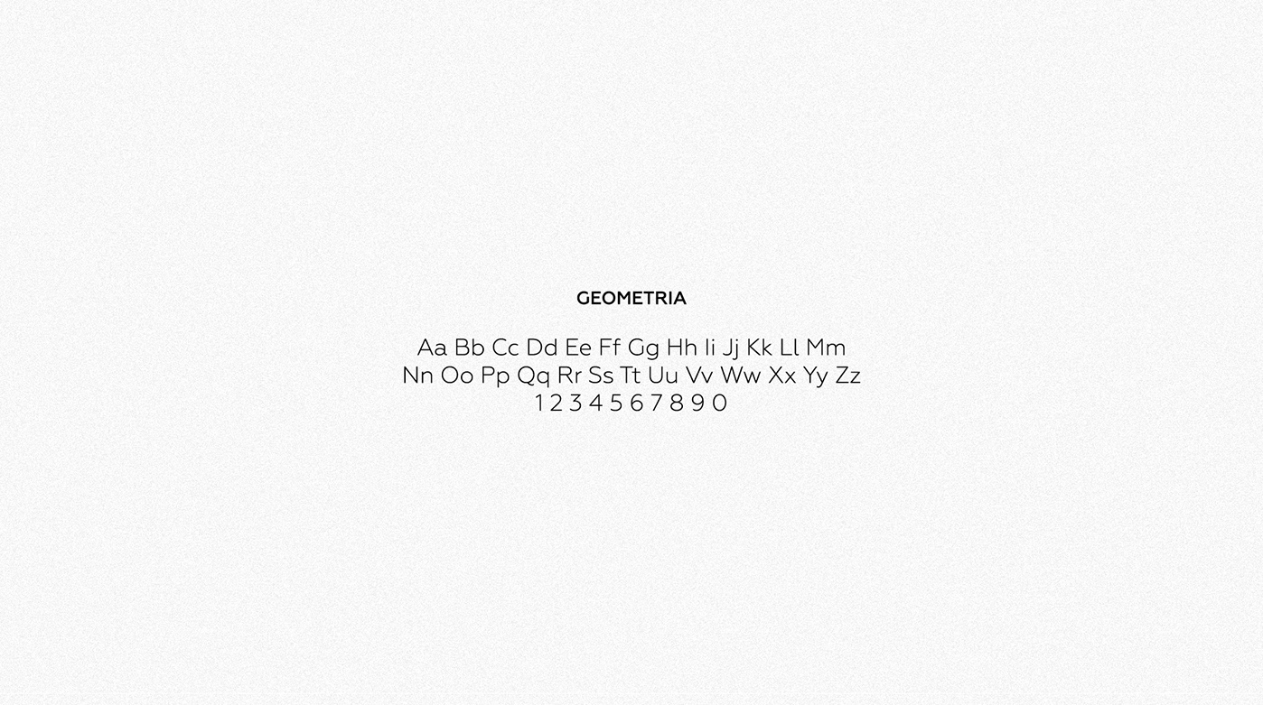
For textual communication, we selected the Geometria typeface. It is a modern sans-serif with soft, humanistic geometry. Its clean lines and open shapes lend lightness and expressiveness to the entire visual system, allowing the brand to speak to the guest in a modern, intelligible language without unnecessary pretension.
In developing the visual identity, we deliberately abandoned digital sterility in favor of lively, handmade forms. This is a collection of visual metaphors that set the rhythm of the space and broadcast the brand's character: slightly chaotic, sincere, and infinitely cozy.


The visual system centers on two key archetypes executed in an "imperfect" graphic technique. The first is an orange sun with chaotic black ray-lines, symbolizing the morning burst of energy and the warmth of that first sip of coffee. The second is stylized mountains, embodying stability, ascent, and the free spirit of a traveler.
These elements function as a flexible construction kit: they can stand alone or weave into complex patterns on packaging, merchandise, and within the interior. The color palette supports this mood through contrast: deep turquoise grounds the design, warm orange energizes it, and black provides graphic accents. It is a style that requires no complex explanation — it is emotional on its own.
To ensure the Mood Mover vibe doesn't stay confined to the cafe, we created a collection of "sticky" emotions. Stickers and magnets are small visual artifacts that guests take with them, turning their laptops or fridges into a part of our universe.
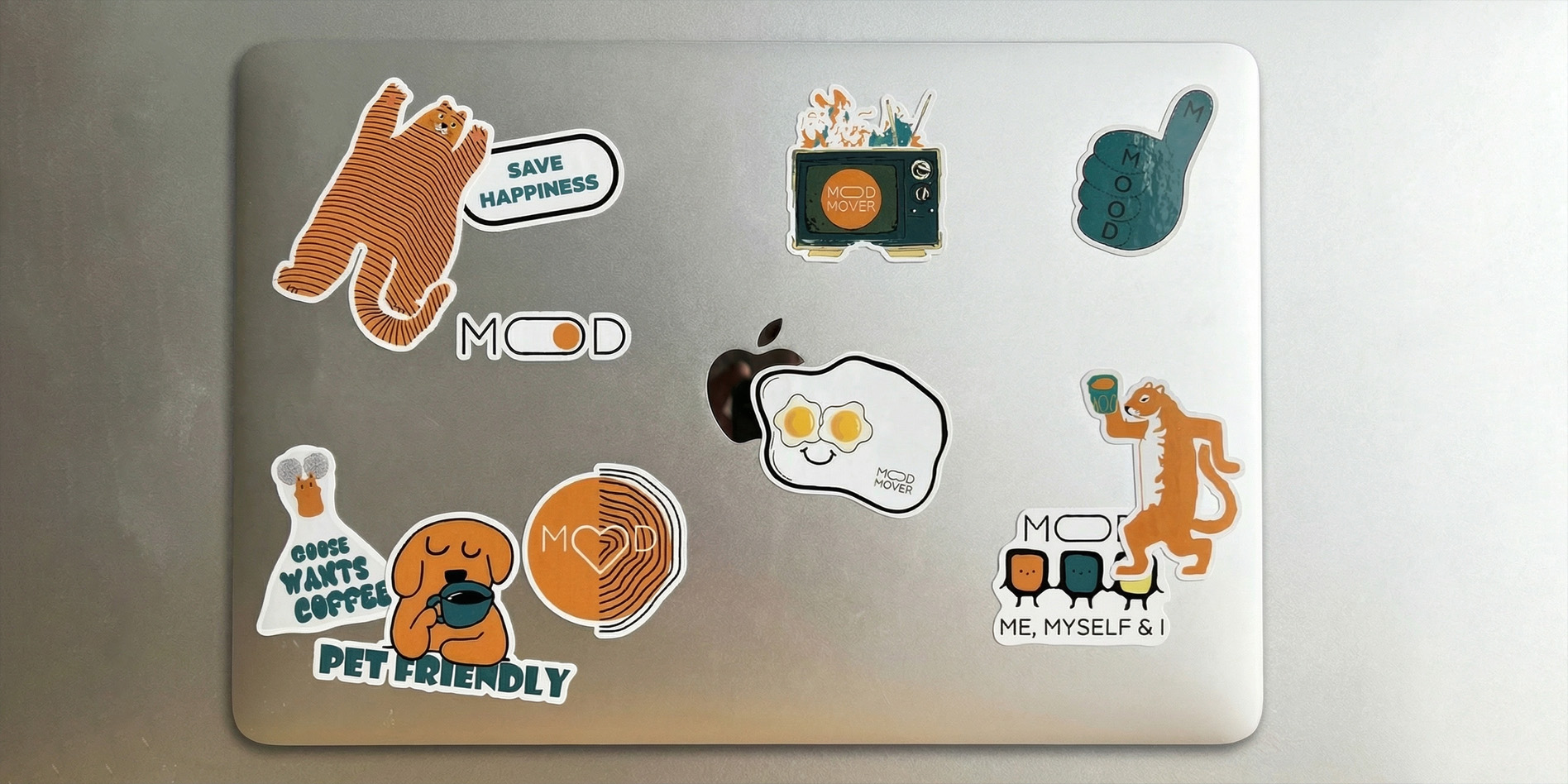
The graphics for the sticker packs became the quintessence of the "chao-minimalism" style. They are lively, ironic, and deliberately imperfect. We developed a series of characters that broadcast the lightness of being: a striped tiger in free flight, a goose demanding coffee, and pet-friendly heroes that remind everyone of the space's openness to four-legged friends.
A special place in the collection belongs to functional magnets shaped like fried eggs. These are not merely kitchen decor but useful gadgets: an embedded QR code leads directly to the delivery menu. In this way, a simple magnet becomes the shortest route to a delicious breakfast, staying with the guest at home as a reminder that their morning is already taken care of.
Apparel became a logical extension of the Mood Mover visual language. It is not merely uniform or souvenir gear, but a full-fledged streetwear capsule that broadcasts the brand's spirit: free, vibrant, and infinitely cozy. We created items that people want to wear not for the logo, but for the feeling.
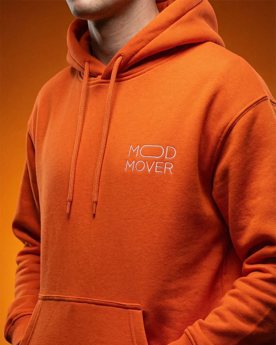
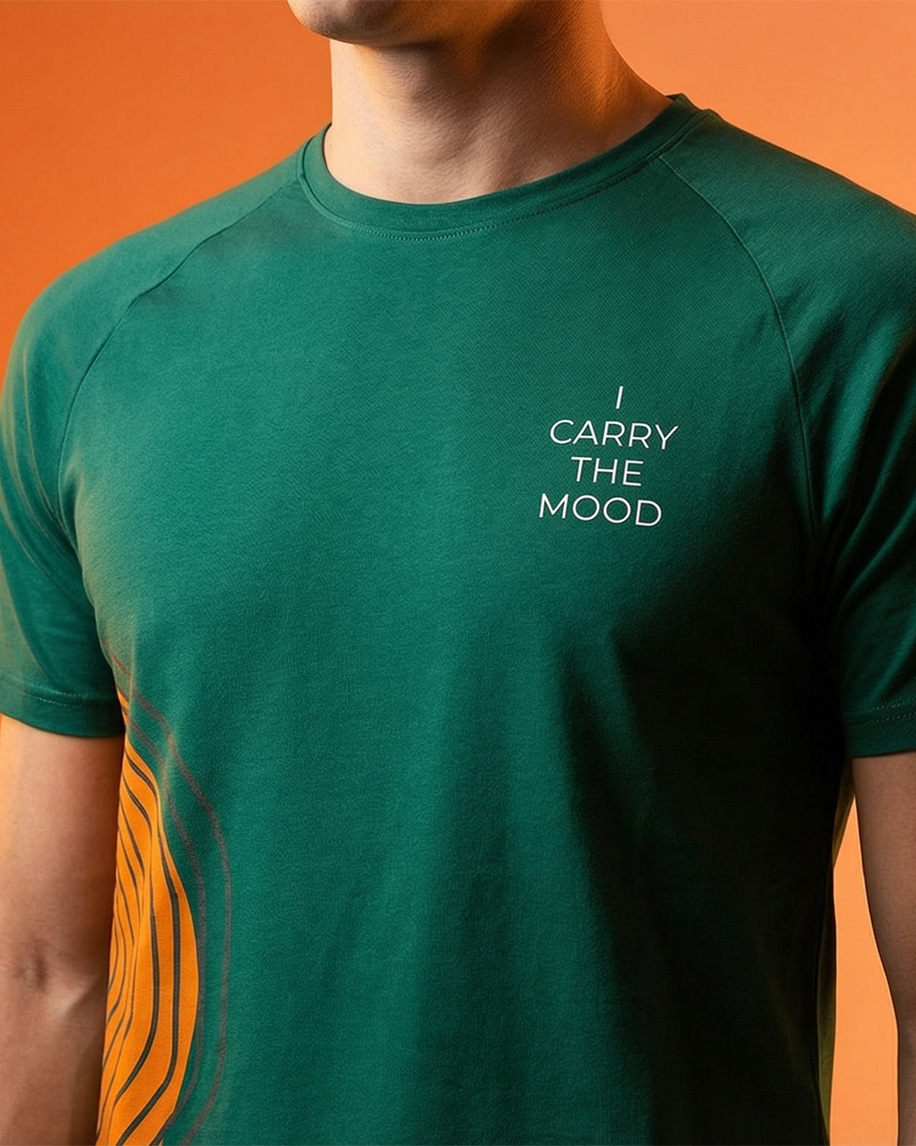

The collection is built on key identity colors and tactile comfort. The foundation of the drop consists of warm, oversized orange hoodies that invite you to wrap yourself up as if in a perfect lazy morning. Contrasting these are deep turquoise t-shirts — concise, sincere, and soft against the skin.
In the design, we avoided "loud" branding. Instead, we utilized delicate details: fragments of signature patterns, embroidered minimalist elements, and phrases that speak volumes without unnecessary words. This merchandise offers the wearer a sense of belonging to a community of people who appreciate the taste of life and the freedom to be themselves.
Mood Mover packaging is not just a utilitarian shell, but the first physical contact with the brand's emotion. We transformed standard take-away carriers into communication tools that speak to the guest before the very first sip. The design here serves a feeling rather than just a function: "Here is something special for you."
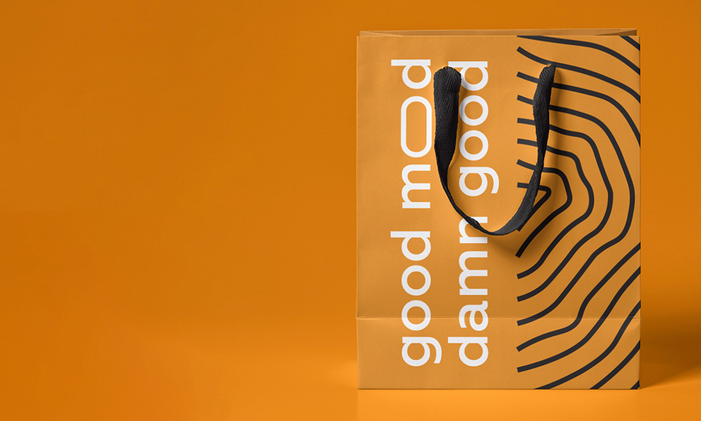

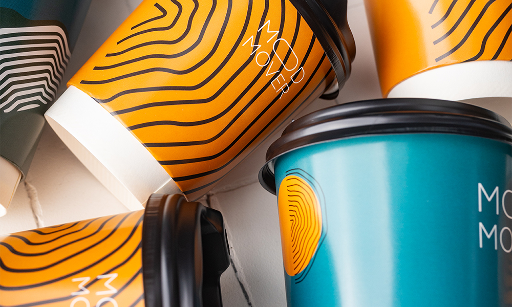
The design system encompasses the full spectrum of carriers: from coffee cups to craft bags. We applied the "free canvas" principle, where signature patterns (waves, mountains) are not confined by frames but dynamically wrap around the form. Every element has its own voice: emerald dessert boxes greet you with the life-affirming phrase "here is your good mood!", turning unboxing into a mini-celebration.
Orange bags bearing the typographic manifesto "good mood damn good" act as visual therapy on city streets. This packaging is recognizable from afar — not because of a giant logo, but because of the powerful charge of positivity and color rhythm it broadcasts into the space.
To ensure the dialogue with the city remained light and effortless, we developed a series of advertising creatives that go beyond standard "coffee" layouts. Mood Mover appeared on billboards and posters as a multi-format space where the morning starts with yoga and the evening ends with wine.
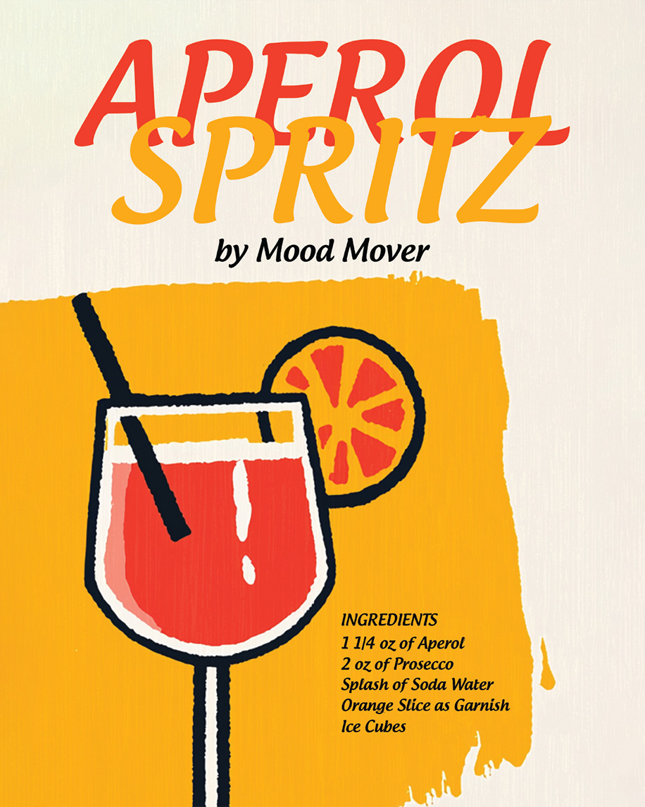
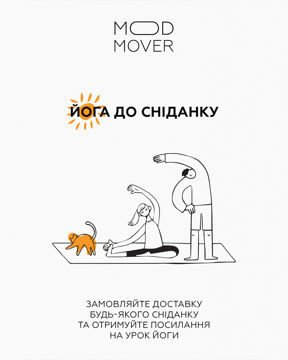
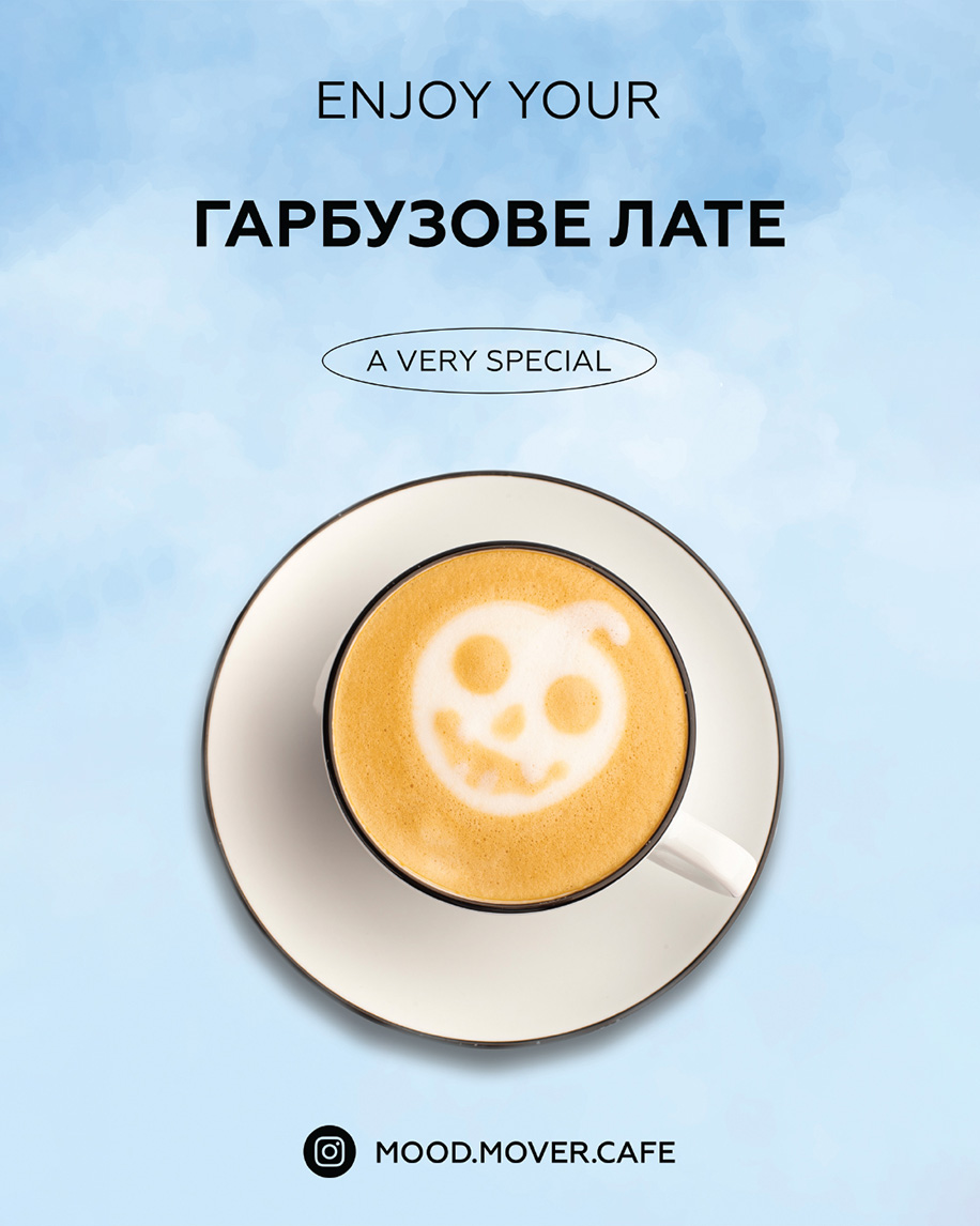
The campaign's visual style is based on "airy" compositions: ample white space, ironic line art, and signature orange accents. On billboards, we broadcast the venue's key advantage — freedom of choice: here, "Breakfasts All Day" harmoniously coexist with sushi and wine, while coffee flows into evening cocktails.
We paid special attention to lifestyle communication. A series of posters integrates the brand into daily life: we offer "Yoga before breakfast" with a link to a class via QR code or invite guests for a seasonal pumpkin latte. For those seeking relaxation, Mood Mover presents its signature take on classics, such as the Aperol Spritz. This is advertising that offers not just a product, but a script for a perfect day.
The Mood Mover space is the physical embodiment of the brand's philosophy, where design transcends graphics to become volume. It is a place that doesn't just provide service but wraps you in an atmosphere. Here, every detail — from the facade to the lighting — works to make the guest slow down and feel the moment.
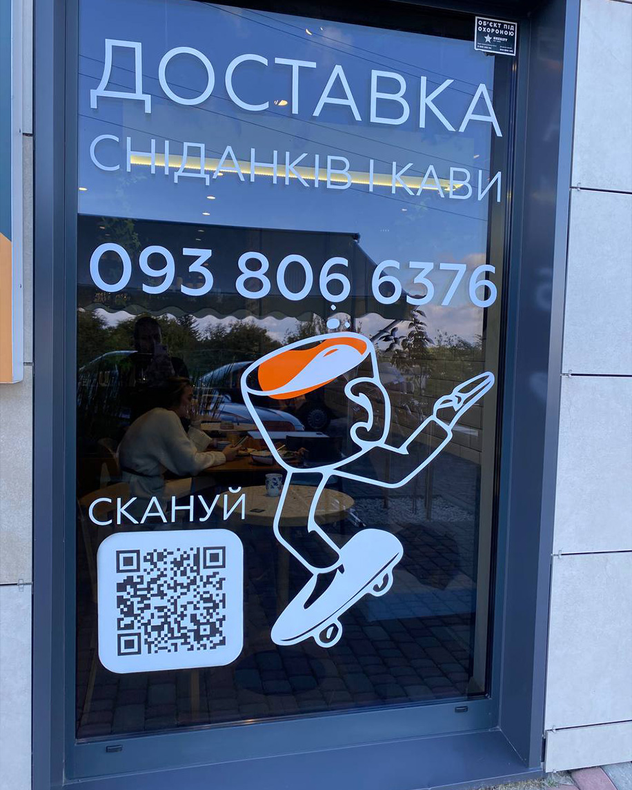


The cafe's exterior acts as a magnet: the concise signage greets you with a smile, while witty A-frames hint that they serve not just breakfast, but the right mood. The entrance area with branded deck chairs has become a manifesto of Lviv's slowness — people don't just sit in them; they linger, watching the city's rhythm.
We turned the windows into art objects: sticker compositions add dynamics without blocking the light. The interior is built on a subtle play of forms: here, our signature "chaos" looks ordered and calm, while minimalism becomes warm and emotional. It is a space you don't want to leave — the very "mood" in which you always want to stay for one more cup.