
To create a brand that accurately captures the spirit of modern Japanese street cuisine: its energy, speed, and bold character. The visual language needed to be vibrant, dynamic, and spiced with humor. We needed to develop a style with a strong emotional message that would make the delivery stand out among thousands of identical offers.
Go Go Han is more than just Japanese food delivery. It is a gastronomic action movie where every roll is like a vibrant comic book panel, and every sauce is an explosion of emotion. It is a story for those living in the fast lane who aren't willing to sacrifice taste for speed.
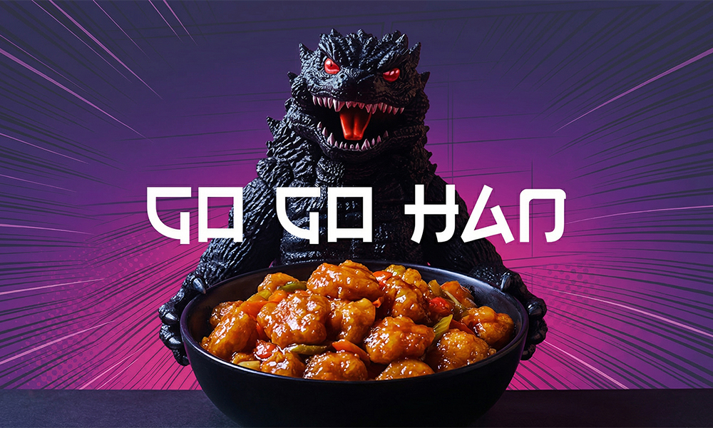
The brand's foundation is a meaningful naming strategy that combines wordplay with the philosophy of movement. The double "Go" sets the rhythm, impulse, and dynamics of a modern city that never sleeps. The "Han" part (referencing the Japanese word for "meal" or "rice") emphasizes the cuisine's authenticity.
The brand speaks to clients through the language of comic book culture: via bold lines, contrasting colors, and assertive presentation. This style sparks appetite and interest even before the courier knocks on the door, turning an ordinary food order into a frame from a high-octane movie.
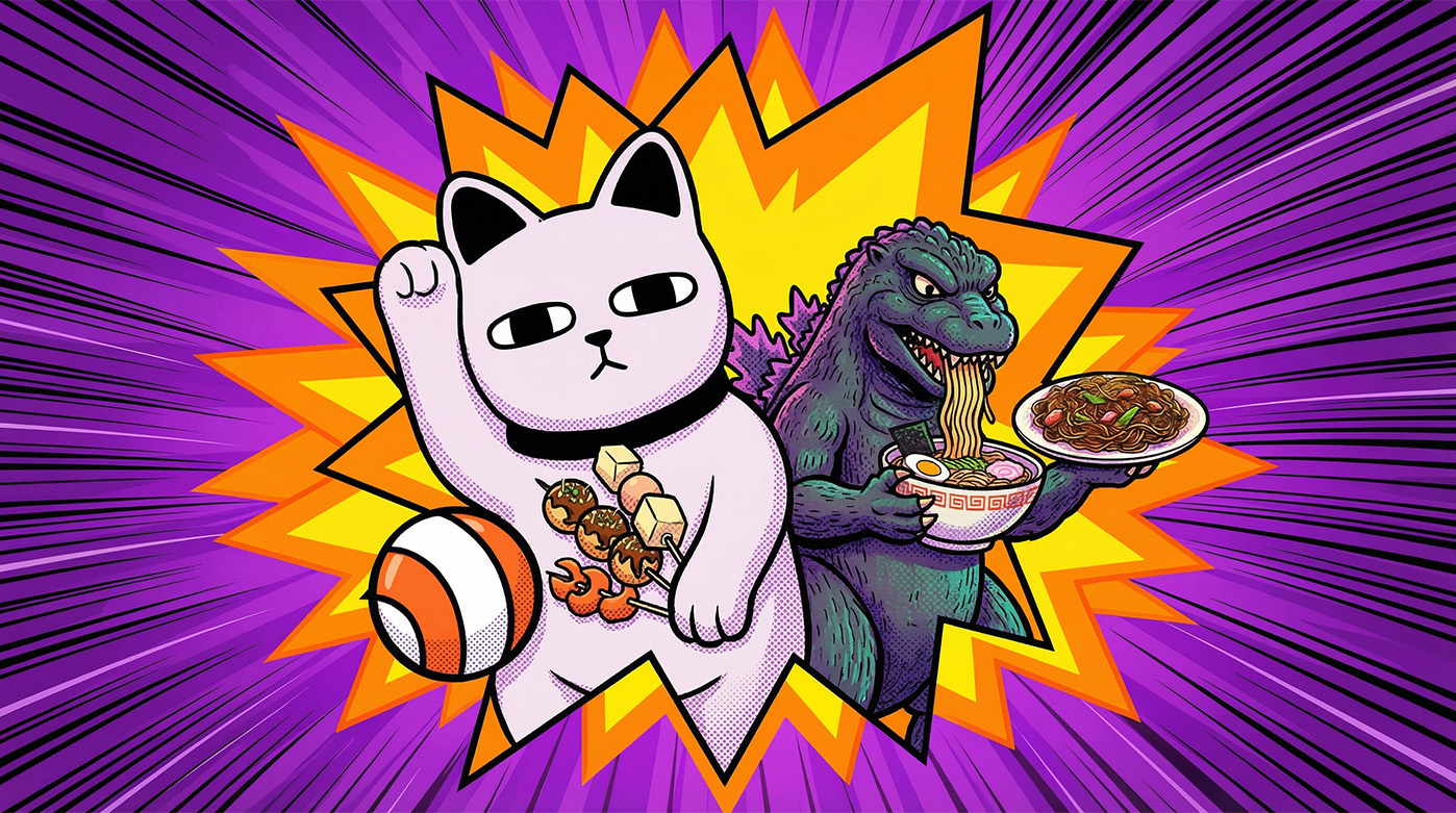
The centerpiece of the identity is the brand character — a Japanese cat on a skateboard. He is not merely a static mascot but a true hero of urban life: hungry for adventure, bold, daring, and a little wild. He personifies the speed with which your order races through the city.
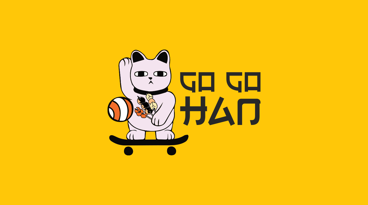
The character's image is a witty blend of tradition and modern street culture. We took the classic "lucky cat" (Maneki-neko), placed him on a skateboard, and put delicious skewers in his paws.
A key advantage of the logo is its modularity. The design structure allow it to be used in two formats: as a full composition with the character for maximum emotional impact, or as a concise typographic wordmark without the cat. This flexibility ensures the brand looks appropriate on any medium — from a vibrant sticker pack to a mobile app icon — working equally effectively in full color and monochrome.
The visual language of Go Go Han is pure dopamine and a rejection of boring stereotypes. Inspired by the aesthetics of classic Japanese manga, we created a design that doesn't just inform but screams flavor. It is a style that pulses to the rhythm of the metropolis.
The brand's color palette is built on uncompromising contrast: deep purple, saturated yellow, and dramatic black. This triad creates a sense of frantic energy, determination, and sharpness, setting the brand apart from competitors.
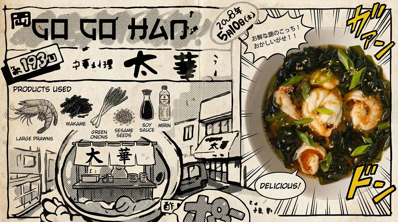
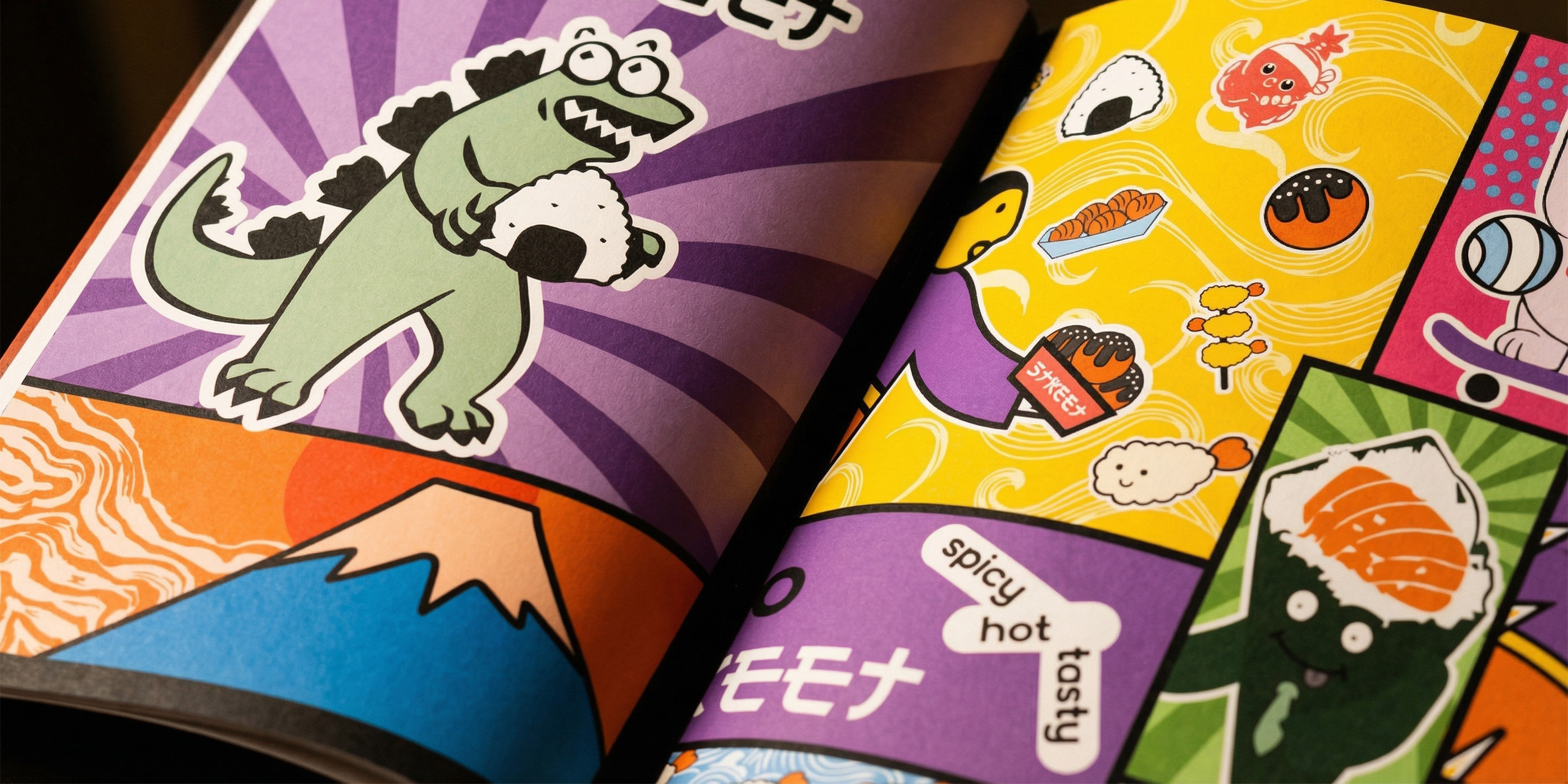
Graphic patterns literally come to life through the use of speed lines and emotional explosions typical of comic books. We infused the identity with humor and micro-plots: on menu pages and packaging, you might even encounter Godzilla enjoying an onigiri. All elements are combined into a recognizable comic book aesthetic with a modern presentation, adding dynamism even to static images.
A static image cannot fully convey the frantic speed of delivery. To bring the character to life, we turned to cutting-edge AI technologies. We created an animation that transforms the wait for an order into entertainment.
Using neural networks, we produced a dynamic video where our hero — the Go Go Han cat — performs a real slalom through the metropolis streets on a skateboard, delivering food straight to the client's table.
This animation became the engine of the launch campaign. It is adapted for all touchpoints: from viral Reels and TikToks to large digital screens at pickup zones. The explosive mix of dynamics, humor, and character charisma ensures the brand sticks in memory from the very first view, stopping the scroll.
Go Go Han packaging is not merely a utilitarian container but an interactive content medium. We turned the unboxing process into a continuation of the comic book, where every box or bag tells a part of the brand's story, transforming a regular lunch into entertainment.
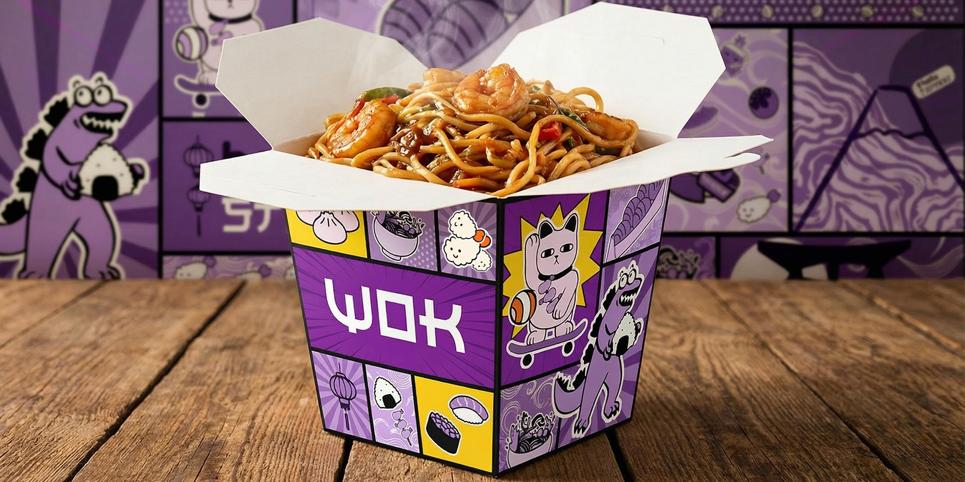
The Wok boxes became full-fledged art objects: their sides are covered in vibrant, pop-art style story panels. An entire universe unfolds here: our skater cat races with a delivery, while Godzilla happily savors a giant onigiri. It is packaging that is fun to explore while eating.
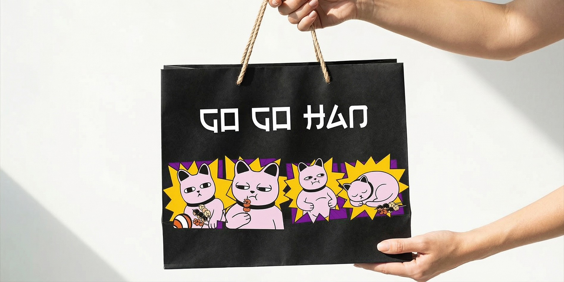
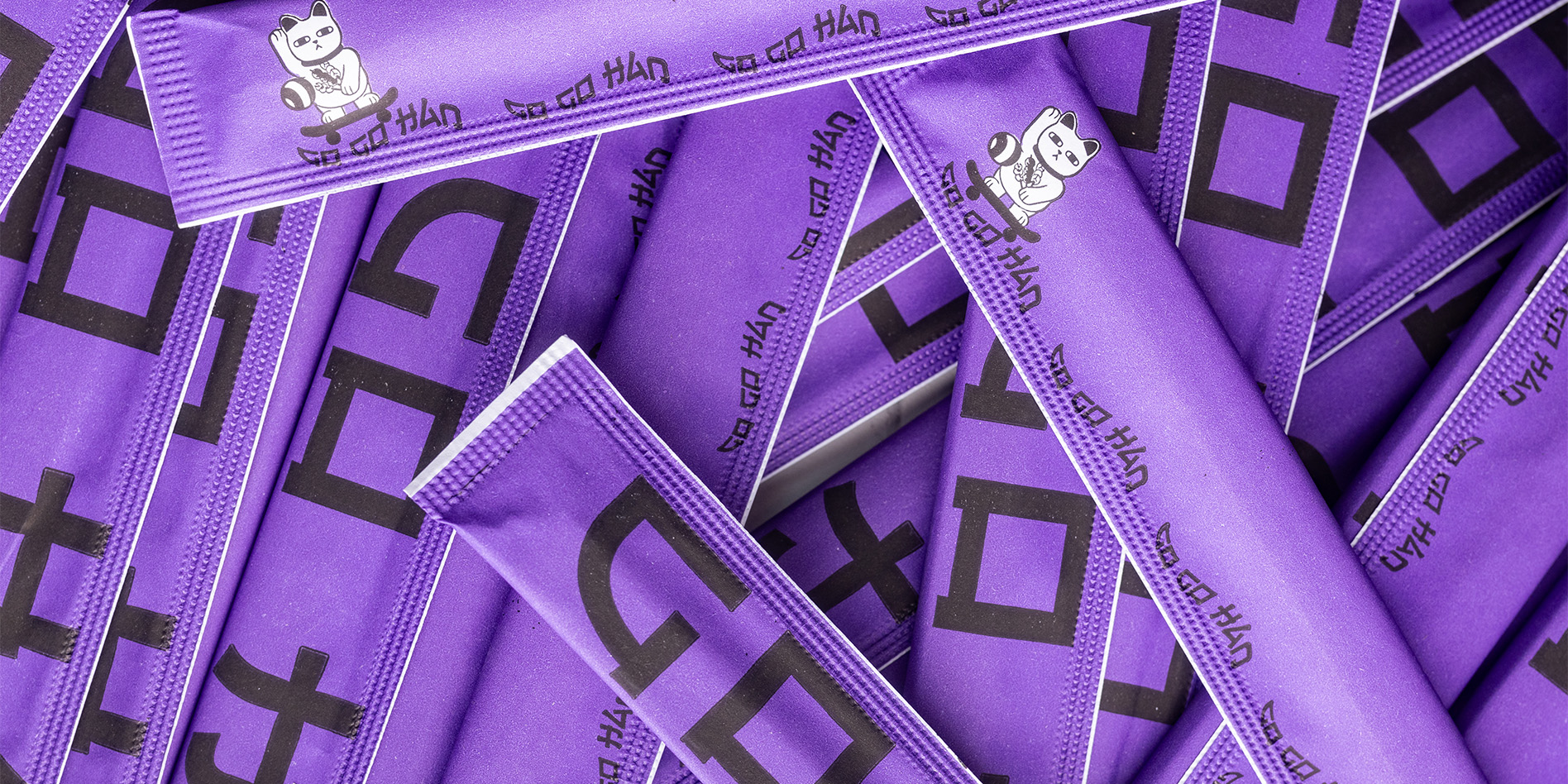
For the paper bags, we chose a stylish black color that serves as a contrasting background for a comic strip. The plot on the bag ironically illustrates the customer's "food journey": from impatient anticipation to a satisfied, happy nap after a delicious meal. Attention to detail is evident everywhere: even the chopstick packaging received the signature purple color and a rhythmic pattern, maintaining the brand's total visual consistency.
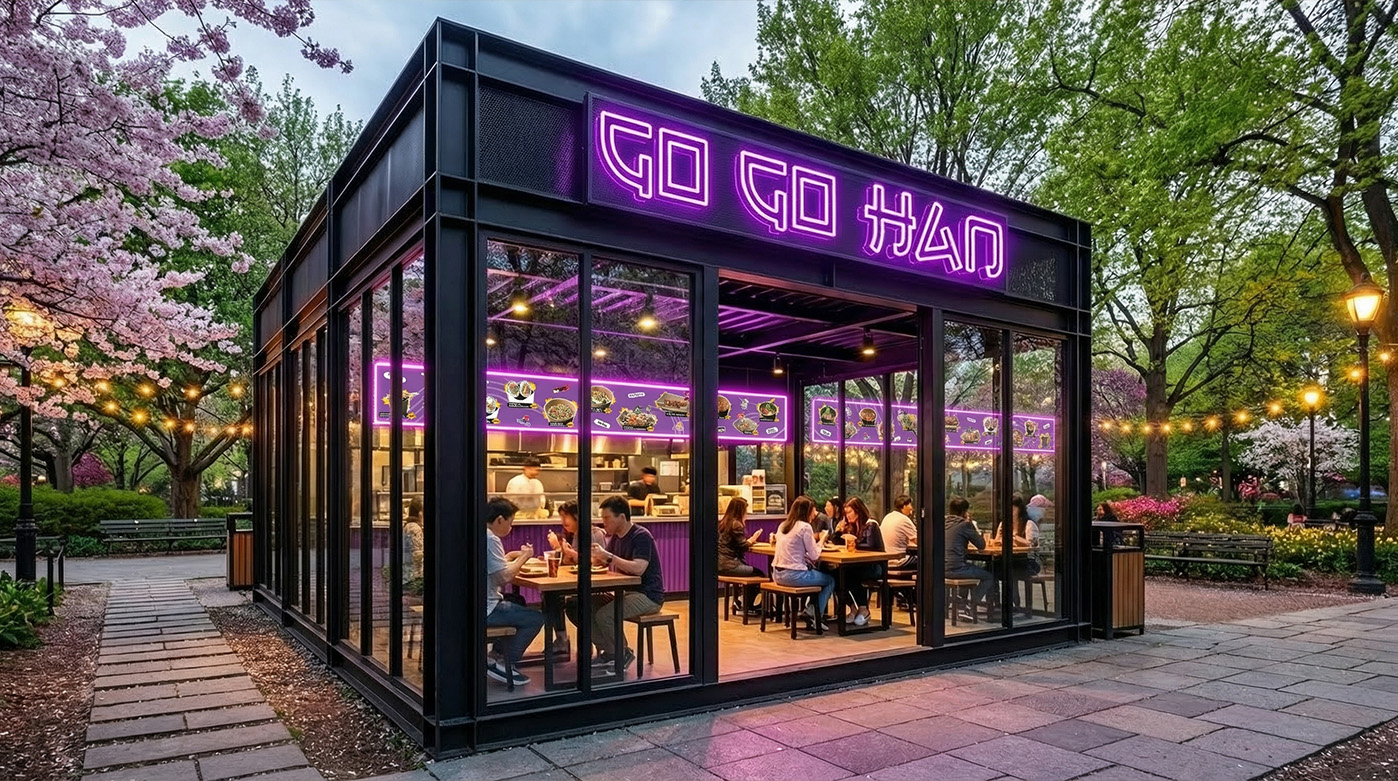
Street food demands a street-level approach. We created an ecosystem of printed materials and merchandise that live in unison with the urban environment. These are elements that allow the brand to expand beyond packaging and become part of a lifestyle.
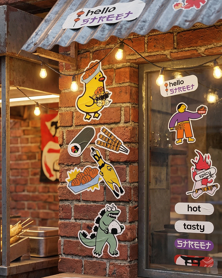
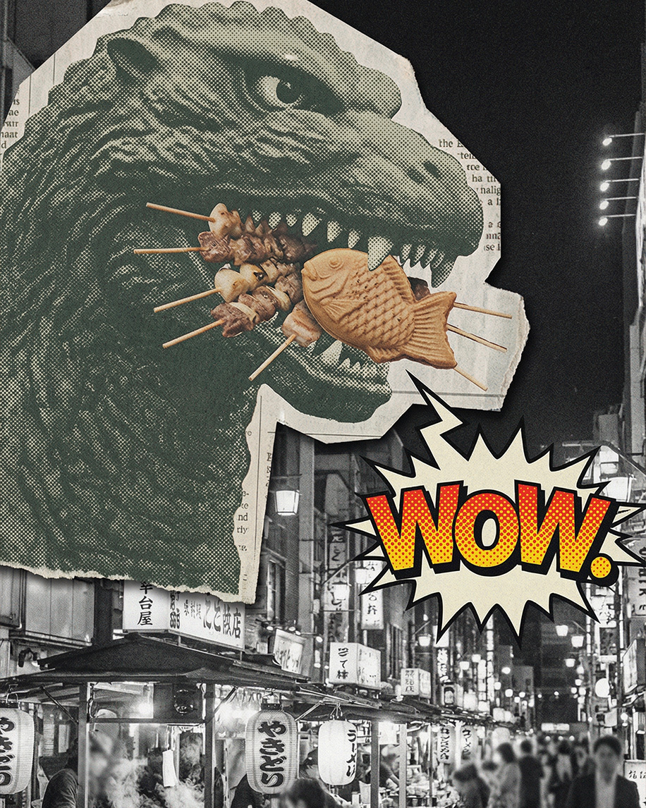
Every medium tells a distinct visual story. We styled advertising posters like vintage blockbuster bills: collage techniques, Godzilla greedily devouring skewers, and expressive "WOW!" exclamations turn ordinary ads into street art.
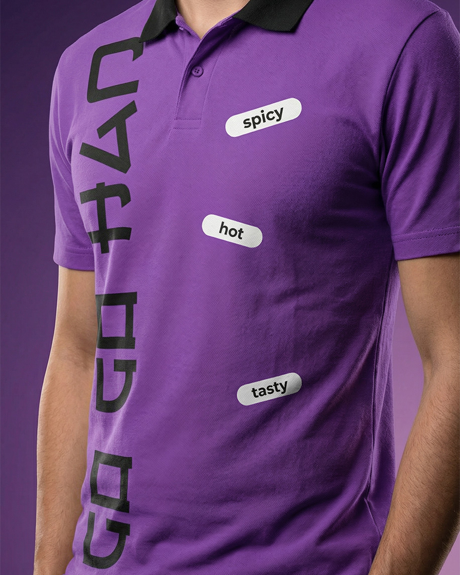
Shop windows and walls "speak" to passersby through a series of vibrant stickers: featuring "hello street" greetings, funny characters, and flavor tags. Staff apparel is also a statement: purple polos with a vertical logo and "spicy / hot / tasty" patches look like stylish streetwear rather than a uniform. Even the smallest details, such as branded chopstick sleeves, work towards total brand recognition.