The main goal was to shatter the stereotype of "scary dentistry" and create an identity that evokes unconditional trust at first glance. The style needed to act as a visual sedative: gentle, open, yet professional. We needed to develop a design that communicates safety and empathy, shifting the focus from medical procedures to human care.
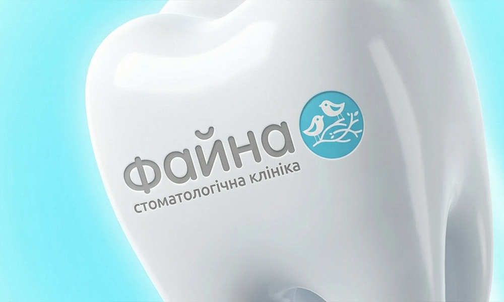
"Fayna" is a modern dentistry that reshapes the perception of treatment. We moved away from the concept of a "sterile hospital" in favor of a space focused on the patient's emotional experience. Here, the visual language speaks not of instruments, but of care, soft forms, and natural tranquility.
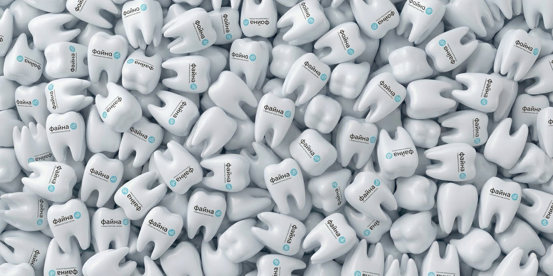
Our goal was to make the brand empathetic — one that sparks a smile and relieves tension before the patient even sits in the chair. The foundation of the new style lies in a harmonious blend of visual lightness and medical professionalism. We created an atmosphere where every design element works as an anti-stress factor, assuring the visitor: it is safe here, it is comfortable here, you are cared for here.
The clinic's logo embodies the philosophy of "family comfort." It is a soft, friendly mark devoid of sharp angles. At the center of the composition is a turquoise circle featuring a pair of birds in a nest, serving as a metaphor for safety, trust, and family values.

The graphic emblem emphasizes an individual approach: just as birds care for their nest, "Fayna" doctors care for every patient. For the typography, we selected a rounded font with soft geometry, visually broadcasting painlessness and friendliness. This mark is memorable and evokes warm associations, distancing itself from typical "tooth" clichés.
The identity is built on a sense of purity and space. We used a palette of calm shades of blue and white, associated with hygiene and freshness. The key style element is a rhythmic pattern of stylized birds, adding dynamics and recognizability to the brand carriers.
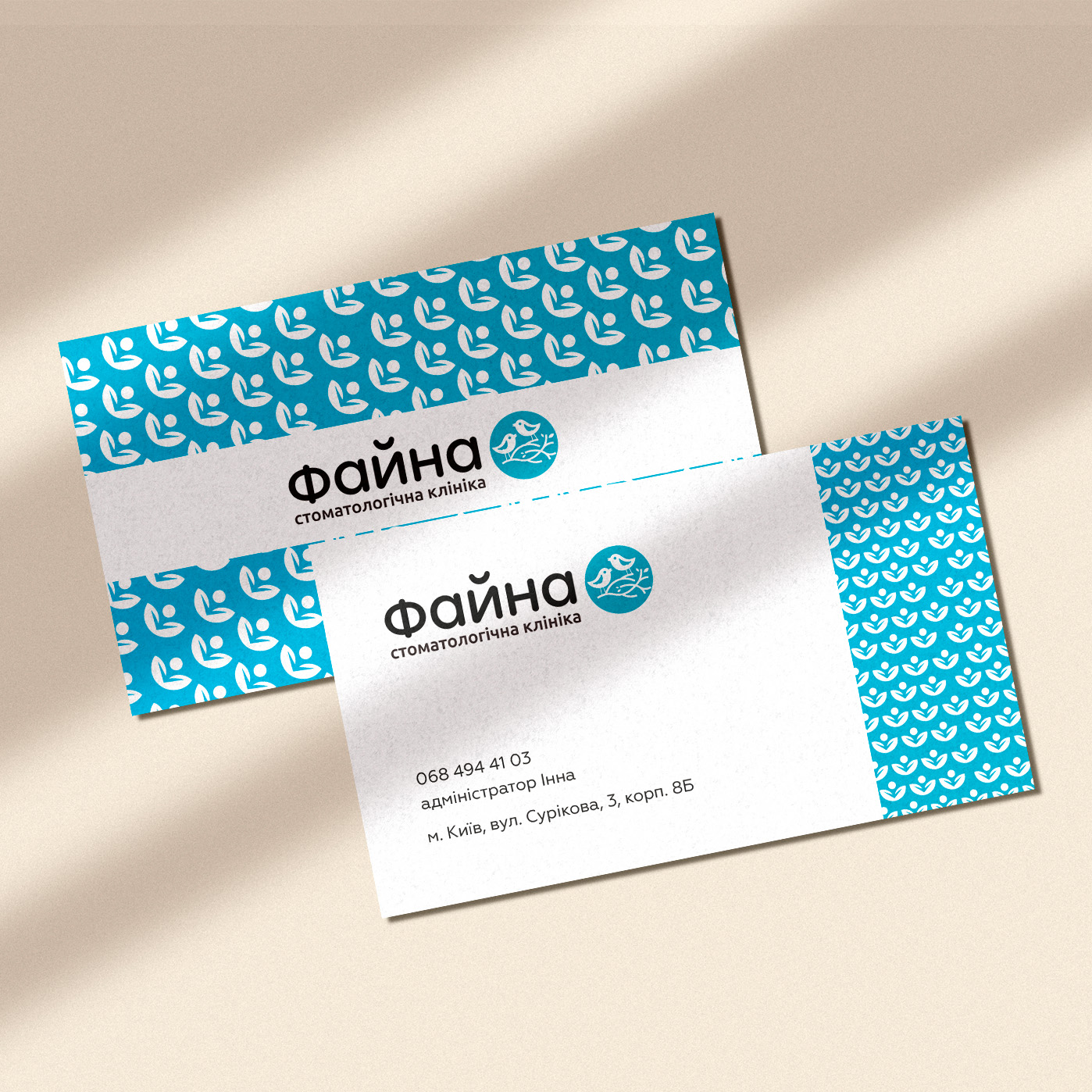
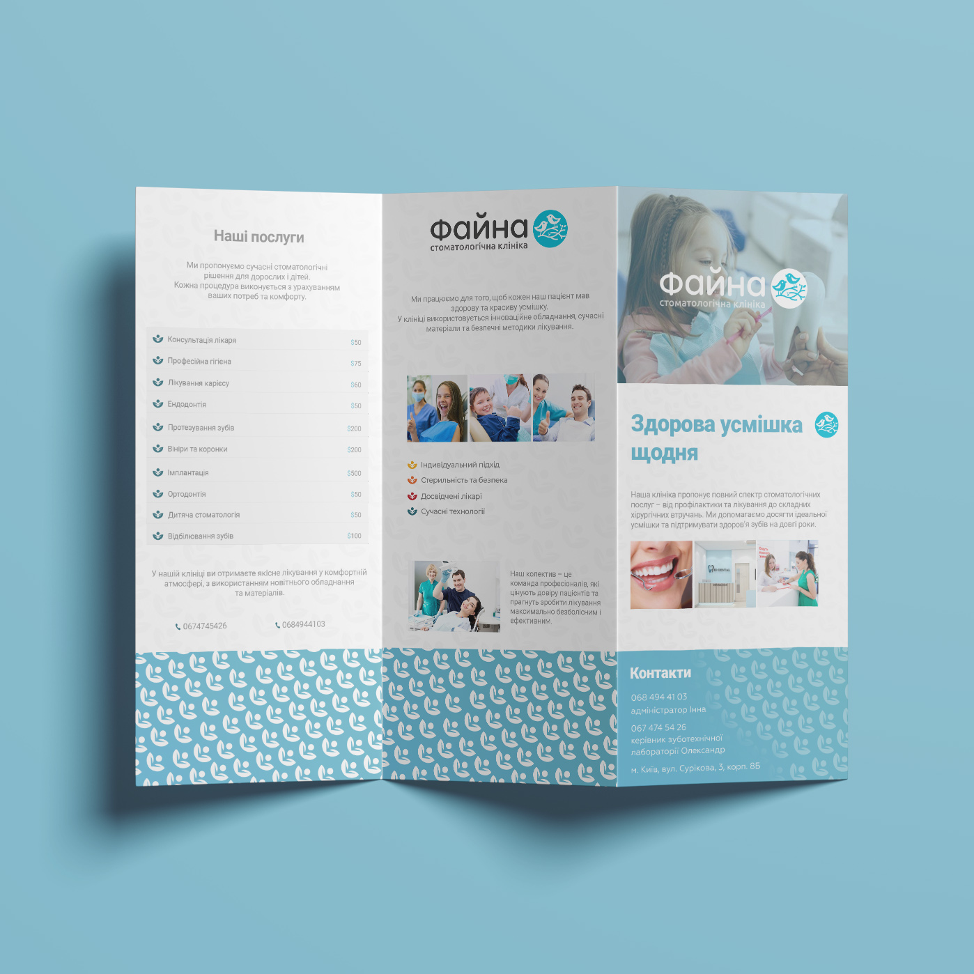
The design system unifies all materials into a cohesive image. Business cards feature a clean, balanced composition: the focus on the logo and contact details is paired with a decorative pattern block that structures the layout.
Information brochures are designed with patient convenience in mind: a clear hierarchy of services, a price list, and doctor photos are framed by the signature ornament. This makes complex medical information easy to digest, while the print materials feel aesthetically pleasing and nice to the touch.