We serve as the brand's ongoing design partner. Our task is not just to create a style, but to ensure its stable evolution in real-time. Every month, we develop new creative solutions, adapting the identity for marketing campaigns, seasonal offers, and new location launches while maintaining brand recognition across different countries.
Sushi Icons continues to scale rapidly, getting closer to customers in various corners of Europe. The key challenge of such growth is preserving a unified visual code that the audience associates with high quality and product safety.


Our team is responsible for the brand's visual integrity at all stages of its expansion. We act as "style architects," creating original designs that function as an ecosystem. Whether it's a printed menu in Warsaw or a digital banner in Kyiv, the communication looks cohesive, modern, and professional. We develop solutions that easily adapt to various formats (print & web), helping the brand speak the same language to its customers, wherever they may be.
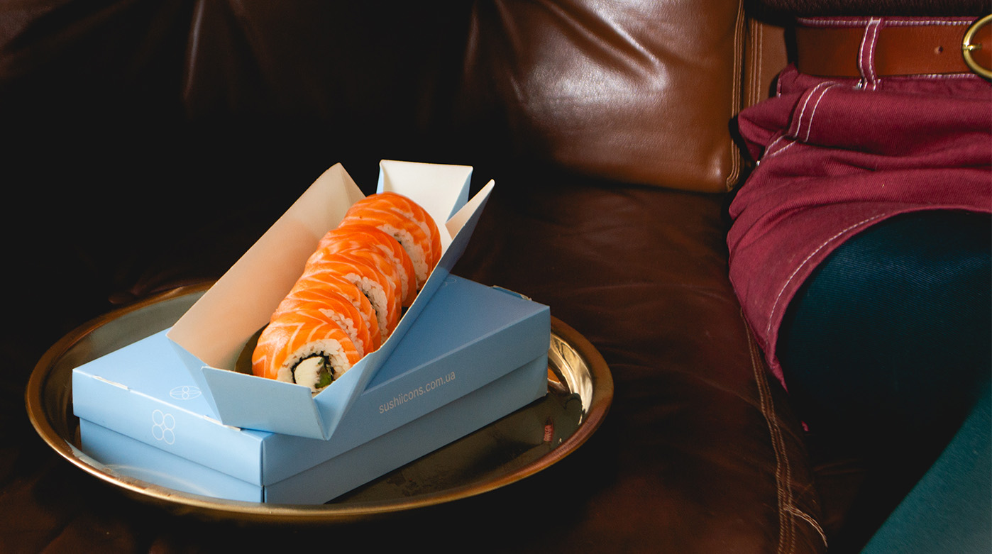
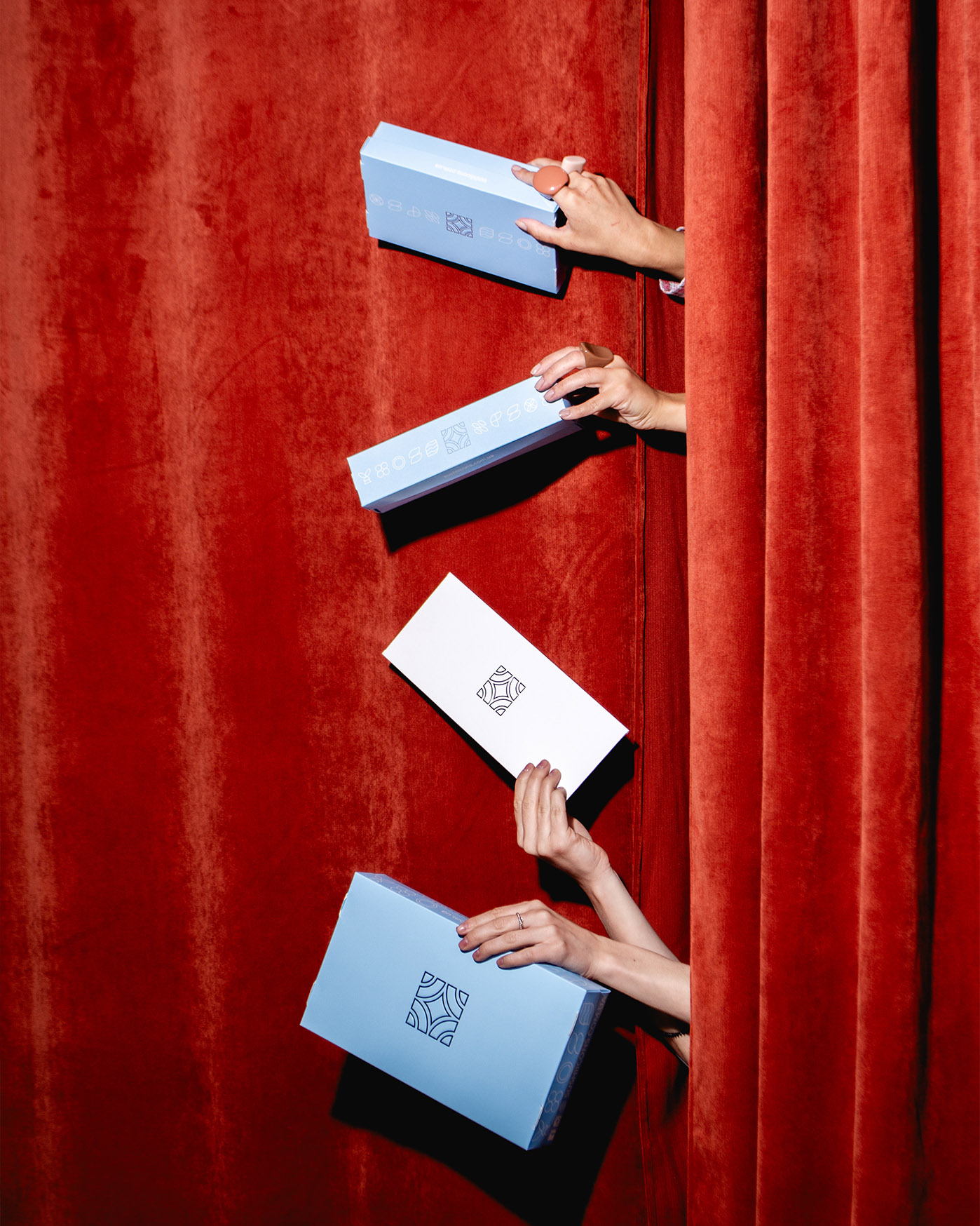
The first thing a client sees before enjoying the taste is the packaging. It acts as the brand's "silent ambassador," setting the tone for expectations and forming the first impression of product quality. We approach packaging development as an engineering and aesthetic challenge: it must be not only visually flawless but also structurally sound, ensuring dishes arrive at the table fresh and neatly presented.
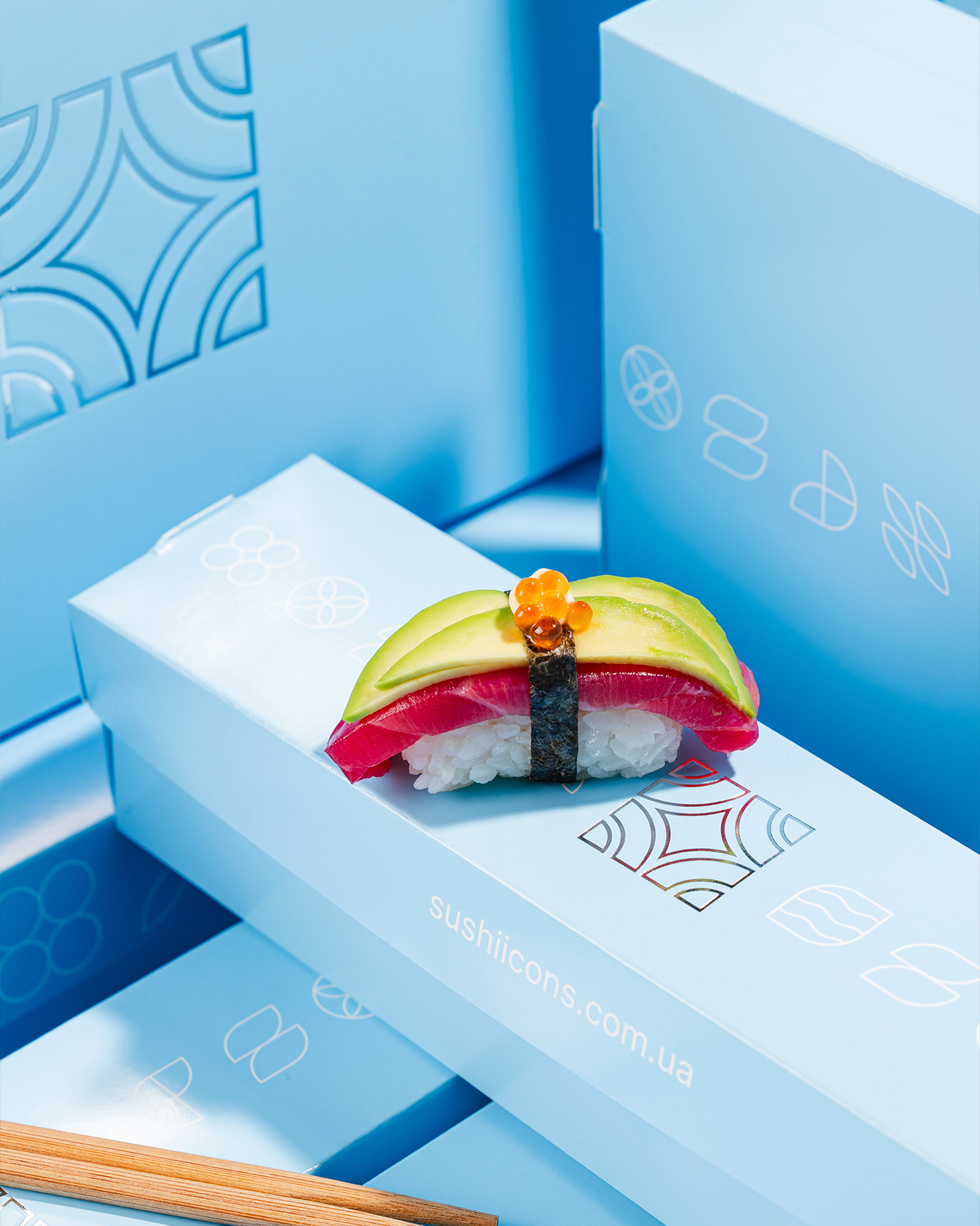
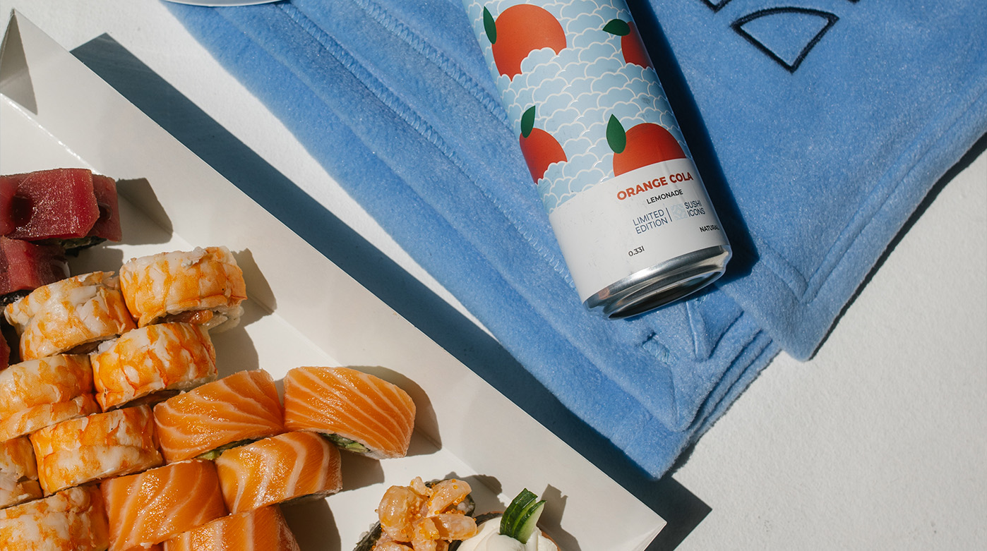
The foundation of Sushi Icons visual identity is our Standard Line, which clients interact with daily. We deliberately moved away from the clichéd black-and-red combinations typical of the Asian market in favor of a unique "Iconic Blue" — a soft cyan shade. This color symbolizes the freshness of the ocean, the purity of ingredients, and premium service, instantly distinguishing the brand from competitors.
The box design is executed in the aesthetic of refined minimalism. The matte blue background features only a concise logo and a signature geometric pattern, rendered in fine white or silver lines. This ornament adds tactility and rhythm to the packaging without overloading it with visual noise. Such restraint emphasizes the main point: the true luxury lies inside the box.

Releasing limited-edition packaging for the company's birthday has become a special tradition for Sushi Icons. It serves as an annual visual manifesto highlighting the brand's achievements. For the anniversary collection, we developed a design in the "Midnight Luxury" style: a deep, rich dark blue color paired with gold foil stamping. The centerpiece features an infinity symbol graphic and the slogan "Taste that never ends," symbolizing consistent quality and customer trust over the years.
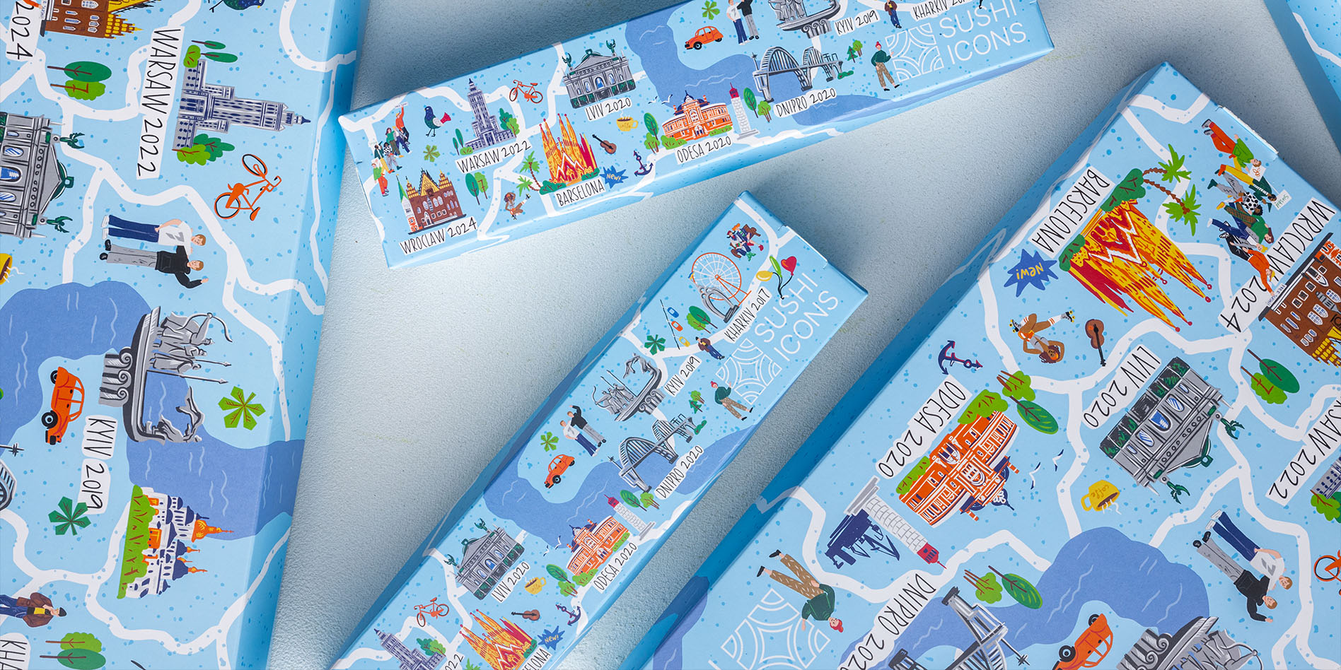
Another direction for holiday design is storytelling through illustration. We created a packaging series that visualizes the expansion geography of Sushi Icons. A true map of the brand's presence unfolds on the signature light blue background: from Kyiv and Lviv to Warsaw and Barcelona.
This design functions as an interactive success story: the customer explores iconic architectural landmarks (Sagrada Família, the Founders of Kyiv Monument) and location opening dates, feeling part of a large international family. Such packaging transforms an ordinary order into a festive souvenir that feels too special to throw away.

We maintain an emotional connection with the customer through seasonal design updates. Every year, for major holidays, Sushi Icons "changes its outfit," turning delivery into a themed gift.
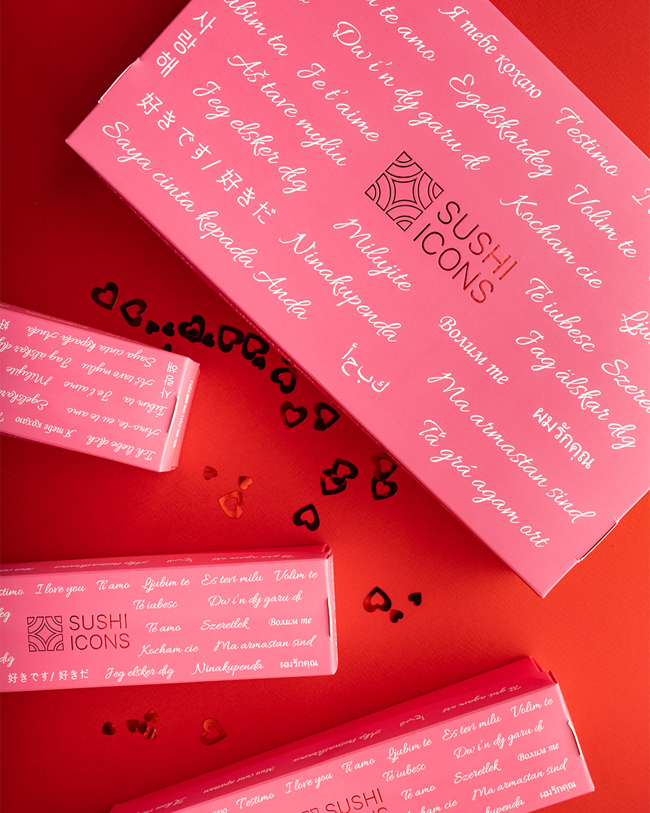
For Valentine's Day, we created a romantic limited edition in a soft pink color. The design concept is "Love knows no borders": the box lid features the phrase "I love you" multiplied in dozens of world languages, from Ukrainian to Japanese, executed with elegant foil stamping.
We conveyed the spring mood for International Women's Day through a radically fresh palette. The vibrant lime color of the packaging acts as a vitamin boost after winter, while large, bold typography makes the box a stylish accessory that perfectly complements a bouquet of tulips.
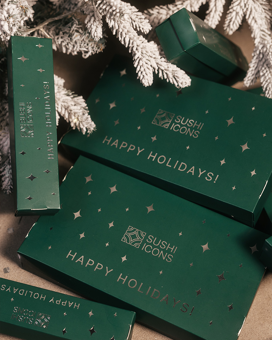
The New Year's collection traditionally embodies the magic of the winter holidays. We chose a noble dark green pine shade and added silver foil stamping in the shape of stars. The concise "Happy Holidays!" inscription and shimmering elements turn such packaging into a full-fledged gift you’d want to place under the Christmas tree.
The physical space of Sushi Icons is more than just a pickup point. It is a portal into the brand's world, where digital convenience meets a genuine atmosphere of hospitality. We develop a design code for locations across different countries, adapting a unified premium style to the unique architectural context of each city.

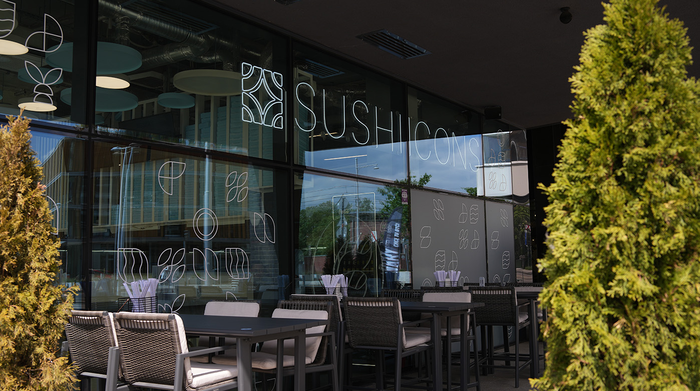
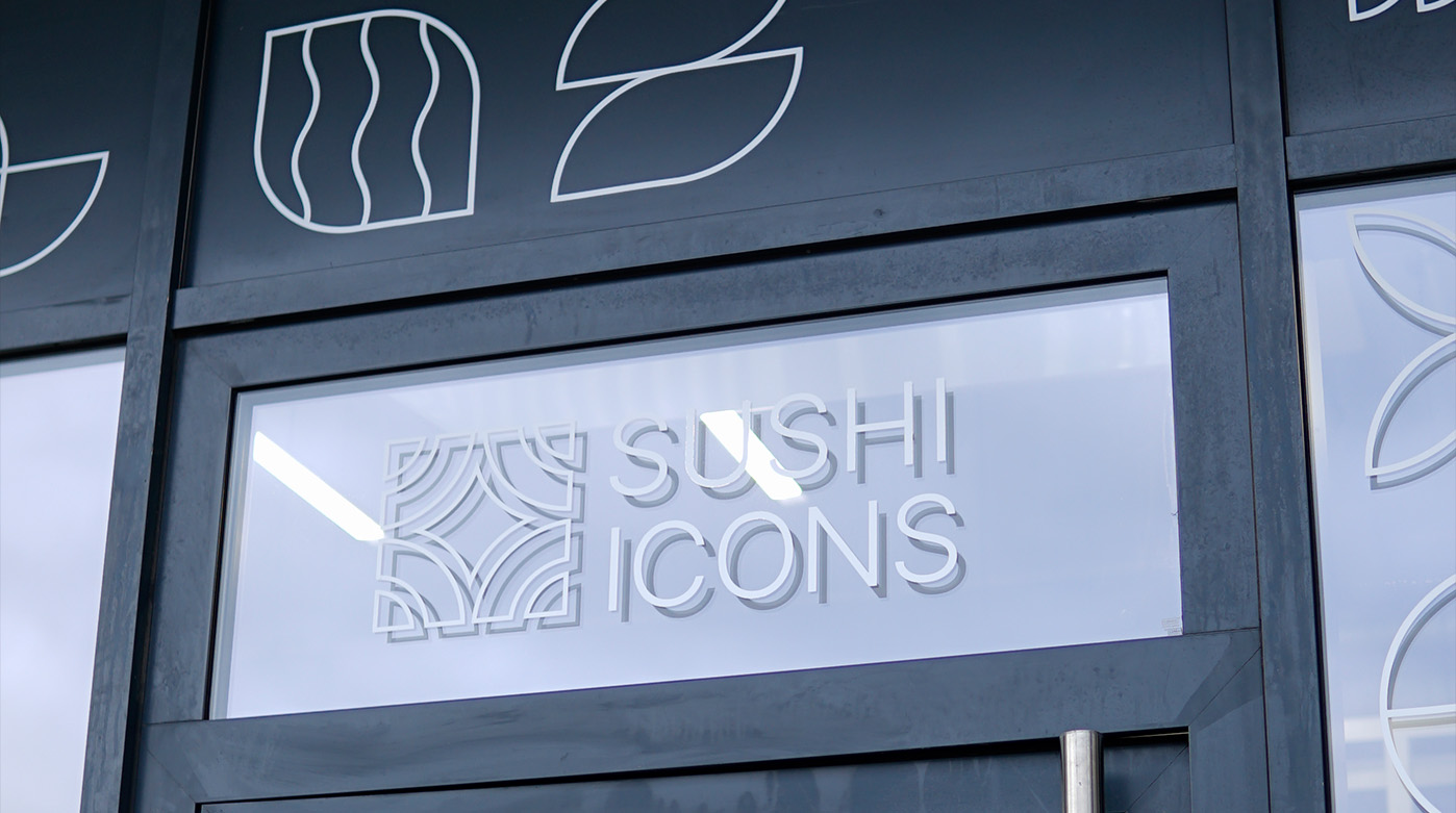
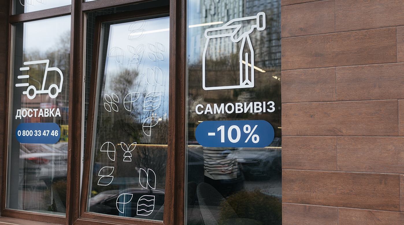
In designing facades, we adhere to the principles of transparency and openness. Large panoramic windows serve as a canvas for the corporate identity: refined white light-patterns and geometric icons on the glass add privacy to the space without blocking the view.
We actively use light as a design tool: concise lightbox signage and stylish neon elements act as visual beacons, capturing traffic attention. Interior solutions, navigation, and branded waiting areas create a cohesive urban image that broadcasts cleanliness, technology, and high service standards, regardless of whether the venue is in Kyiv or Warsaw.
To get even closer to customers living in the fast lane, Sushi Icons launched a network of vending machines in Poland. This grab & go format required a specific design approach: the machine had to be visible from afar, intuitively understandable, and appetizing within seconds.

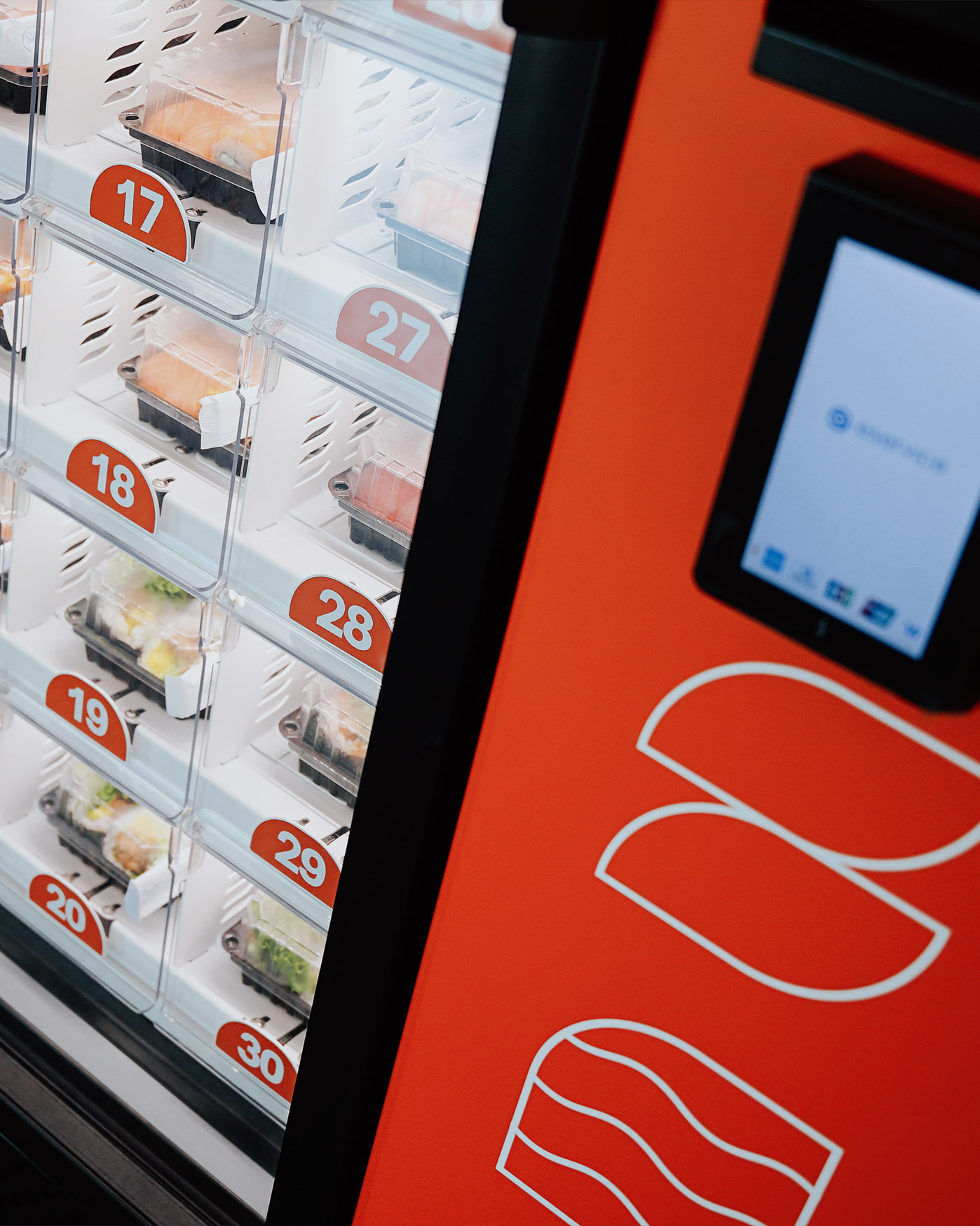
We developed a design based on clear functional zoning. The machine's body is visually divided into two contrasting sections. The left side is executed in the signature dark blue, broadcasting reliability and premium quality. It features key communication in Polish, "Zamów sushi z dostawą" (Order sushi for delivery), along with a set of concise linear icons (Sushi, Rolls, Sets, Salads) that help users instantly navigate the assortment.
The right side — the action and payment zone — is highlighted in an active orange color. It acts as a "visual anchor" and is decorated with white fragments of the signature pattern, maintaining brand recognition. The transparent facade showcases the product's freshness, making the food itself the main design element, while shelf lighting gives the machine a futuristic look at any time of day.
In the digital age, physical brand assets hold special value. We view polygraphy not as disposable material but as a crucial loyalty tool. Every touchpoint — whether it's a menu page or a promotional flyer — must broadcast Sushi Icons' values: quality, attention, and aesthetics.
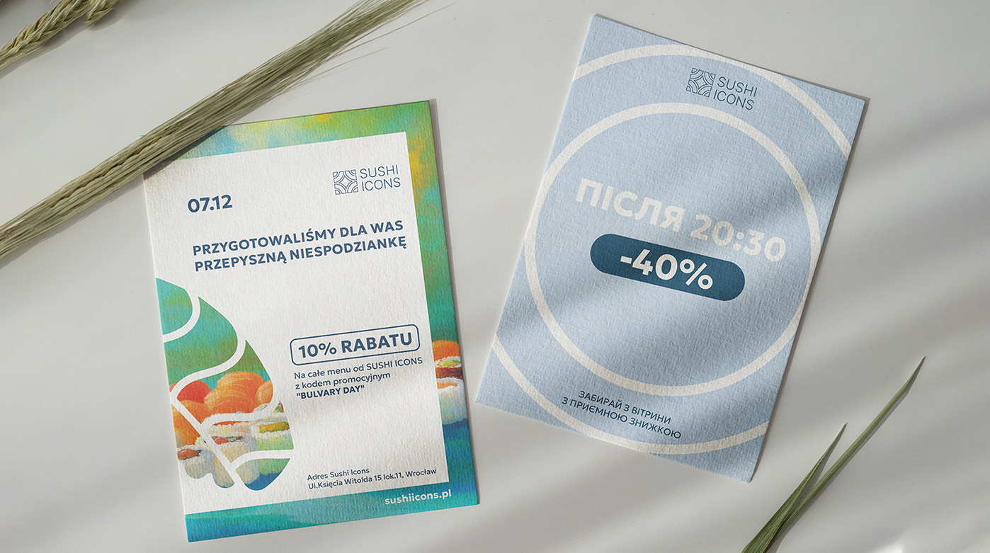
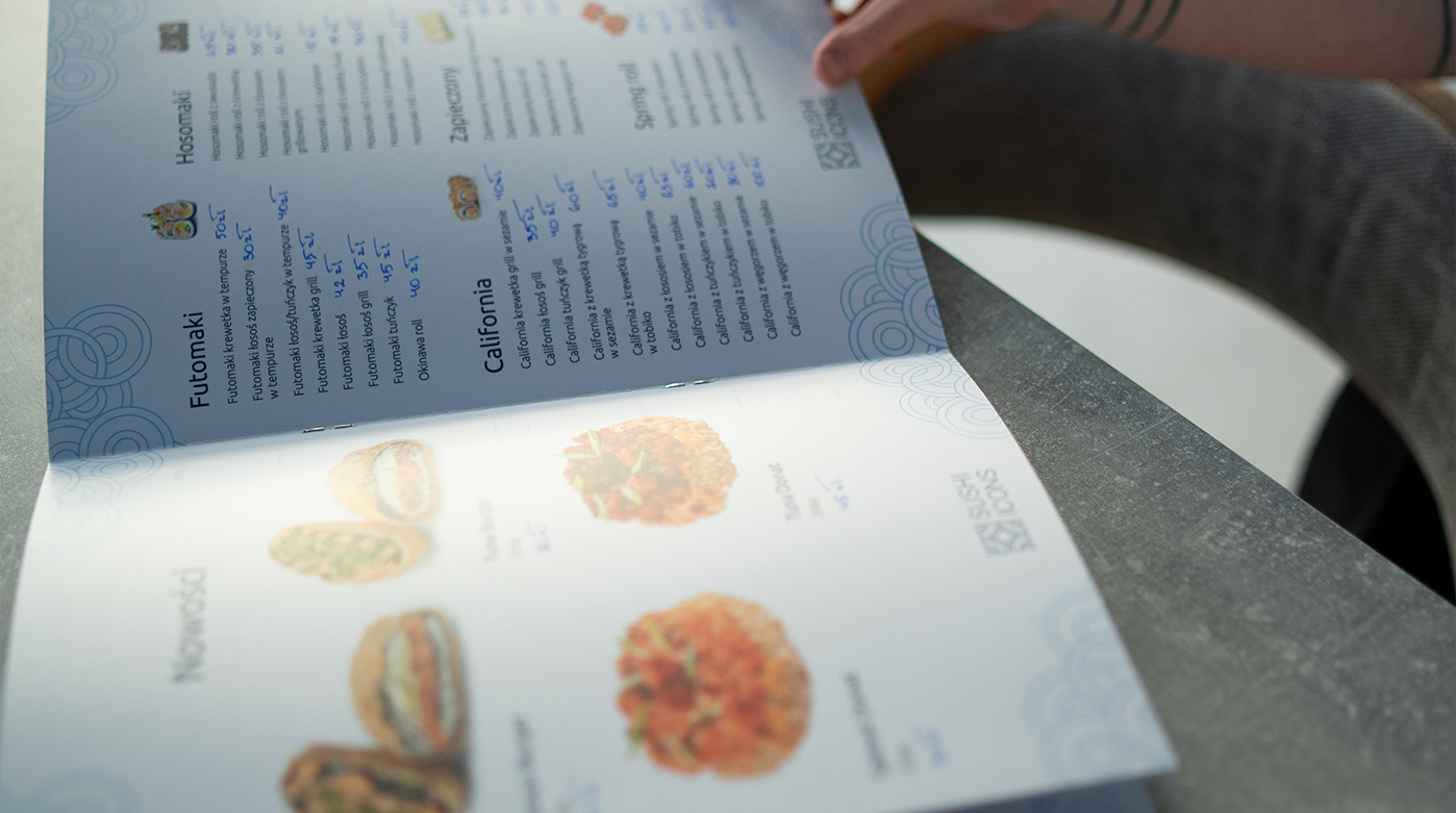

We created an ecosystem of printed materials where function harmoniously blends with visual style. The menu is designed based on ergonomic principles: thoughtful layout and clean typography allow guests to instantly find their favorite dish without being distracted from the appetizing photos.
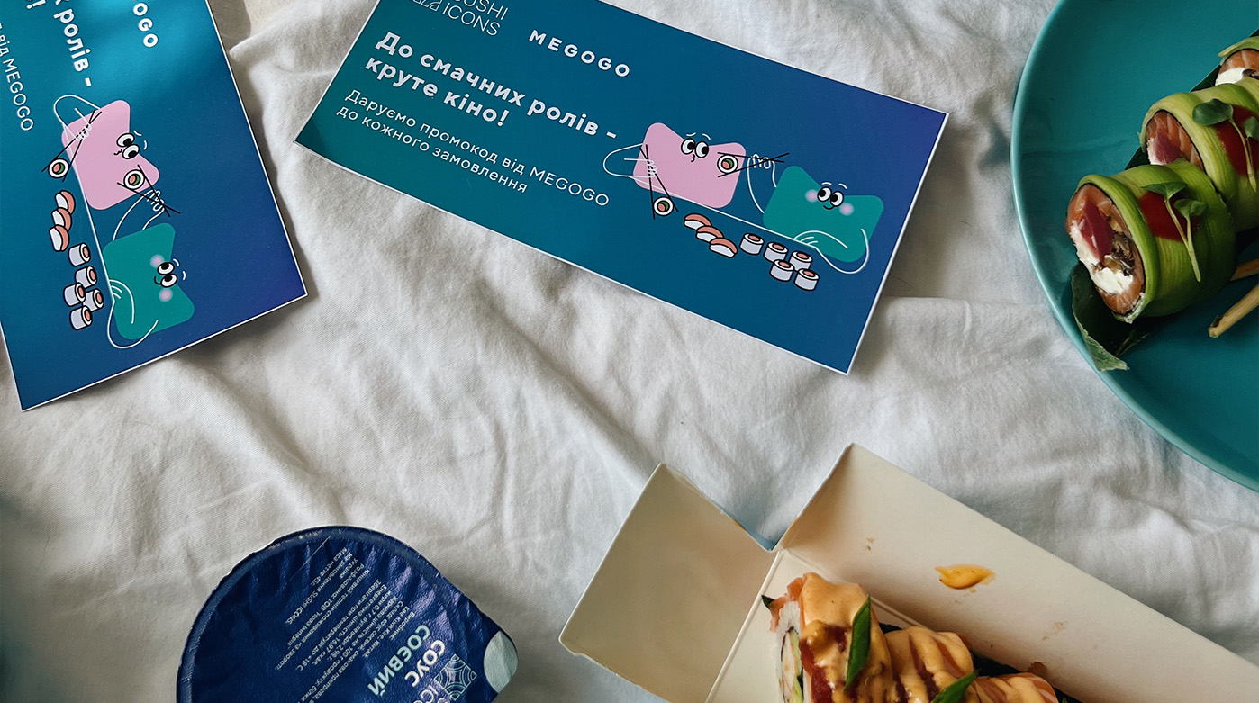
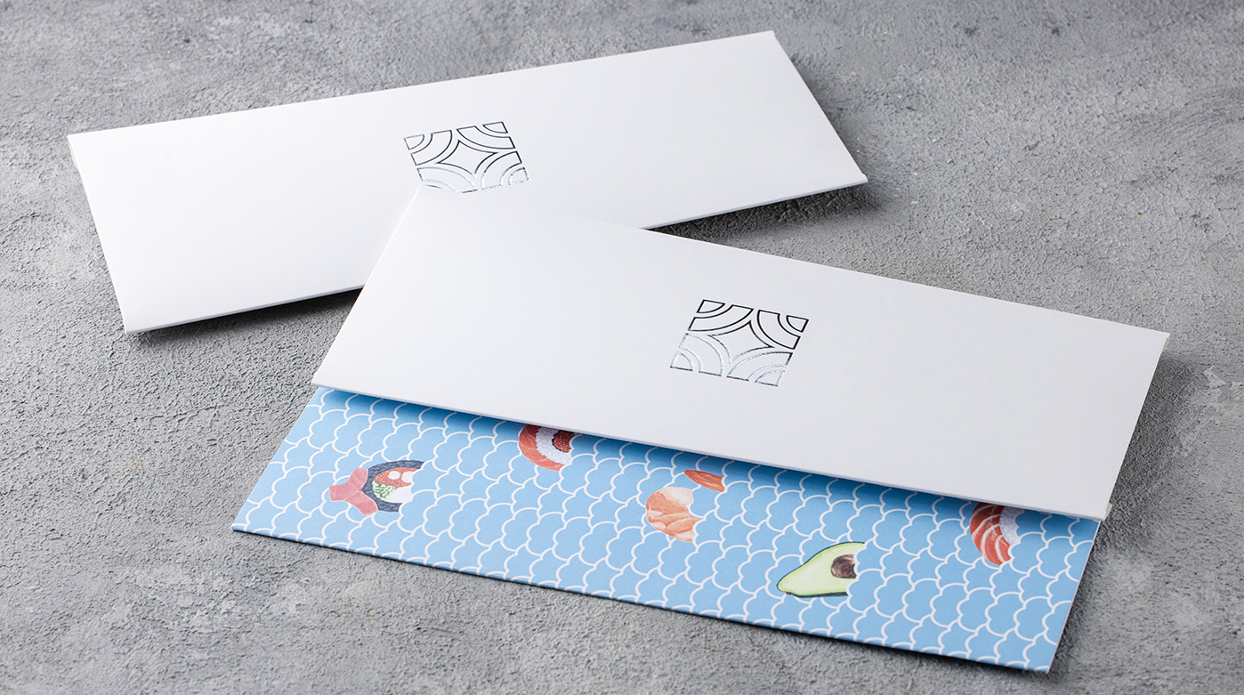
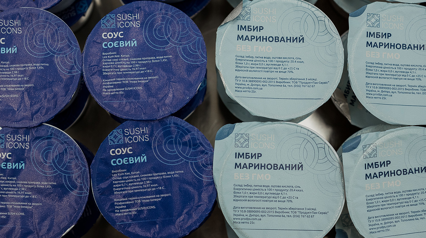
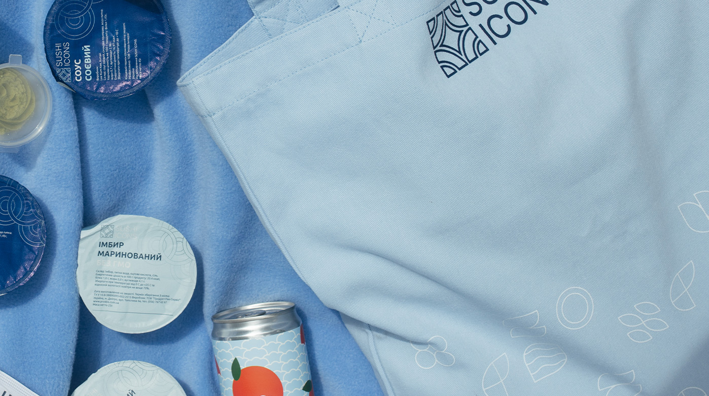
We pay special attention to image-building products. Gift certificates and envelopes are crafted using premium paper and silver foil stamping, turning them into elegant gifts. Promotional flyers and leaflets retain the signature "blue code" and tactile patterns. The identity system extends to even the smallest carriers: we developed unique designs for sauce container lids, sets of branded stickers, and a merchandise line. All of this works to strengthen the emotional bond, reminding the client: everything here is thought through.
In a world saturated with visual noise, Sushi Icons advertising doesn't shout; it seduces. We develop campaigns that work on an instinctual level: they trigger appetite and clearly broadcast the offer within the few seconds of contact with the audience.
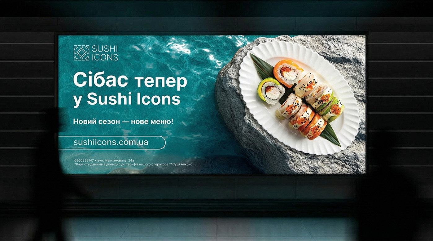

The outdoor advertising strategy is based on "food porn" aesthetics and maximum layout cleanliness. We use large-scale photography of ingredients to highlight the product's premium quality. For example, to launch seasonal new arrivals, we created a billboard series focusing on textures: fresh sea bass against a seawater background or signature rolls featuring whole crab. Here, the visual speaks louder than any slogan.
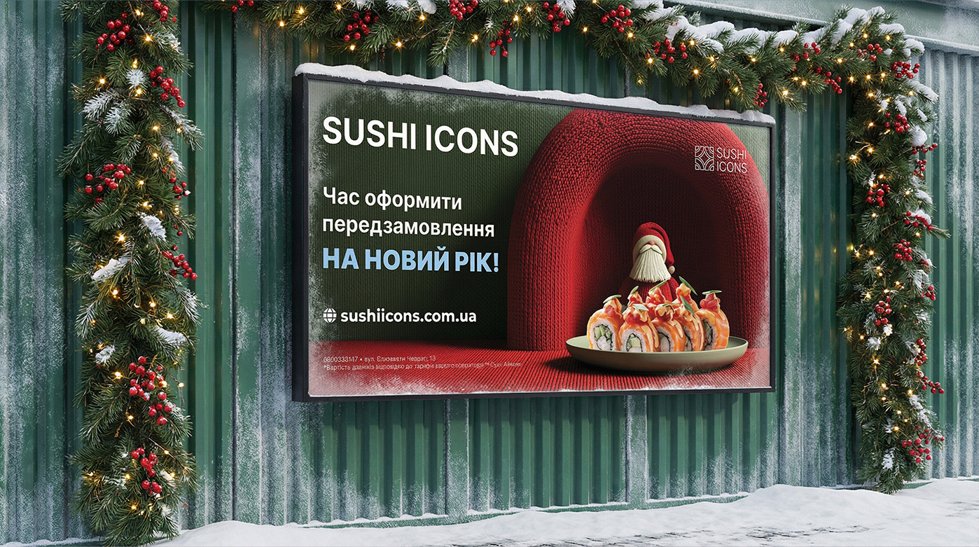
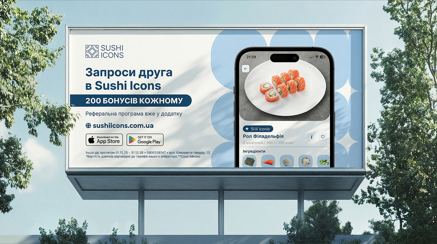
Beyond product communication, we integrate marketing mechanics into OOH. Ads for the mobile app with a referral program showcase the interface on a smartphone, bridging offline reach with digital action. Meanwhile, holiday campaigns, such as the New Year series featuring Santa and a "knitted" background, work to build a warm emotional connection with the brand.
Social media for Sushi Icons is a playground for bold experiments, where the brand competes for attention not just with other deliveries but with entertainment content. We develop a visual language that goes beyond standard food photography. Our goal is to stop the scroll and trigger an emotion, using everything from humor to cutting-edge AI technologies.
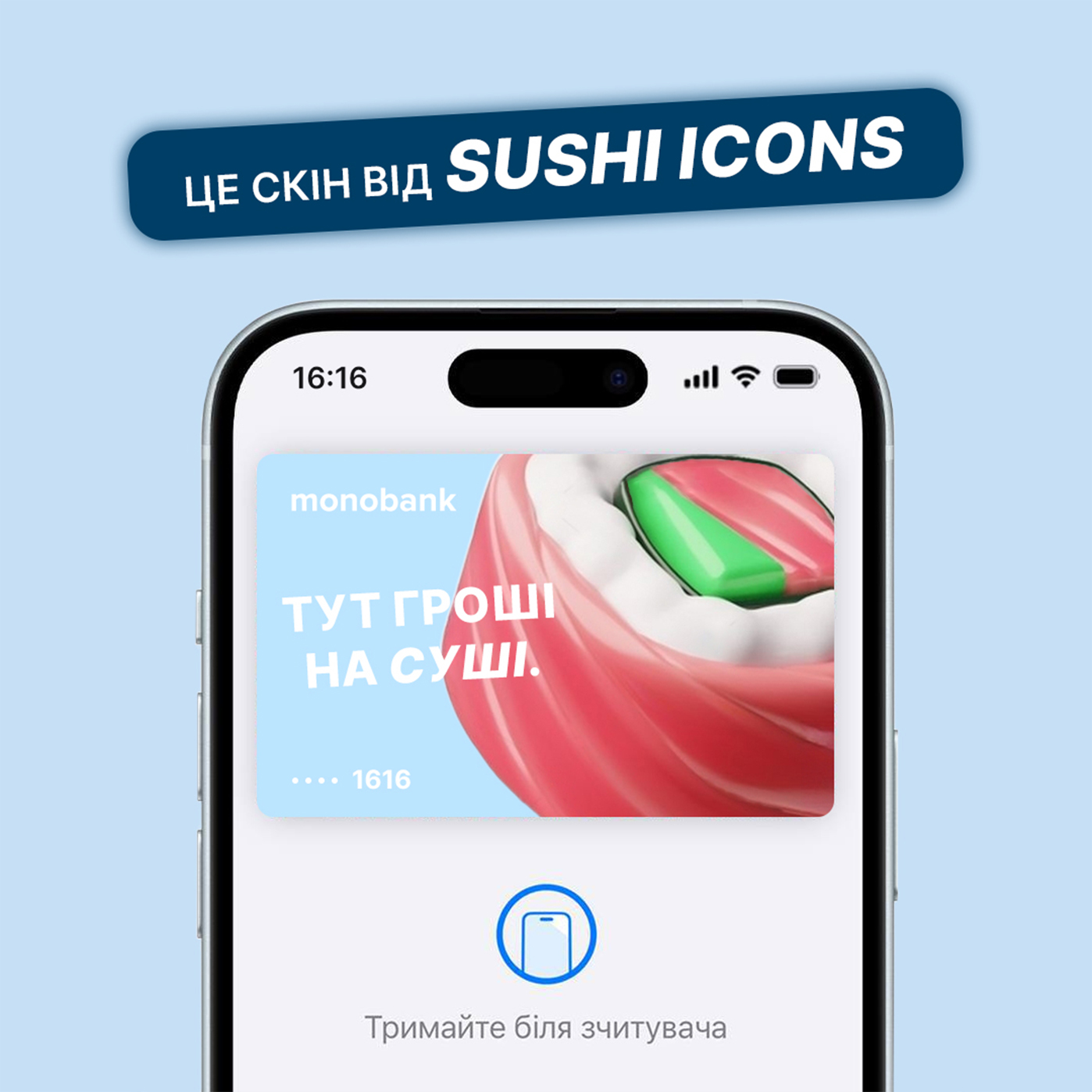

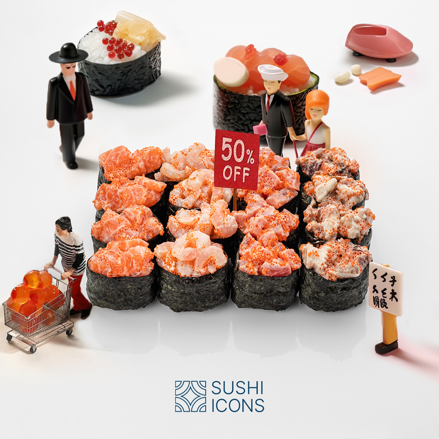
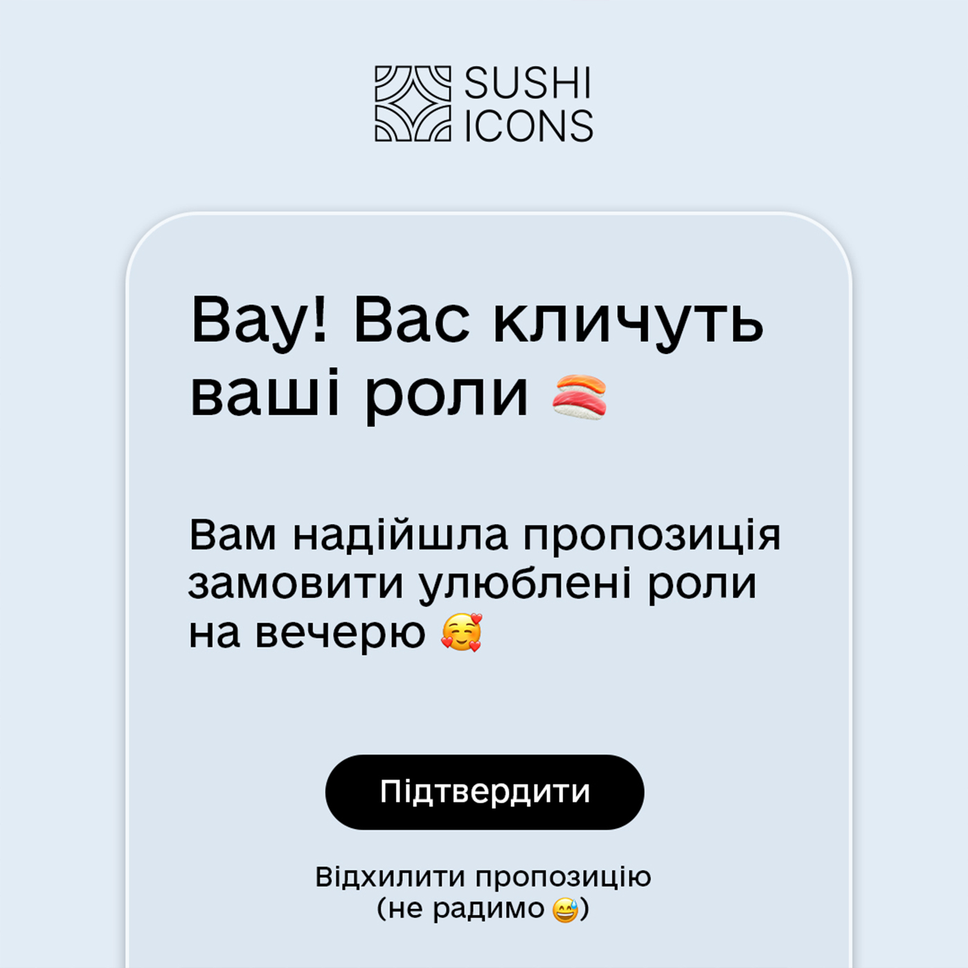
We transformed the brand's feed into a source of creative inspiration. The content strategy blends diverse styles: we create witty interface imitations where push notifications claim "your rolls are calling for dinner", or integrate the brand into digital habits by designing custom skins for banking cards. A separate direction involves narrative layouts with miniature figures interacting with sushi, adding irony and scale to the content.
To stay ahead of trends, we actively implement Artificial Intelligence. Generating unique concepts allows us to create fantastic scenes impossible to capture on camera. A prime example is the animation where a giant Sushi Icons box shaped like a cloud floats over a metropolis skyline. This approach makes the brand viral, modern, and engaging for the audience.