
Develop an identity that combines high-tech precision with natural origins. Visualize product purity, evoke trust, and emphasize the company's international scale. The label design must convey organic quality in a modern style.

Shollagro is a company with a global mindset, building a bridge between nature's abundance and modern needs. The brand works exclusively with natural raw materials, creating products for a conscious and healthy lifestyle. The portfolio's flagships include cold-pressed oils, plant-based proteins, select spices, and seeds.
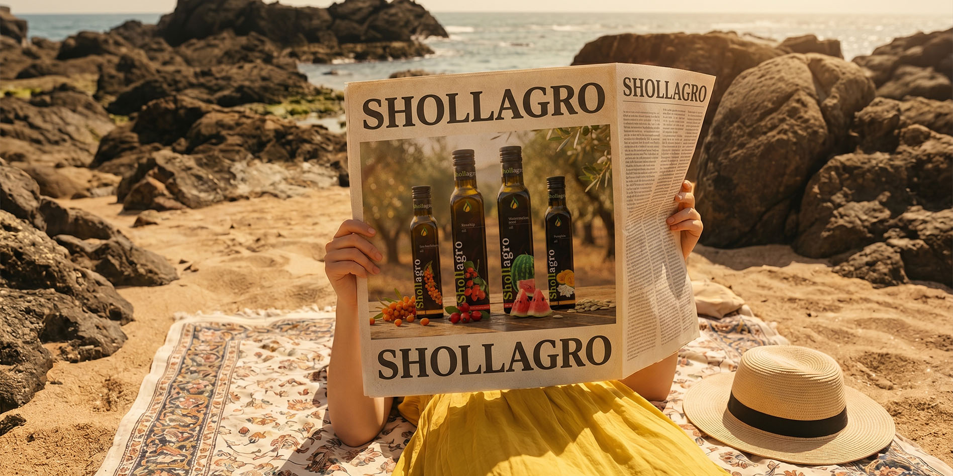
The project's main challenge was finding the perfect visual balance. Thanks to the fusion of advanced agricultural technologies and age-old traditions, Shollagro is not a typical "rustic" story. Therefore, in the design, we deliberately moved away from craft aesthetics, aiming to create an identity that looks clean, expert, and professional, yet remains warm and accessible to the consumer. It is a brand that speaks the universal language of quality in any market around the world, demonstrating that natural can be technological.
The brand emblem is a stylized drop, becoming the quintessence of Shollagro's philosophy. It is not just a liquid form; it is a complex object formed by natural lines, embodying ideas of continuous motion, saturation, and vital energy.
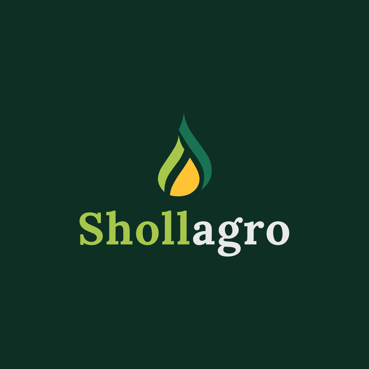
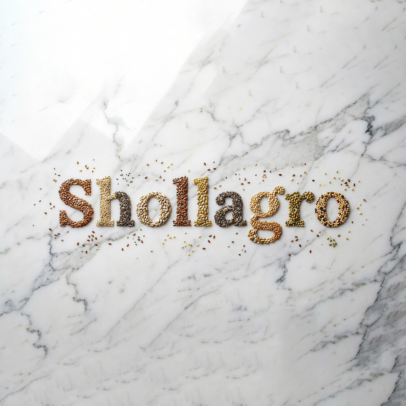
The logo's color architecture is built on three meaningful accents that narrate the product's origin story. Sunny Yellow at the core symbolizes precious oil and solar warmth. Fresh Light Green personifies young shoots and active growth, while Deep Dark Green acts as a stable base, broadcasting the strength of fertile soil and brand confidence.
This mark is a paragon of adaptability: it retains recognizability whether as a mobile app icon or on a large-format banner. The logo successfully combines the corporate rigor of an international holding with a living, natural aesthetic, working equally effectively in full color and monochrome.
We developed a comprehensive visual system for the brand's key product lines: functional protein powders and an exclusive collection of cold-pressed oils. The design of both lines resonates through a unified "dark code," creating a cohesive and recognizable brand block on supermarket shelves.
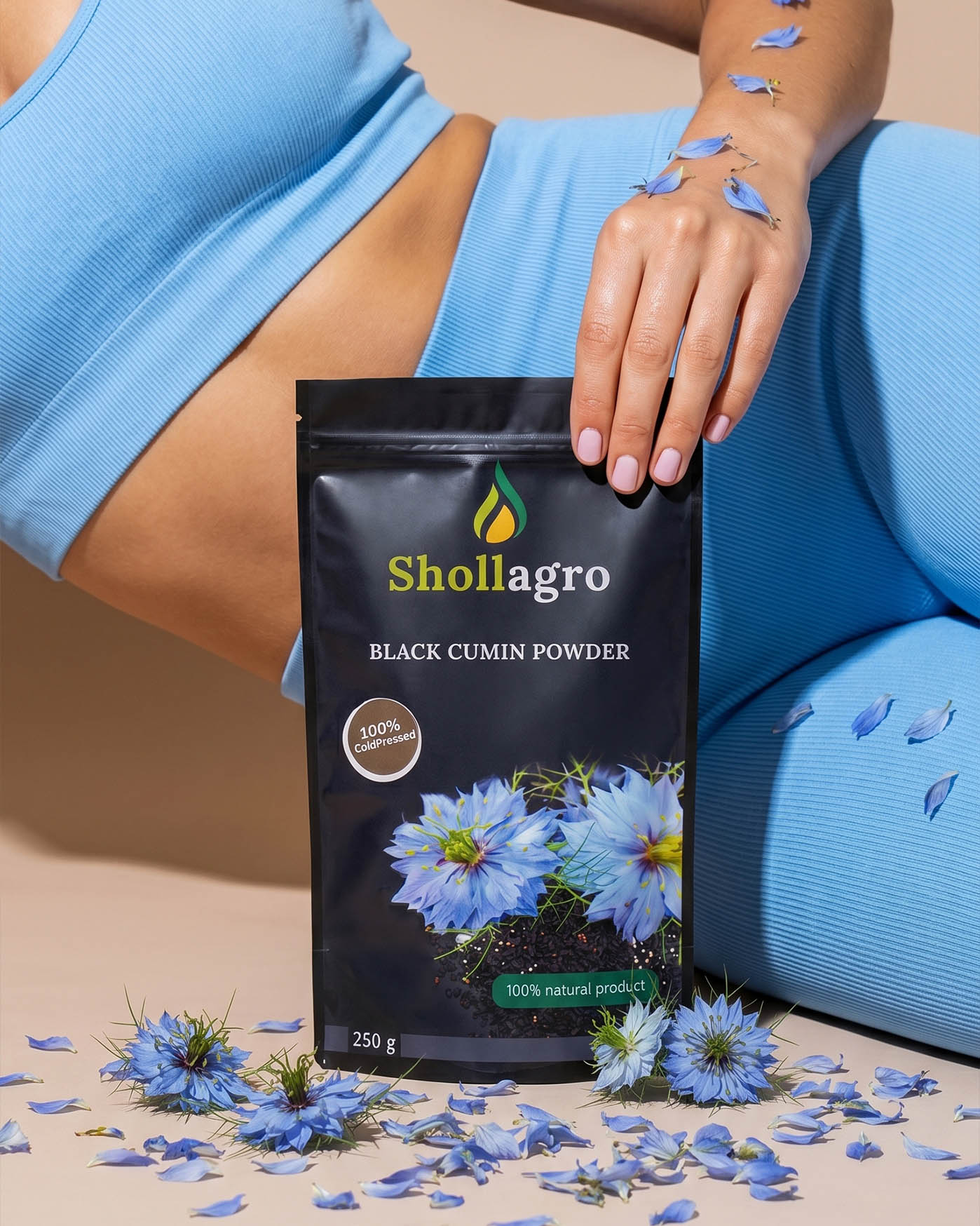
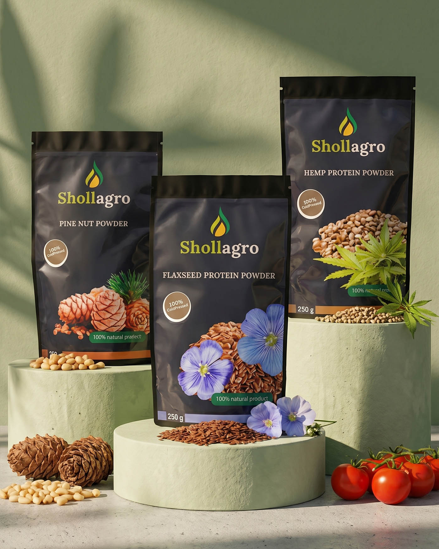
For the protein superfood series, we chose the concept of "hidden energy." The deep black matte background of the doypacks serves as the perfect stage for the main accent—rich macro photography of the ingredients. Realistic images of pumpkin, flax, or black cumin do not merely decorate the packaging but demonstrate the primal power of the product. Product names are executed in a crisp font, adding weight and a premium feel to the item.

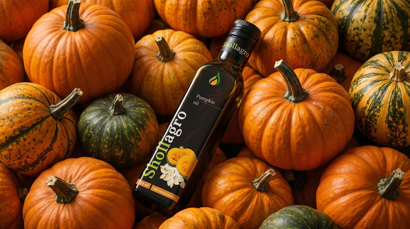
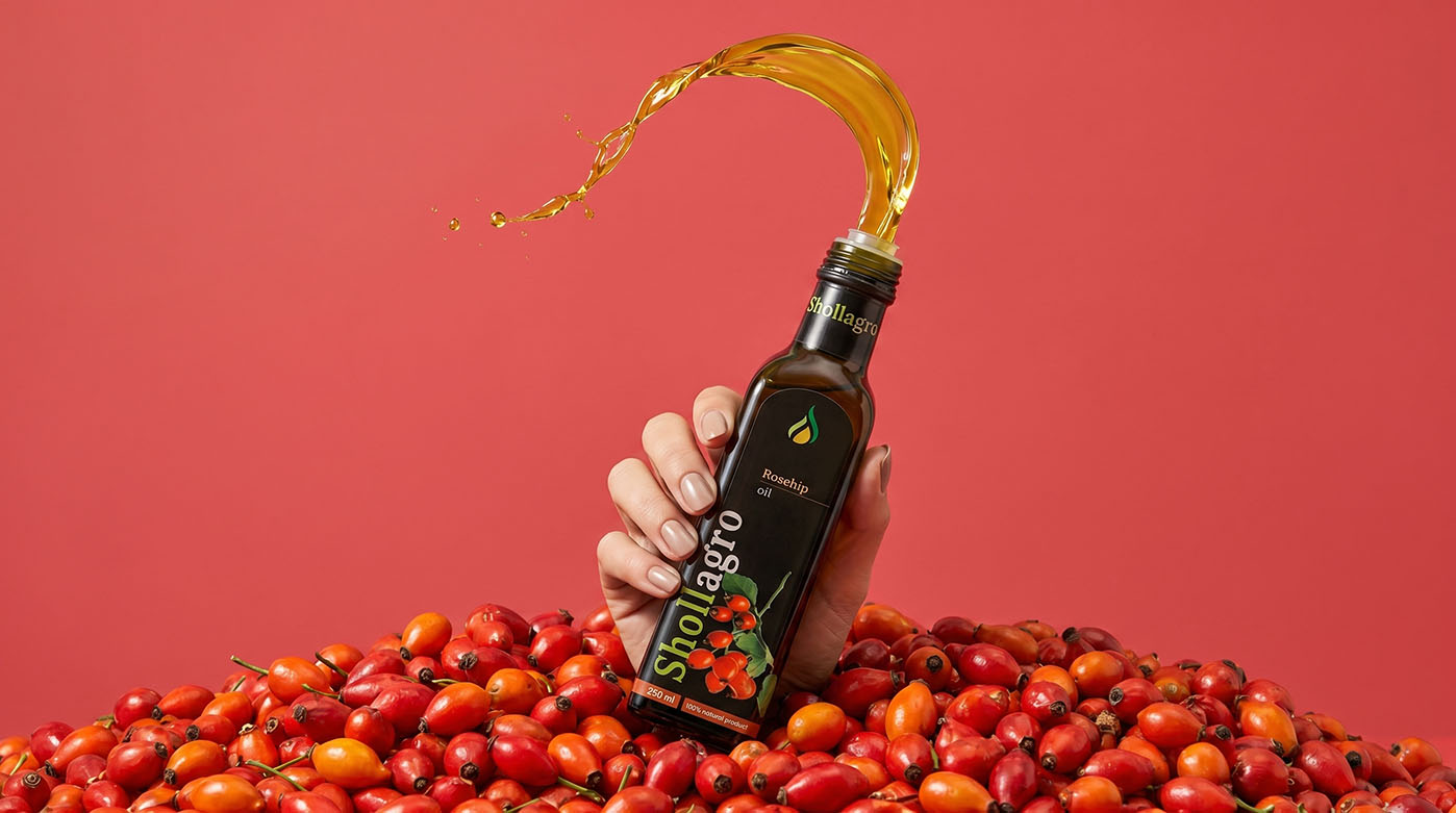
The cold-pressed oil collection extends this aesthetic in a more refined form. We used dark medical-grade glass to protect the contents, while the label design is built on vertical architecture. The restrained black background contrasts with bright, juicy images of the oil source (watermelon, sea buckthorn, rosehip). Color-coding of the names allows the customer to instantly identify the desired flavor, while the signature drop logo acts as a seal of quality, guaranteeing a "first press" product.