To develop a comprehensive branding strategy and a website that blends professional expertise in seafood selection with the welcoming character of a family business. To create a visual system including identity, packaging, and merch design, alongside a functional online platform.

Serce Oceanu is more than just a seafood delivery service; it’s a story about family values and the belief that shared meals bring people together. We created a brand that speaks to the customer through the language of trust and quality, where every product is chosen with respect for the ocean and care for those gathering around the table.
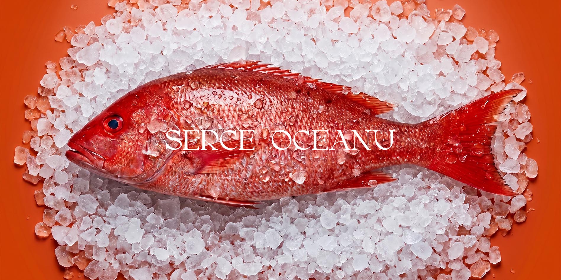
The project is built on the idea of "the taste of a true celebration." We aimed to convey the sensation of a fresh sea breeze through a modern visual language. The logo and corporate identity reflect the brand's expertise: we moved away from clichés in favor of clean aesthetics and deep colors associated with a premium selection — from chilled fish to gourmet marinades and snacks.
We integrated the family philosophy into every aspect of the brand. The visual concept is a balance between a professional approach to the product and the emotional warmth of home comfort. Every element — from the graphic pattern to the website structure — is designed to make the customer feel cared for from the moment they start choosing delicacies. Serce Oceanu becomes a guide to a world of gastronomic pleasure, where product quality brings genuine joy to every family.
The visual identity of Serce Oceanu is a sophisticated ode to the ocean and family bonds. We created a logo that blends organic marine shapes with a heart symbol, highlighting the brand's name and its emotional core. Every line of the identity works to build the image of a premium, yet accessible and sincere product that is a joy to have on one's table.
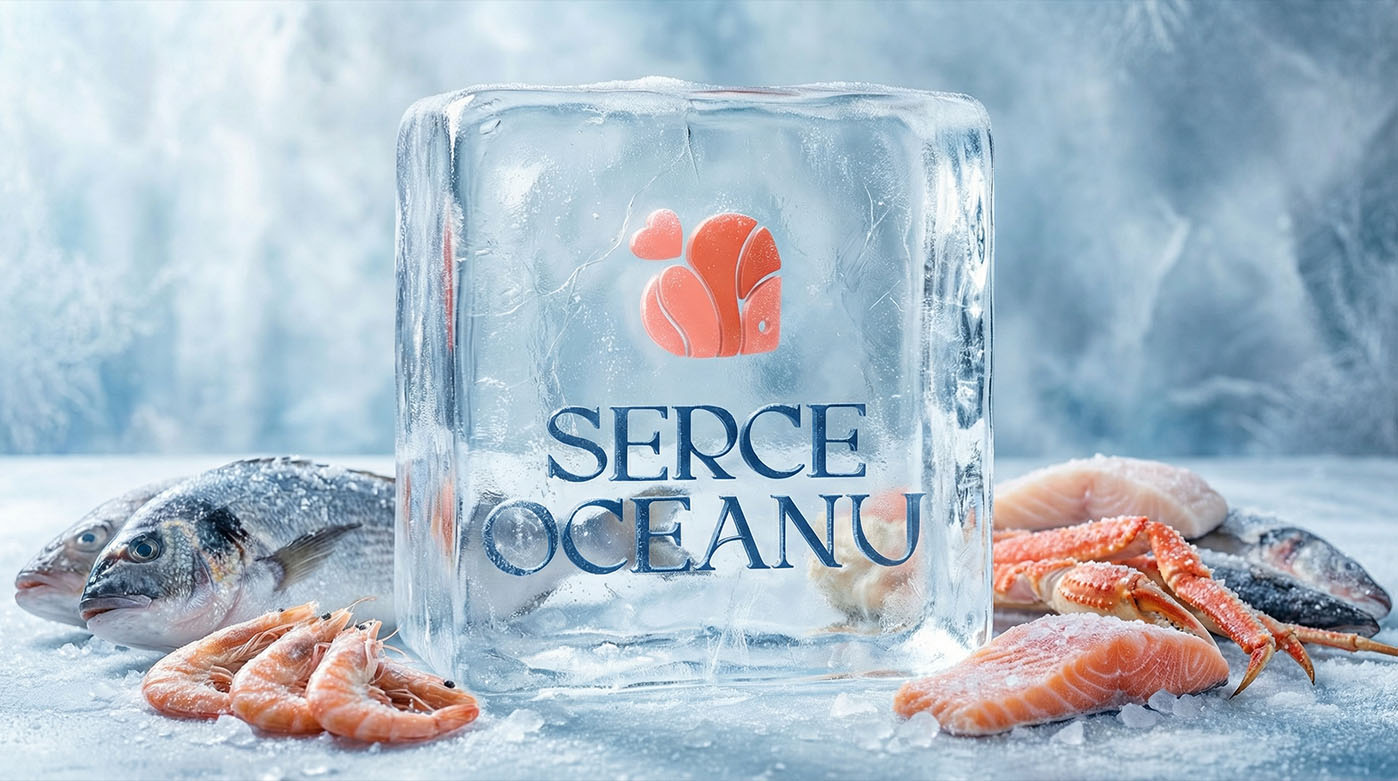

The brand logo is a stylized combination of a seashell and a heart, symbolizing a love for the craft and a commitment to quality. The color palette is based on the contrast between Deep Navy, embodying the reliability and infinity of the ocean, and Soft Coral, which adds warmth, appetite appeal, and "vibrant" energy to the brand. The typographic choice of a classic serif with modern accents adds status and hints at a deep respect for tradition.
A standout element of the identity is the signature pattern. It was created by deconstructing the logo's lines into an infinite wave. The complex interlacing of lines against a deep background evokes the feel of premium textiles or high-end wrapping paper. This allow the brand to maintain a cohesive look across all touchpoints — from minimalist packaging to interior elements and digital surfaces — reinforcing the idea that high-quality seafood is always about beauty and creating a special moment.
Serce Oceanu packaging is the physical touchpoint where the customer connects with the brand's values. We developed a design that transforms standard delivery into a premium unboxing experience for gourmet delicacies. The use of noble textures and deep colors emphasizes the high quality of the contents and the attention to every detail, which is vital for a family-run business.
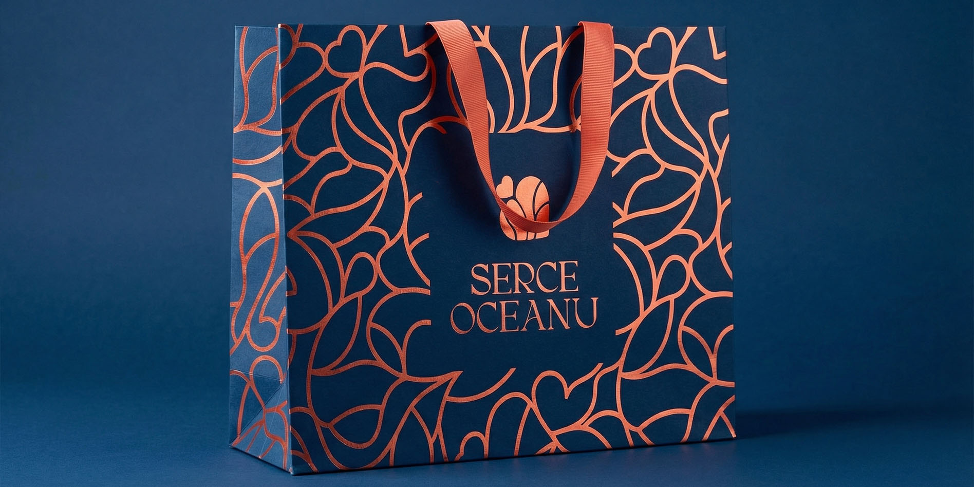
The signature pattern became the primary tool in the packaging design, executed through embossing or spot UV techniques. This adds a pleasant tactility to the bags and boxes — making them inviting to the touch and creating a "handmade" feel. The deep navy background of the bags, combined with contrasting coral handles and graphics, looks striking and prestigious, setting the brand apart from mass-market competitors.
The logo takes center stage on the packaging, placed within a space clear of the pattern to create a perfect compositional balance. This approach makes the packaging versatile: it looks equally appropriate in the hands of a courier or as a gift for loved ones for a festive dinner. We aimed for every detail — from the paper's durability to the shade of the ribbons — to convey the idea that Serce Oceanu cares about your comfort and aesthetic pleasure.
We have developed a convenient and modern online store for Serce Oceanu. The main focus was on combining the premium style of the brand with real usability, where every customer can order fresh seafood in just a few clicks.
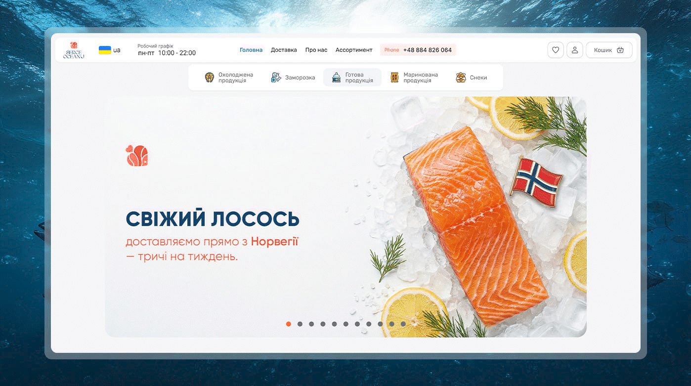
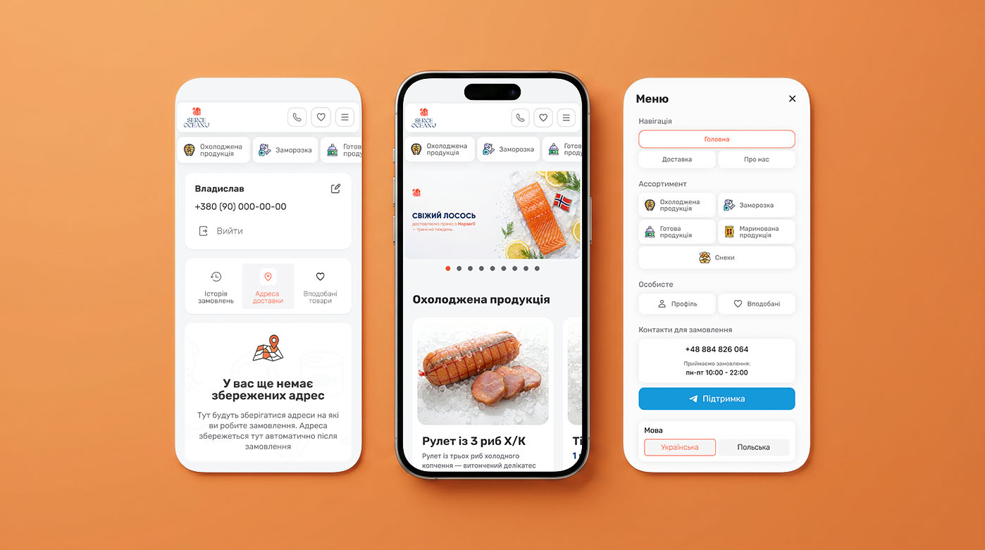
This project began with the development of a unique web design that serves as a digital extension of the brand. We created a fully responsive interface that looks equally stunning on desktop monitors and mobile devices. This is a crucial requirement for modern e-commerce since the majority of consumers shop on the go. Every design element from the product cards to smooth animations is crafted to make the customer journey intuitive and seamless.
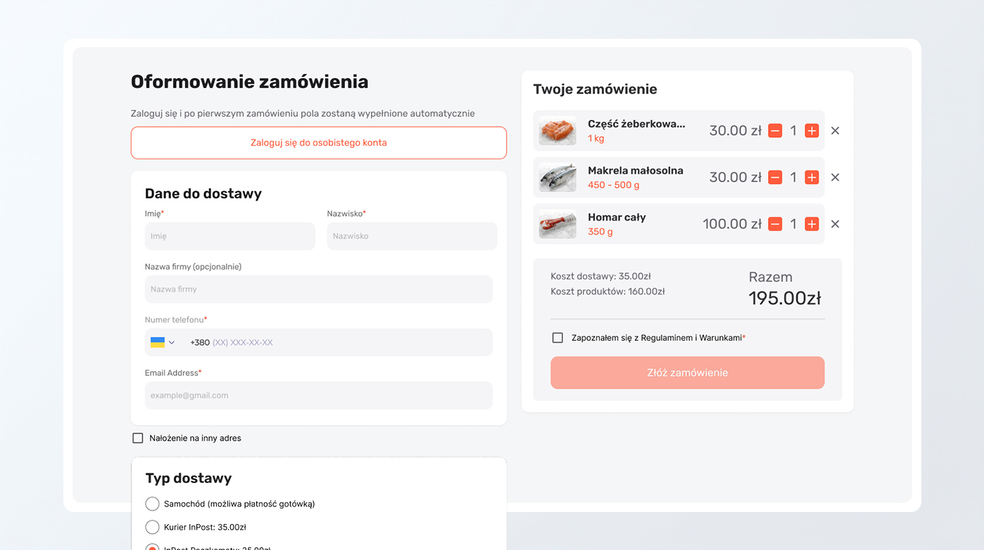
The technical backbone of the project features deep integration with essential e-commerce services, the development of a functional user account area, and a custom admin panel for business management. We integrated the secure PayU payment gateway for seamless transactions and the InPost logistics service for fast automated parcel locker delivery across Poland. The streamlined checkout process ensures instant order placement, which significantly boosts conversion rates and enhances customer satisfaction.
To automate internal business operations, we set up a smart inventory management system and CRM. As soon as a customer purchases salmon or shrimp, the stock levels are updated automatically in real-time. This helps the business owner avoid inventory errors and ensures that shoppers only see products that are currently in stock. Ultimately, the client received a powerful sales tool that is easy to scale, whether adding new product categories or implementing advanced marketing features.
We focused on making the user's journey to fresh seafood as simple as possible. The main emphasis is on card functionality and the convenience of completing an order, so that the buyer can finalize a purchase effortlessly.


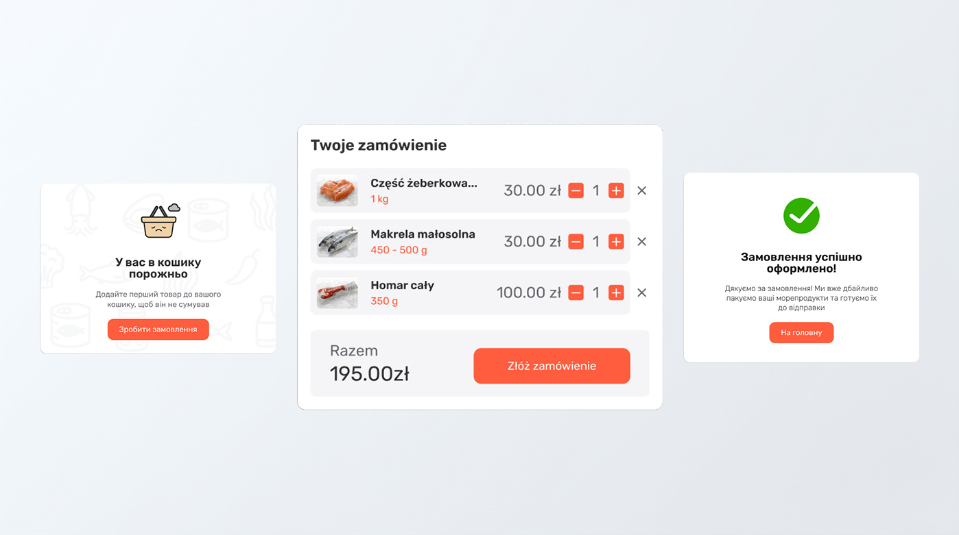
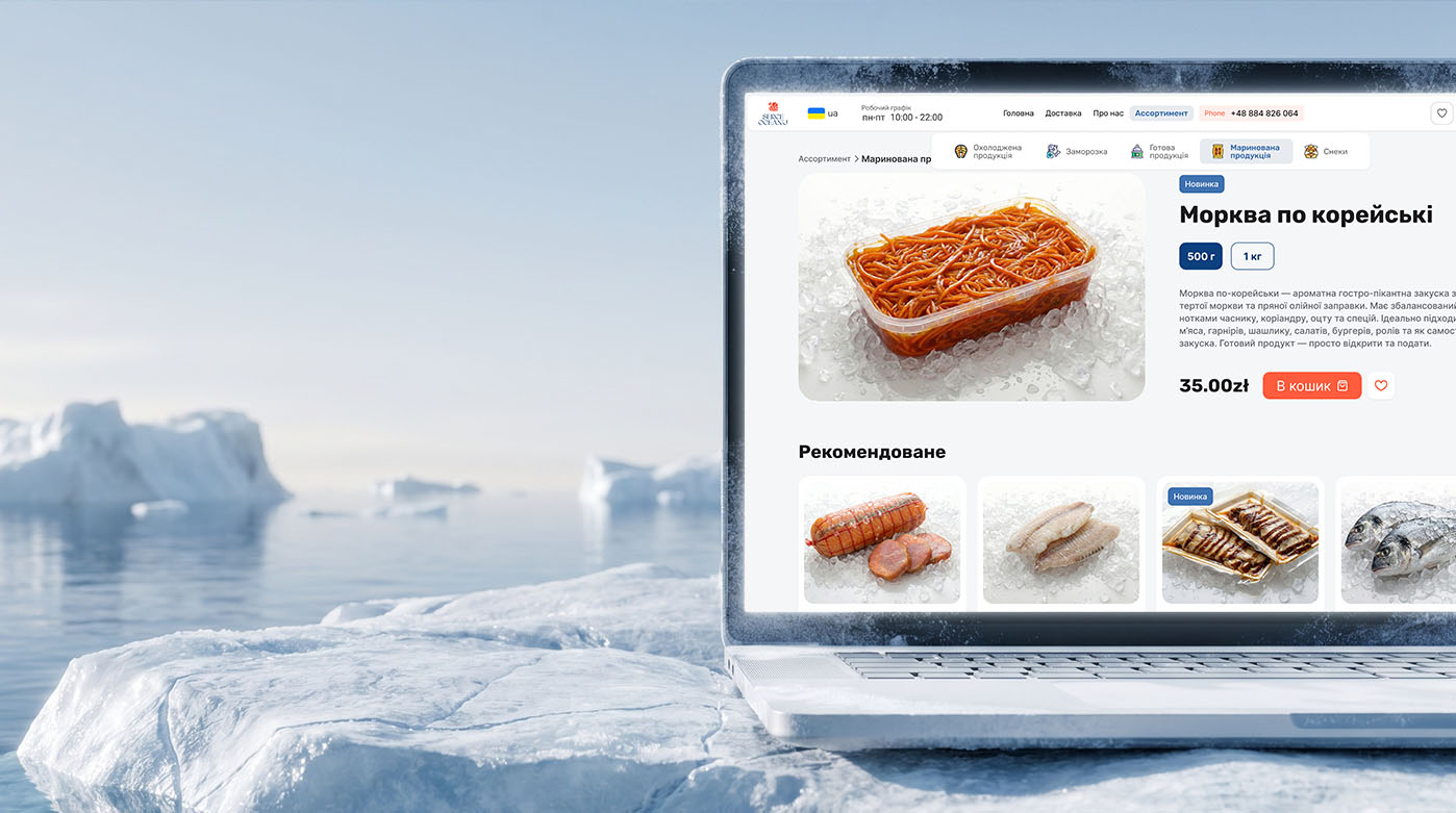
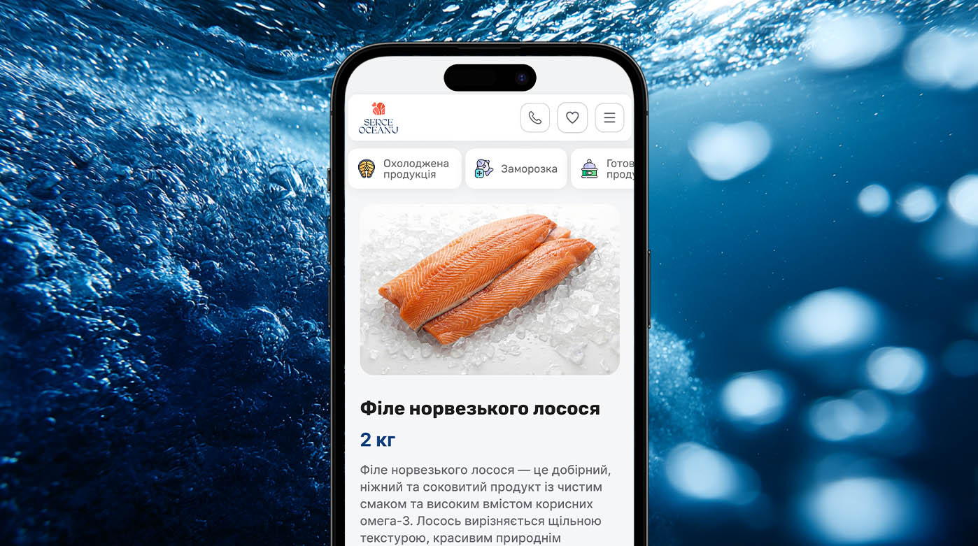
The catalog is based on product cards designed in a consistent visual style featuring professional food photography on an ice background. We implemented a flexible packaging selection system depending on the product type. The interface provides three options for weight selection: fixed weight, weighted products with a range (e.g., for whole fish), and a choice of several packaging types. This allows the customer to instantly add the required amount to the cart directly from the product list without navigating to a separate page.
The cart and checkout page are designed to minimize the number of steps to purchase. In the cart, the user sees a clear list of selected delicacies with the ability to quickly adjust the quantity or remove items. We optimized the order form, leaving only the necessary fields for delivery and payment method selection. After a successful transaction, the system displays a concise message about the order status, completing a positive brand interaction experience.
This website structure allows efficient management of various product types from small snacks to large fish where weight accuracy is crucial. Thanks to clear UX logic, the user does not get confused during the selection process, which directly affects decision-making speed and the online store's conversion rate.
We have created a functional personal account that acts as a personal assistant for every shopper. The main goal is to simplify repeat orders as much as possible and give the customer full control over their purchases at Serce Oceanu.
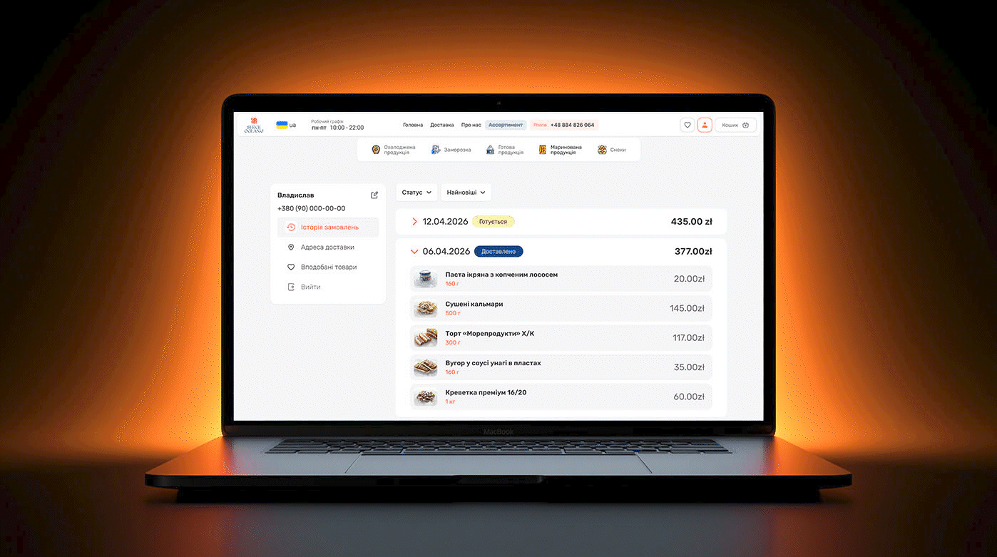
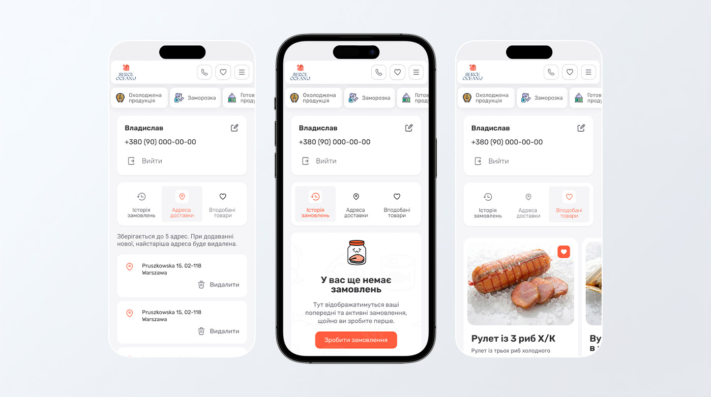
For convenient access, we implemented quick authorization via Google or by phone number with a verification code. This eliminates the need for users to remember passwords and ensures a high level of data security. Within the account itself, several key sections are implemented: order history with real-time statuses, a wishlist of favorite products, and address management.
The "Favorite Products" section allows users to save their preferred delicacies with one click, enabling them to find them quickly during their next visit without searching the entire catalog. This significantly improves the experience for those with established taste preferences. We also implemented a system for saving delivery addresses (up to 5 different locations). This allows for automatic data filling during checkout, which is critical for shopping speed, especially in the mobile version of the site.
Thanks to the well-thought-out account logic, the customer always sees a transparent history of their purchases and can easily track the status of current orders. This approach to UX design not only makes the service feel premium but also encourages customers to return, as the system already "knows" their preferences and stores the necessary information for instant shopping.
We have developed a custom control panel that allows the Serce Oceanu team to flexibly manage the online store in real-time. The main priority was an intuitive interface where every action can be completed in a matter of seconds.
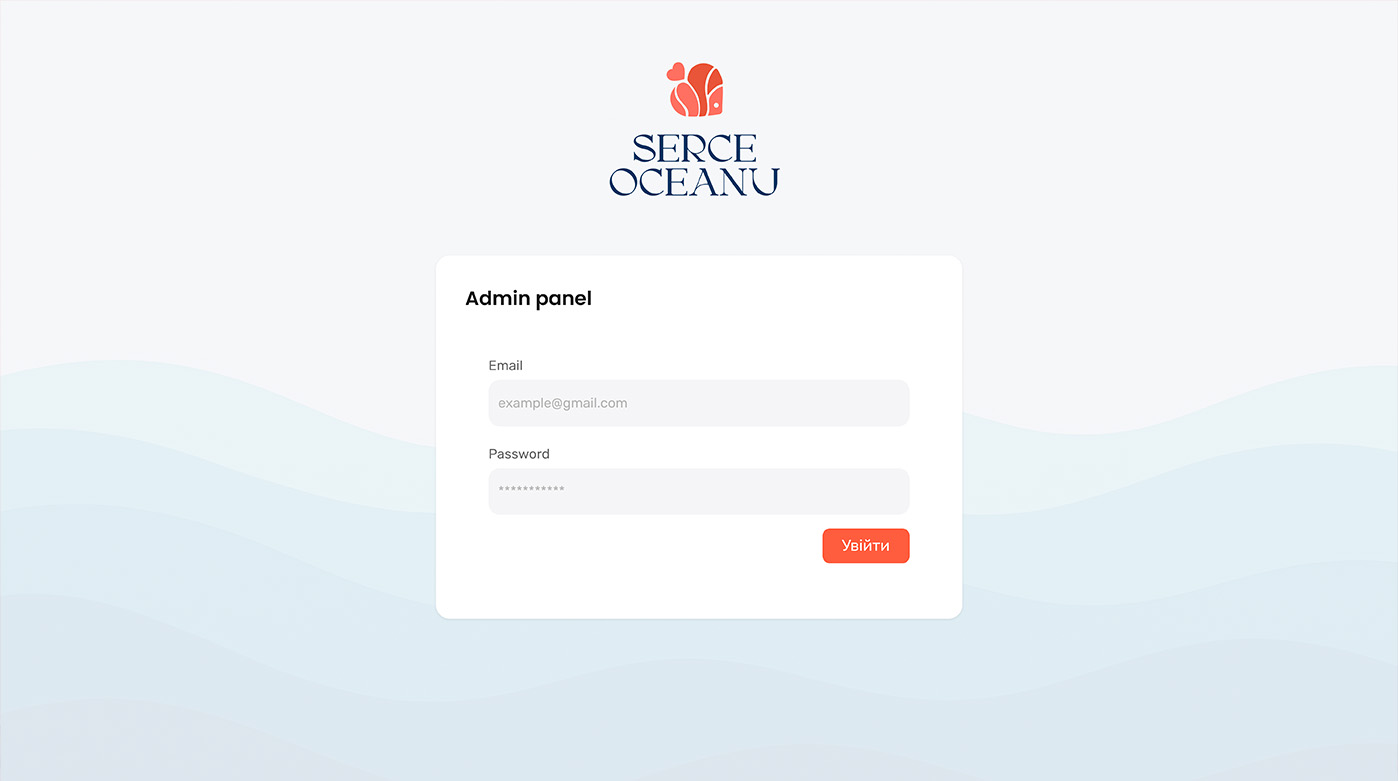
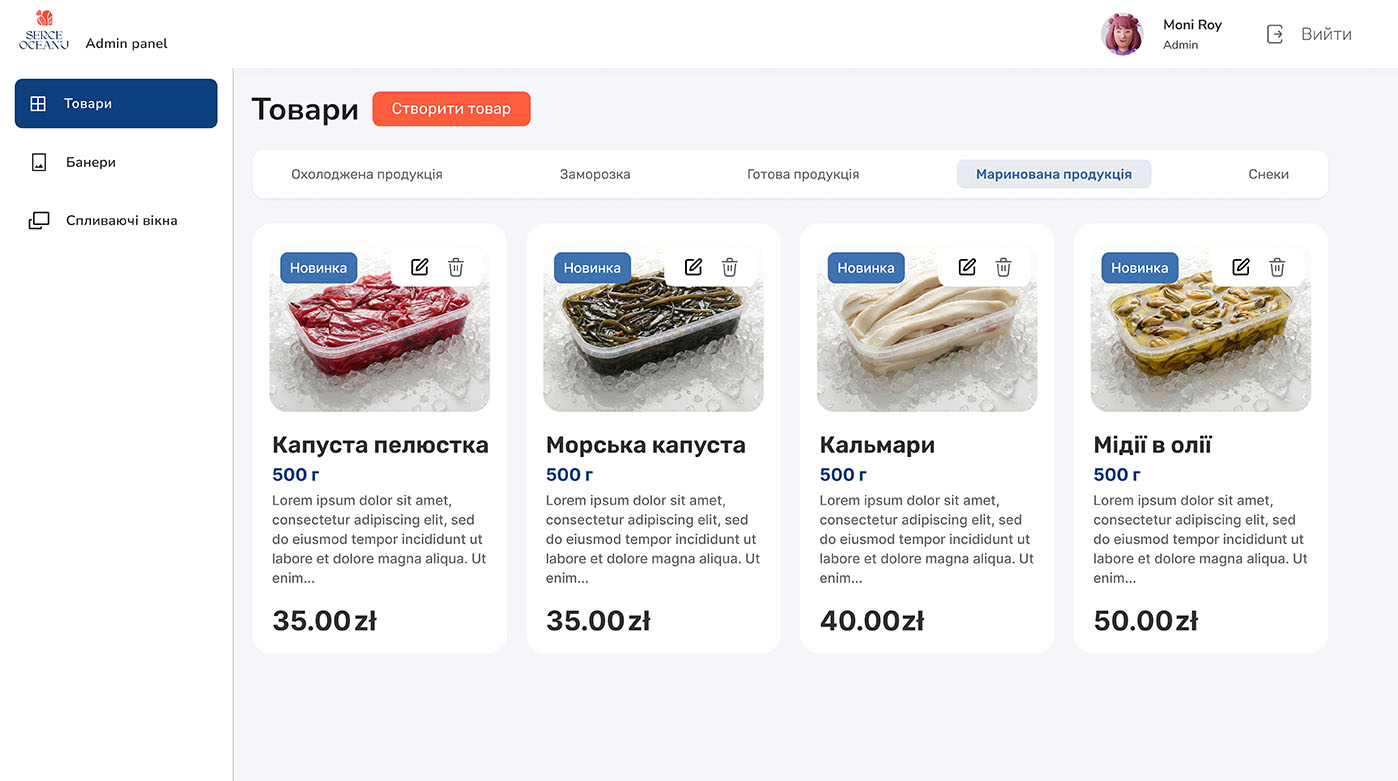
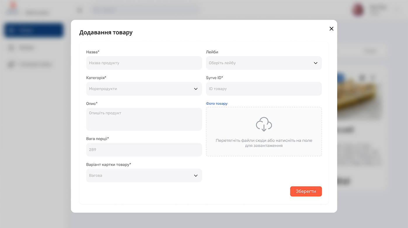
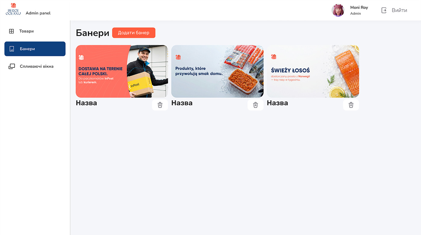
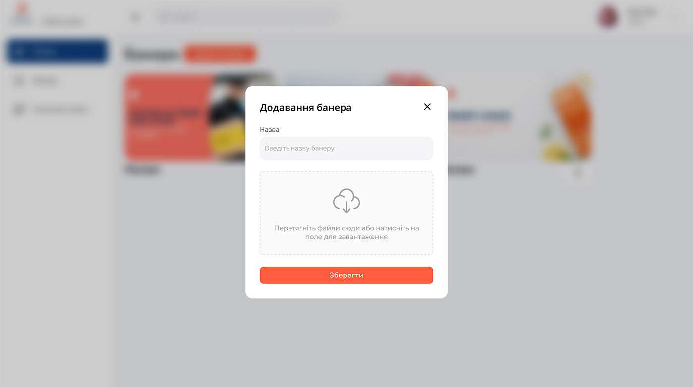
The system provides full control over the product range: managers can independently add new items, edit descriptions, change prices, or remove discontinued products. We implemented a user-friendly upload form with category selection and automatic CRM synchronization. Furthermore, the admin panel allows for instant visual updates to the site uploading new promotional banners for the homepage to quickly respond to inventory changes or seasonal offers.
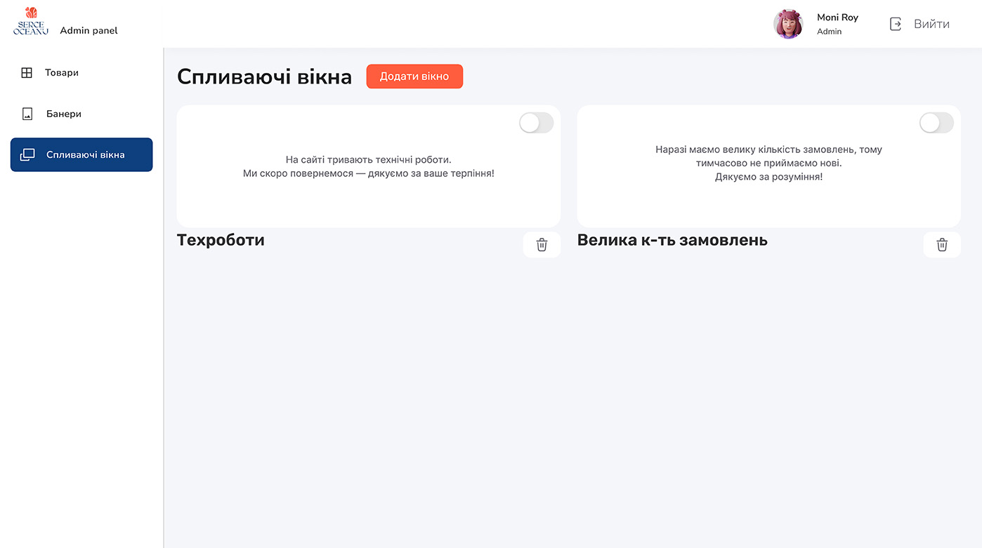
Particular attention was paid to marketing tools, specifically the pop-up notification system. The owner can independently create and activate alerts regarding maintenance work, high order volumes, or special discounts. This level of autonomy makes store management simple and effective, allowing the business to focus on growth rather than the technical nuances of website maintenance.