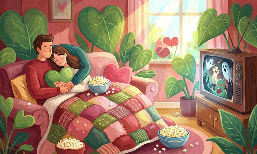
How We Created Spring Creatives for Sushi Icons
A Natural Reset for the Location
We started with the real architecture of the spot. The facade, windows, rhythm of the building, and Sushi Icons branding already carried a clean urban mood. Our goal was not to cover it with decoration but to highlight its structure and give the place a fresh, seasonal layer.
Once the base design was locked, we moved into spring experiments. Using AI, we generated dozens of variations with greenery, flowers, climbing plants, and soft natural frames around the entrance. From there, our team stepped in manually. We adjusted scale, growth direction, density, lighting, and shadows so everything felt believable rather than like a simple visual effect.
We were chasing the feeling of a quiet transformation. The same location, but touched by spring. Familiar, yet suddenly warmer and more alive.
In the final version, we focused on floral frames that seem to grow straight from the facade and wrap around the entrance. Vertical compositions of pink blossoms, cascading greenery, and subtle accents along the canopy and windows created the sense of a garden appearing in the middle of the city.
Balance mattered most. The plants never block the logo or navigation. Instead, they work alongside them, strengthening brand presence while adding emotion. That contrast between architectural restraint and natural softness became the backbone of this spring illustration set.
These scenes later turned into the foundation for motion work. In video, flowers slowly bloom, leaves sway in a light breeze, and the facade comes to life in front of the viewer. The approach works as inspiration for seasonal campaigns, storefront redesigns, or digital creatives built around urban locations.
A Vertical Garden in the City Flow
This location immediately set a different tone. A tall corner building, bold balcony geometry, deep blue sky above, and the Sushi Icons sign acting as the visual anchor of the composition. Here, our task was not just to add a spring layer but to design a vertical narrative that reads from the ground up and amplifies the scale of the architecture.
We started by studying facade proportions, floor lines, and the spots where natural elements could feel intentional rather than random. Using AI, we explored multiple versions with cascading greenery and dense floral clusters growing between levels. After that, our team stepped in with manual refinements to clean things up, sharpen balance, and push the scenes closer to reality.
What mattered most was avoiding a decorative look. We were aiming for a seasonal shift that feels organic, as if the building itself were responding to spring.
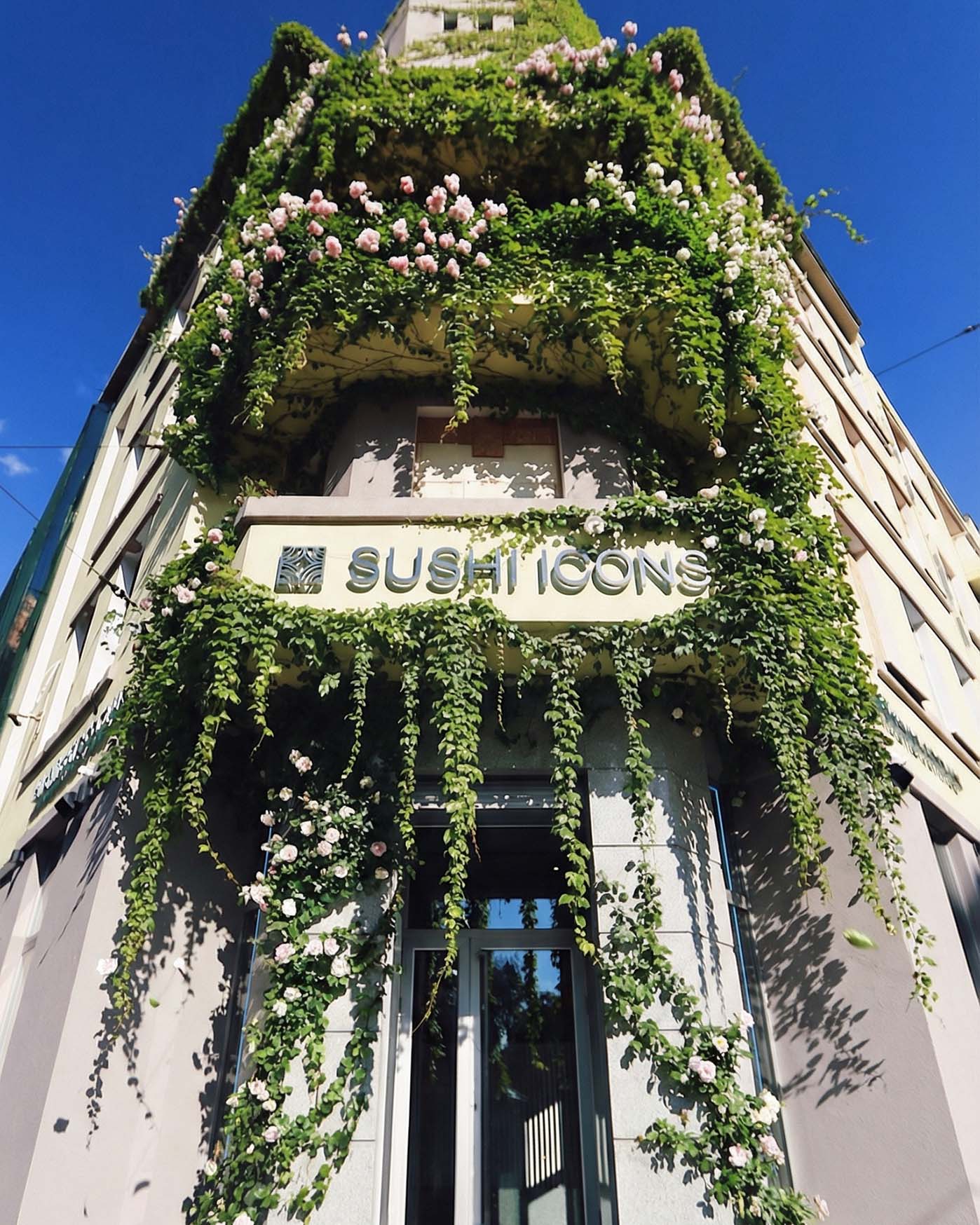
In the final version, the facade gained a rich plant layer that works with the architecture instead of fighting it. Green streams highlight the structure, frame balconies, and guide the eye toward the entrance, while keeping the logo clear and readable.
This illustration set later became the foundation for animation, which you will see at the end of the article. There, we reveal how static scenes evolved into moving stories and how the spring mood carried over into video.
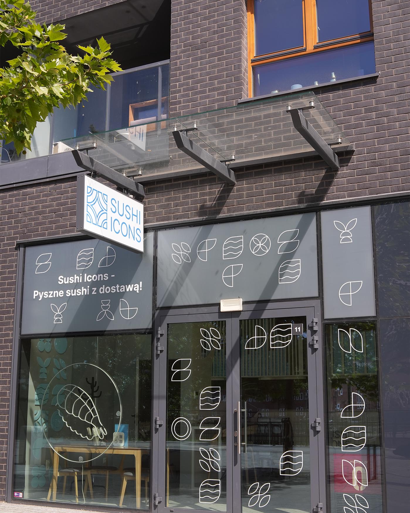
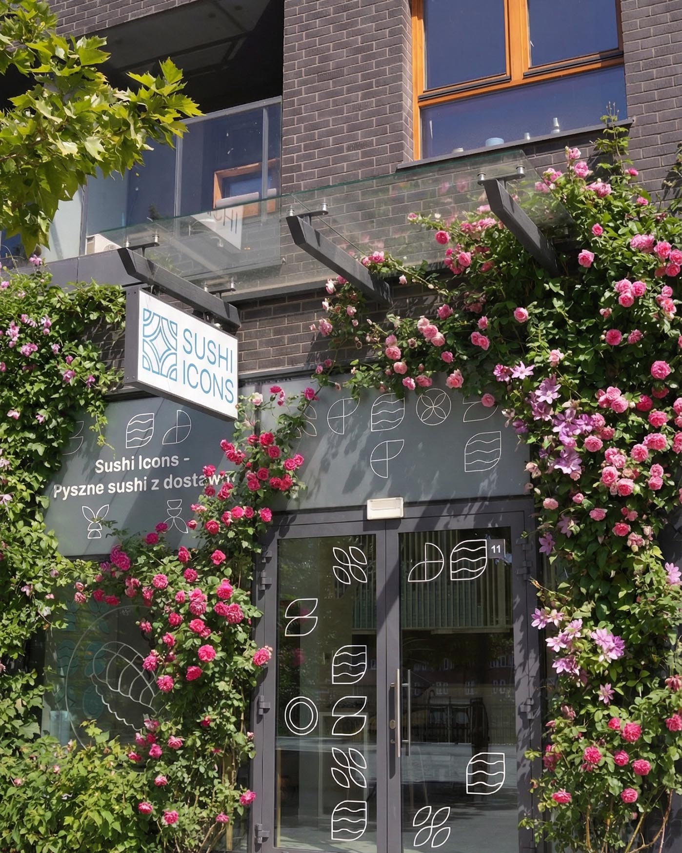
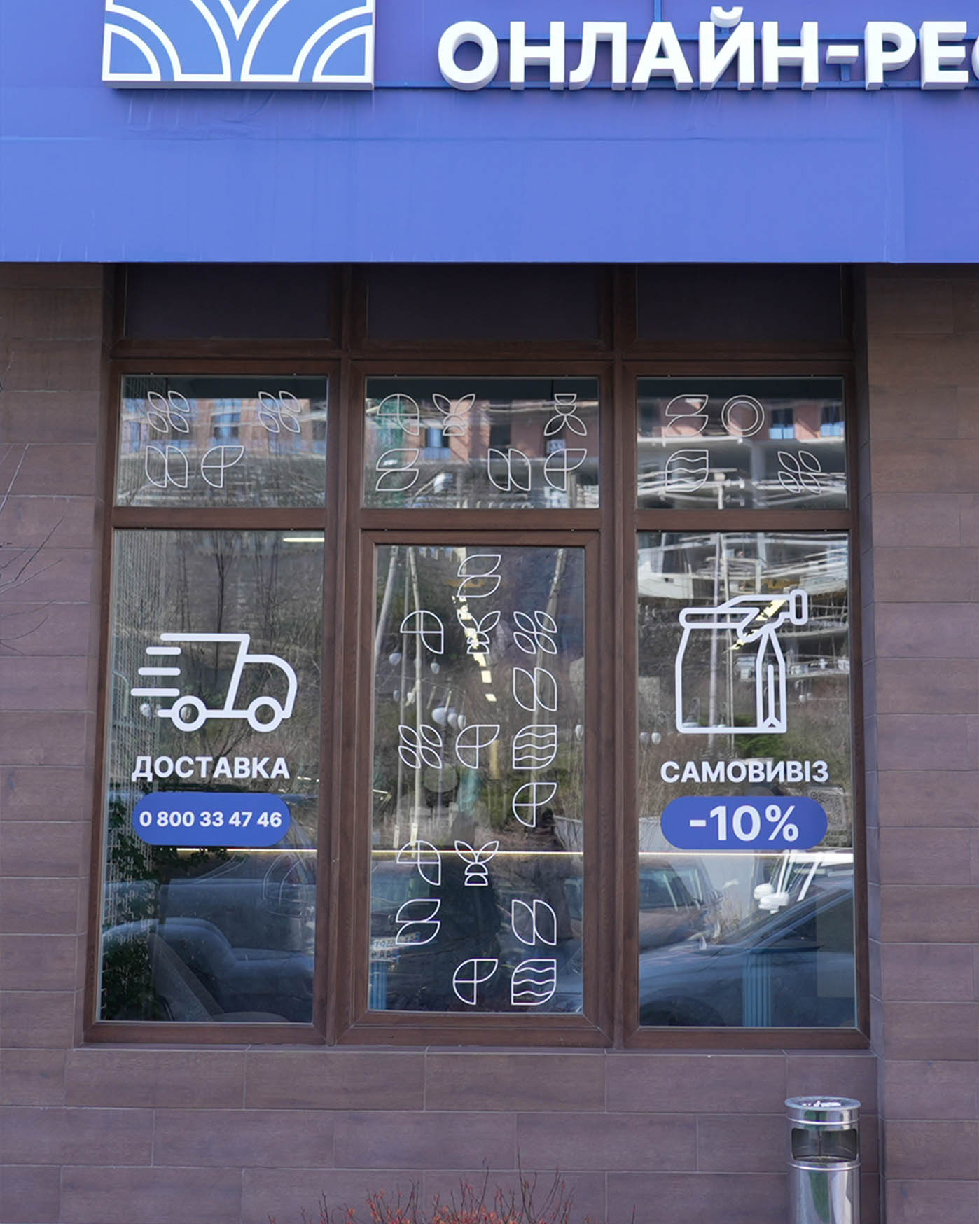
A Floral Accent in Everyday Urban Space
Here we were working with a calmer, more functional location. Straightforward storefront windows, delivery and pickup icons, a clean facade without visual noise. These are the kinds of places where seasonal changes become especially noticeable.
We first locked the base composition and mapped out where natural elements could feel like signs of life rather than decoration for decoration’s sake. Using AI, we explored floral bands along the top of the windows, cascades of greenery falling downward, and softer accents near the lower edge. From there, we stepped in with our own refinements to keep everything believable in scale, protect readability, and keep the brand front and center.
We were careful with balance. Spring here was meant to feel woven into the city rhythm, not staged. Subtle, warm, and quietly transformative.
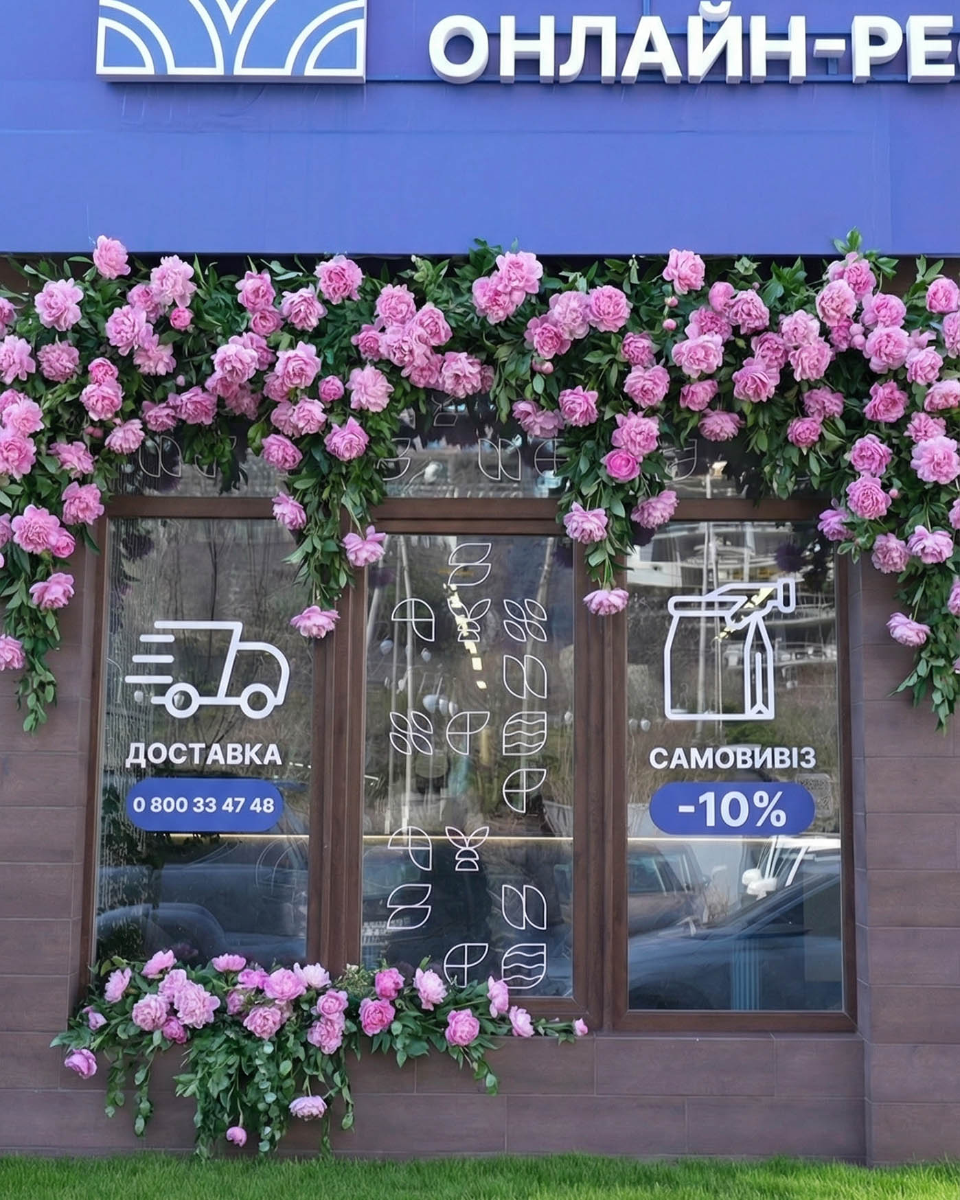
In the final version, the facade gained a clear floral contour that works as a frame for the windows. Pink blossoms and greenery underline the building’s horizontal lines, add depth, and create a sense of freshness and care.
This illustration set also became the base for the animations you will see at the end of the article. There, we show how these scenes evolved into moving formats and how the seasonal mood carried over into digital campaigns.
A Dramatic Floral Portal
This location called for a different strategy from the start. A glass corner facade, Sushi Icons graphic patterns, a staircase leading to the entrance, and heavy city flow around it. Here we chose not subtle accents but a bold seasonal gesture that turns the spot into a visual event.
We first locked the clean architecture and branding logic to understand where plant structures could be built without sacrificing readability. Using AI, we generated multiple options with dense rose clusters, layered greenery, and floral frames around the doorway. Then came careful manual refinement. Density, growth direction, perspective, and how flowers interact with the stairs and glass surfaces were all adjusted in detail.
The transformation had to feel intentional. Everything followed the building’s structure instead of fighting against it.
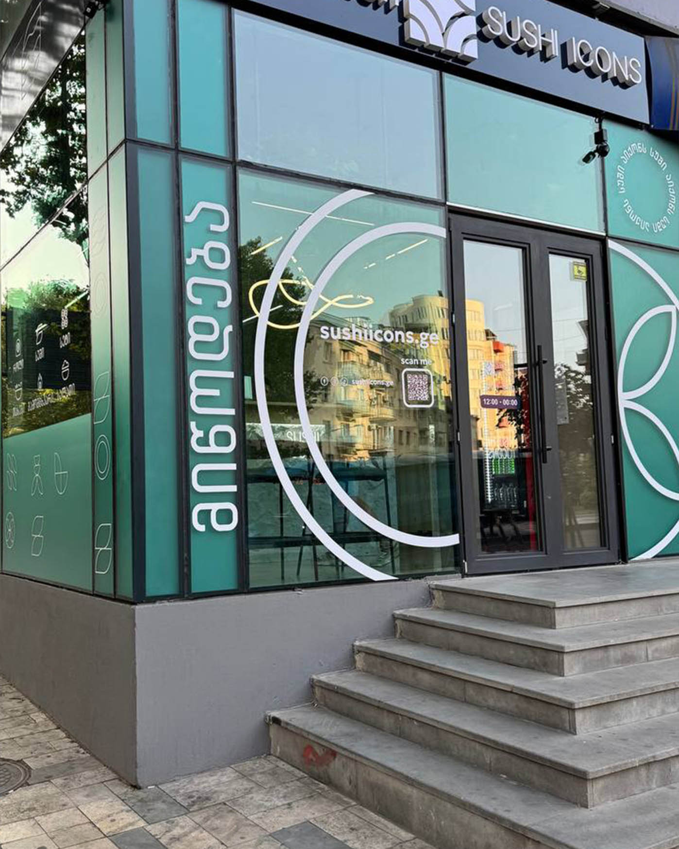
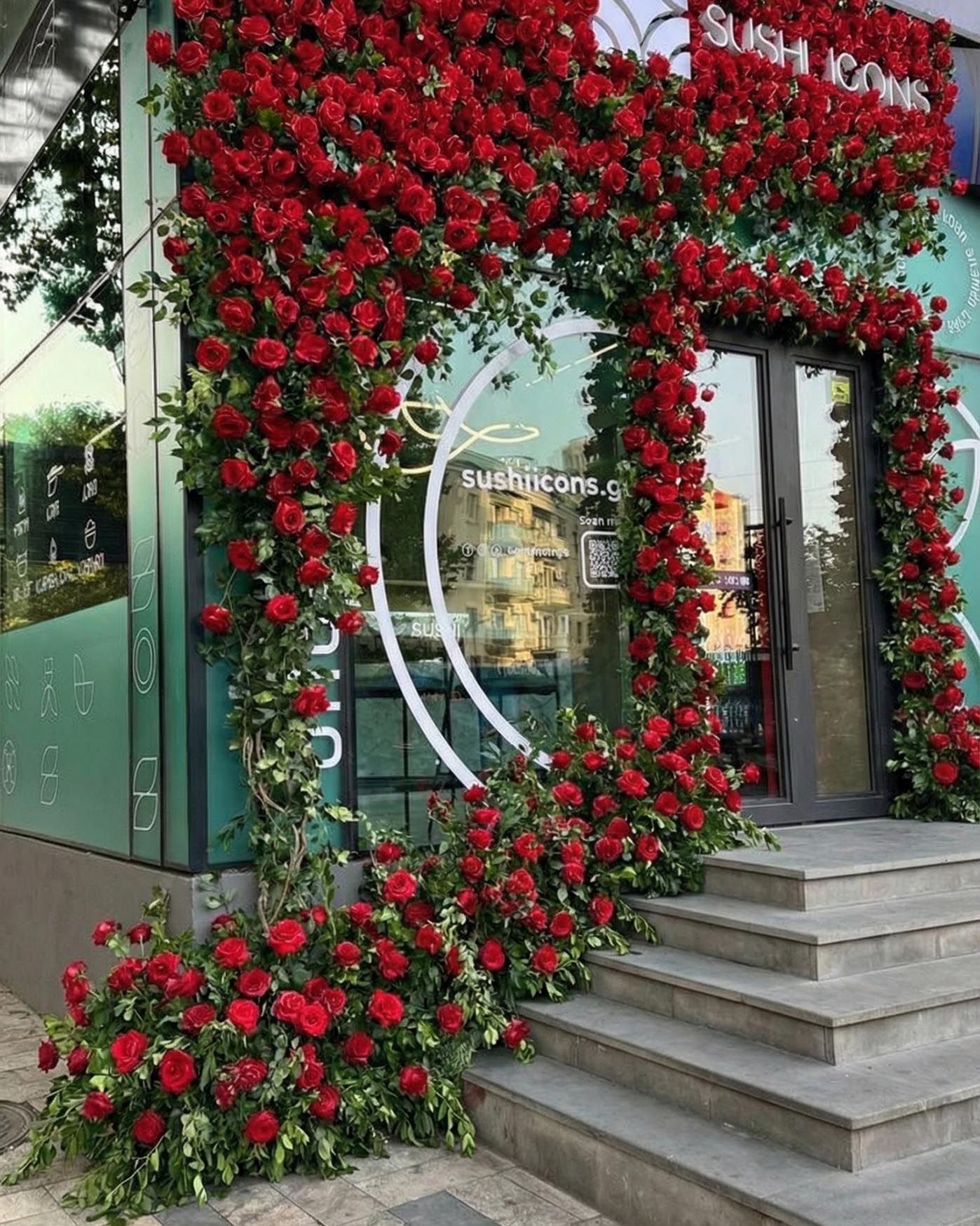
In the final version, the entrance became a rich floral portal that frames the movement from street to door. Deep red roses add depth, set rhythm, and sharply contrast with the calm facade graphics, making the location visible from afar.
This set became one of the core chapters in the overall spring series. Toward the end of the article, we reveal how scenes like this evolved into dynamic formats and started working as full-scale video creatives.
When All Locations Come Together
After working on individual spots, it became clear that the series needed to live beyond static visuals. We wanted to show scale, rhythm, and the feeling of the season across multiple locations, including those that did not appear earlier in the article. That idea shaped the final video, where all spring transformations come together in one continuous visual journey.
We built it as a flowing sequence between cities and facades. Viewers move from place to place while sensing a single system behind it. The same approach to greenery, florals, scale, and light runs through the entire piece, forming a recognizable seasonal language for the brand.
The video became the closing chapter of the campaign. Instead of spotlighting isolated solutions, it gathers everything into one cohesive picture, presenting Sushi Icons as a network that responds to the season and speaks to the city in a unified way.