Develop a visual language that conveys trust, British restraint, and technological excellence. The main challenge was to avoid visual noise and aggressive "gadget aesthetics", transforming complex technology into an intuitive, warm, and human-centric experience.
DwellIQ redefines the smart home experience by embracing the philosophy of "Calm Technology". In an era of constant digital intrusion, we crafted a brand identity that offers quiet confidence, ensuring innovation is felt intuitively.

The visual system is anchored in the concept of precise coordinates, serving as a metaphor for absolute control over space and context while highlighting the product's engineering excellence.
The project's design code establishes a bold dialogue between restraint and energy. The foundation of the palette is a deep, architectural graphite that creates an atmosphere of premium silence and solidity. Against this backdrop, the primary visual protagonists emerge: electric neon green and crisp aqua-mint. These vibrant, piercing shades act as navigational beacons and symbols of system activation, cutting through the darkness of interfaces and packaging. The fusion of brushed metal, frosted glass, and intense color accents forms a unique brand image where every detail speaks the language of modern quality, technological drive, and security.
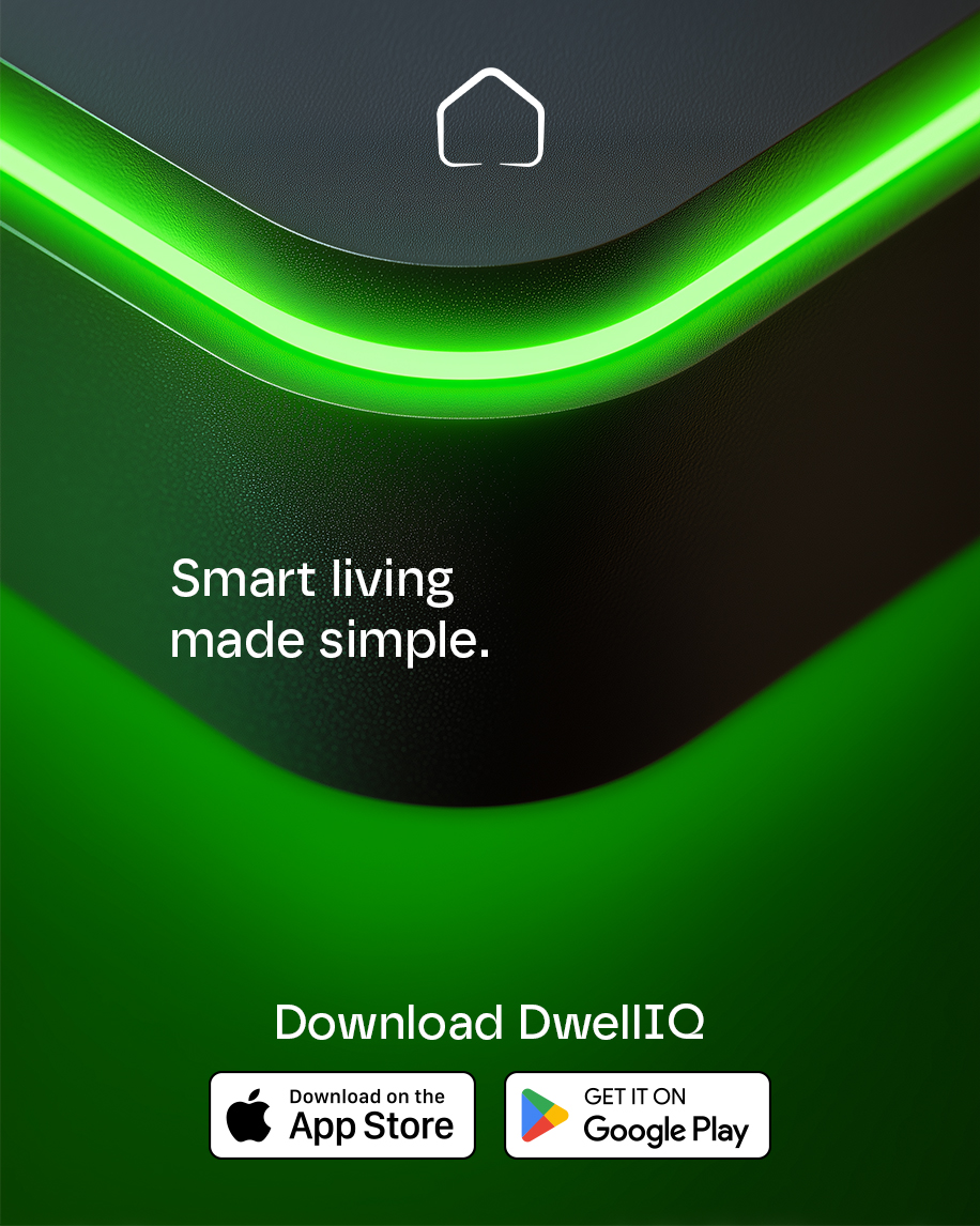
In designing the DwellIQ logo, we moved away from literal imagery, transforming the classic home archetype into a minimalist digital symbol.


It is not a closed fortress but an open ecosystem: the distinctive gap at the base of the outline serves as a metaphorical portal, seamlessly connecting physical space with technology. The fluid, rounded geometry of the mark creates a non-aggressive silhouette, emphasizing the philosophy of a user-friendly and secure interface.
This symbol acts as a universal identifier, appearing just as confident as a micro-icon in an app as it does as a tangible element on device hardware.
The project's color scheme is built on the dramaturgy of light and shadow, perfectly reflecting the essence of smart-home electronics. The foundational graphite-black represents the hardware - the reliable, physical "shell" crafted from premium materials. This is contrasted by a vibrating triumvirate of light: electric Neon Green, representing the active state and signals, and cool Aqua-Mint, which adds a sense of freshness and balance. This contrast creates the effect of a "living device": when the technology is inactive, it is discreet and restrained, but upon waking, it ignites with a bright, navigational glow, demonstrating readiness for action.
The architectural core of the ecosystem is the DwellIQ Hub - a physical embodiment of digital serenity and engineering precision.

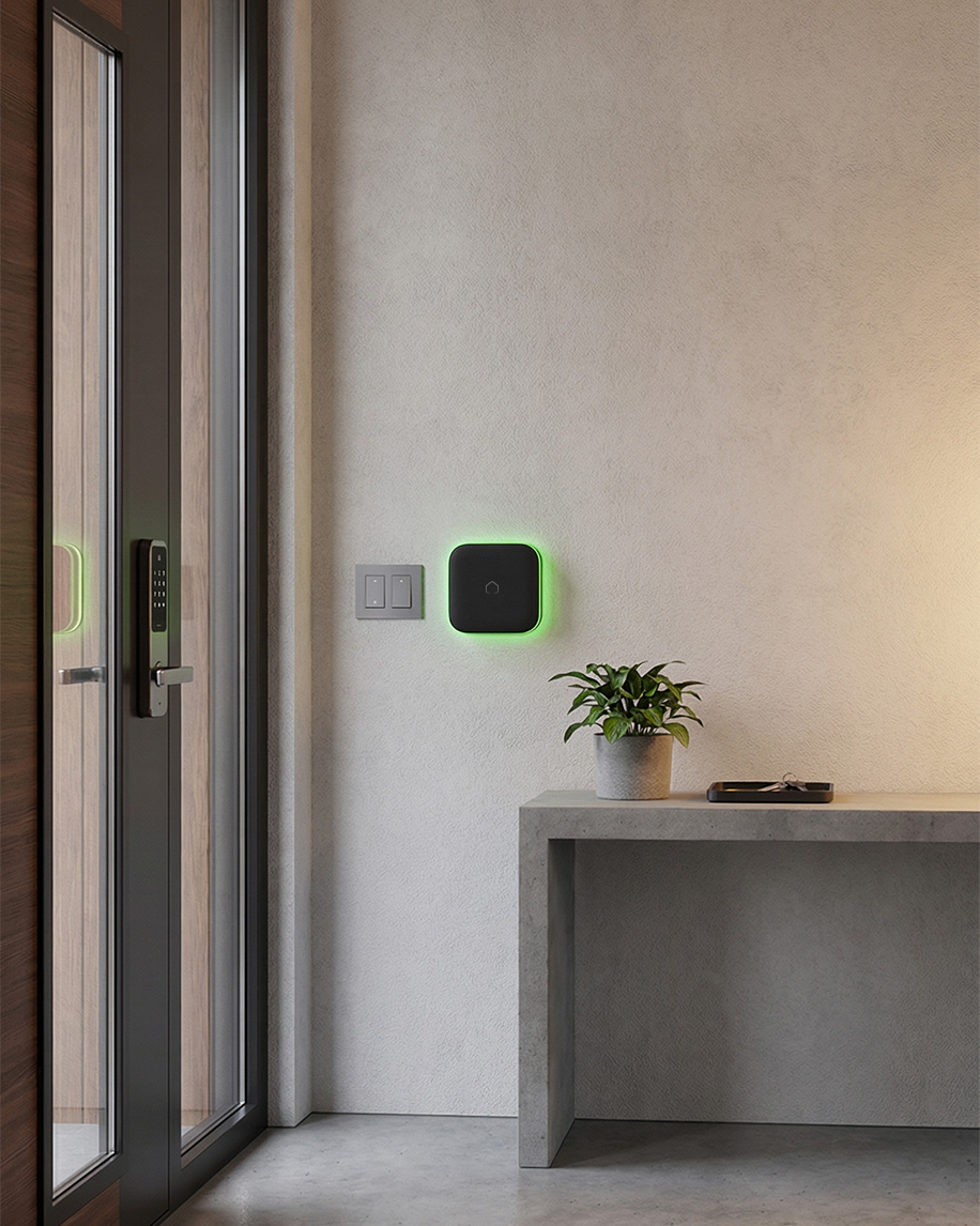
In developing the industrial design, we rejected visual noise and complex displays in favor of tactile minimalism: the device housing is crafted as a flawless graphite square with a premium light-absorbing soft-touch finish.
The sole yet expressive interface is a continuous neon ring along the perimeter, functioning as ambient lighting that intuitively signals security status by pulsing with the brand's signature green glow.
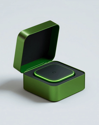
We reimagined the user's first encounter with the product, transforming the packaging design into a genuine sensory ritual. Instead of traditional disposable cardboard, we created a reusable presentation case made from anodized aluminum in a rich emerald hue, highlighting the brand's technological nature. Inside, the hub is securely cradled in a dense EVA foam insert. This visual contrast between the cold metal exterior and the velvety darkness within instantly focuses attention on the protagonist - the device's vibrant, glowing outline. This structure is not merely an aesthetic choice but an ecological statement: it is zero-waste packaging engineered to serve as a stylish interior accessory organizer, perfectly aligning with the values of sustainable design.
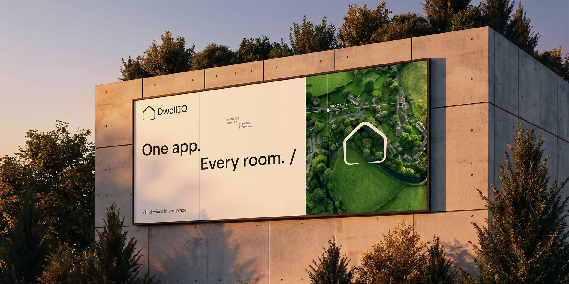
DwellIQ's communication strategy transcends traditional tech advertising by merging physical urban presence with a hypnotic digital experience. In developing our OOH (Out-of-Home) campaign, we prioritized visual purity: billboards feature a split composition where a concise typographic manifesto on a white background "One app. Every room." contrasts with rich aerial photography of green landscapes, emphasizing the brand's global scale and eco-conscious nature.
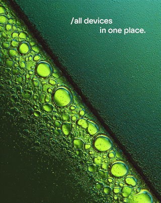
For the digital environment and social media, we moved away from standard gadget showcases in favor of artistic abstraction. The series of motion creatives is built on unique macro cinematography capturing the interaction of fluids: oils, water, and bubbles within the signature neon-green palette. This "living" animation, accompanied by empowering slogans like "Think less. Live more.", serves as a powerful metaphor. It visualizes invisible data flows, the organic nature of processes, and the seamless integration of technology into natural life. This approach allows the brand to capture user attention on an emotional level, transforming standard targeting into a session of visual therapy.

The DwellIQ merchandise collection transcends traditional branded swag, establishing a "tech ninja" lifestyle aesthetic for those who value substance over loud logomania.
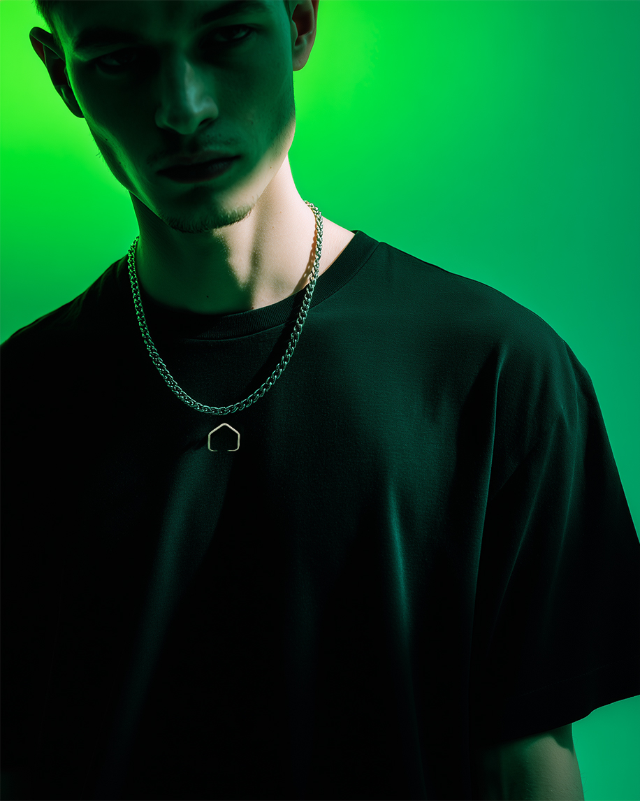
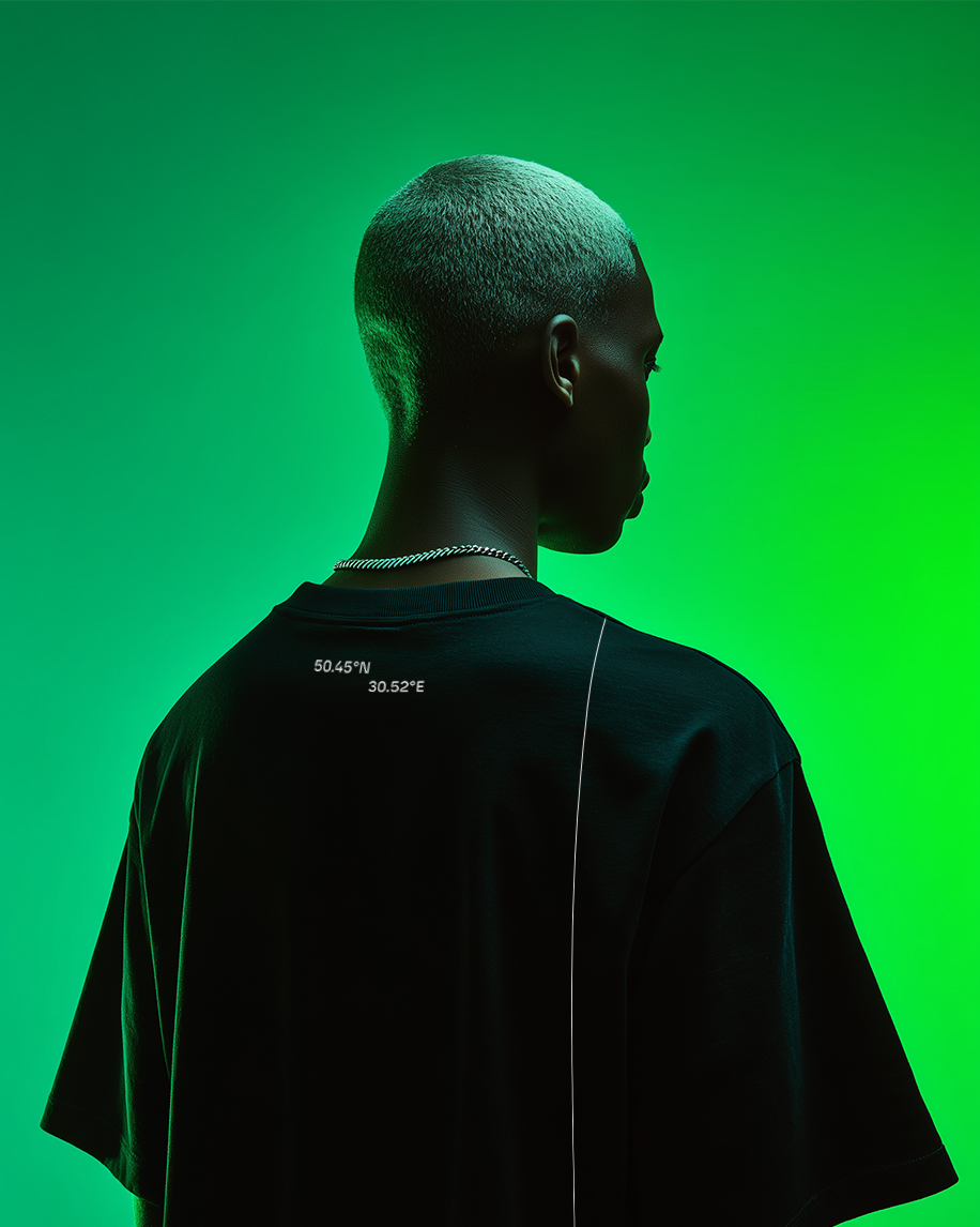
Crafted from premium heavyweight black cotton, the apparel capsule relies on understated precision and architectural restraint. The front of the garment remains maximally concise, featuring only a delicate, metallized outline of the logo over the heart, while the primary visual narrative unfolds on the back. There, embroidered like a cryptographic code, lie the precise HQ coordinates, bisected by a thin vertical decorative seam that traverses the fabric like a meridian on a navigation map.
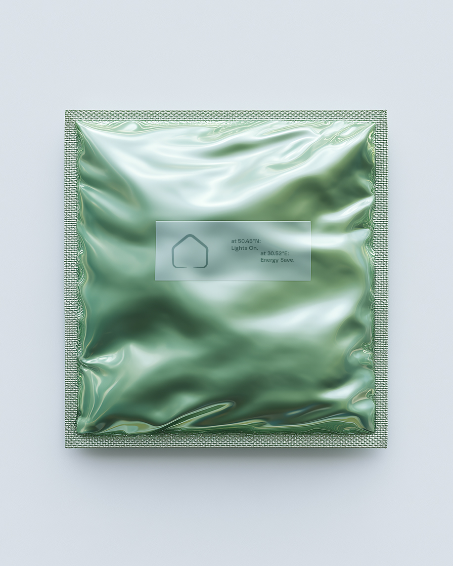
We amplified the apparel experience through an innovative approach to packaging design. Bypassing standard cardboard boxes, we engineered futuristic hermetic pouches made from metallized soft-touch material in the signature Aqua-Mint hue. Their unique "liquid metal" texture evokes a tactile sense of sterility and innovation, ensuring that unboxing the garment feels like revealing a high-tech component from the future.