We had to build a brand that speaks for itself. The goal was to create a visual language that screams premium quality but stays approachable for true meat lovers. It’s about more than just a logo — it’s about capturing that spark of energy and making a real connection with the guest from the very first glance.

Carne e Fuoco is an Italian risto-bar born from a obsession with raw, authentic cooking. Our story is all about getting back to basics: where the real flavor comes from high-end meat, glowing coals, and good times with friends. We built this brand for those who crave honest food and a real experience without the modern fluff.
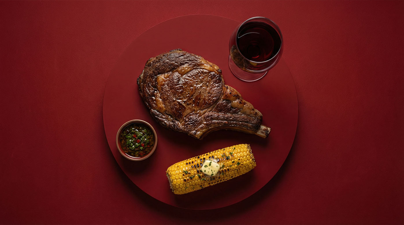
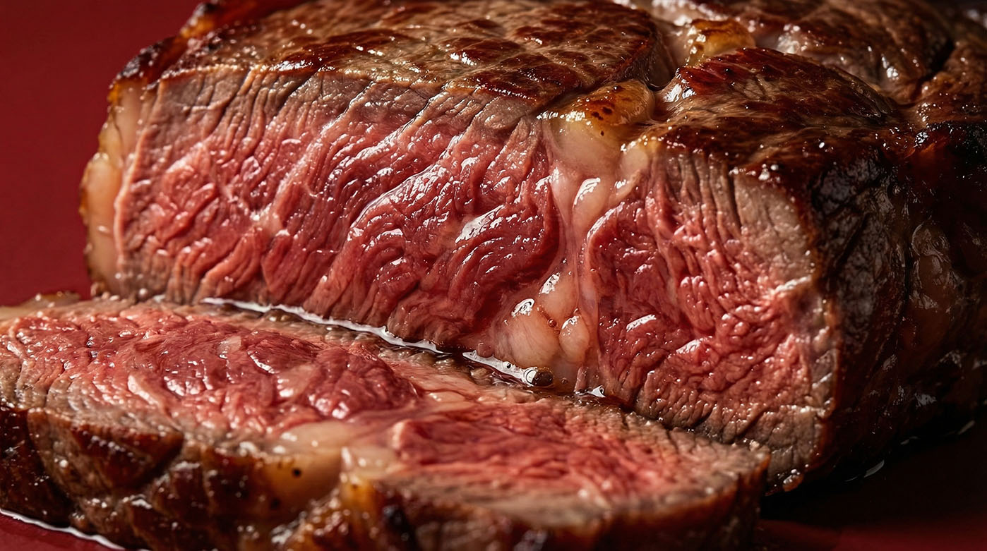
The name literally means Meat and Fire, which is the heart of everything we do. At Carne e Fuoco, every dish goes through the ritual of the open flame. It’s the only way to truly unlock the texture and bold flavor of a prime steak. We focus on top-tier local ingredients, letting expert grilling turn a simple cut into a masterpiece.
The visuals follow the same path: bold, raw, and sophisticated. That deep wine-red background isn't just a nod to a perfect pairing; it’s the pulse of the kitchen's heat. We stripped away all the distractions to keep the focus exactly where it belongs: on the perfect crust and the juicy goodness that only real charcoal can deliver. Carne e Fuoco is a tribute to the product and the timeless tradition of the Italian grill.
The Carne e Fuoco identity is a visual tribute to the ultimate pairing: prime cuts and fine wine. We designed a logo that sets the tone for a premium Italian risto-bar, focusing on that sense of confidence and pure enjoyment you get from a great meal.
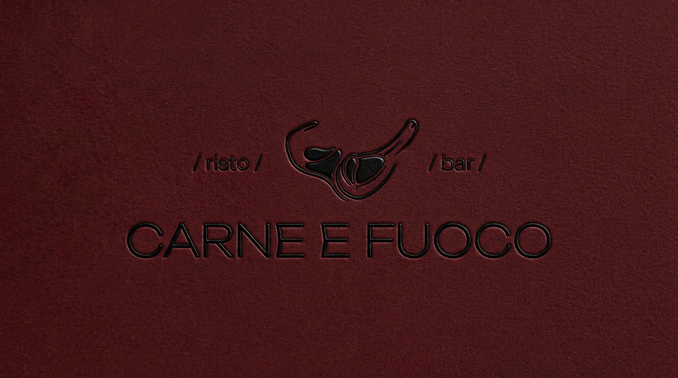
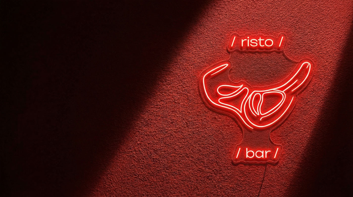
The heart of the brand is a graphic steak-on-the-bone, with the silhouette of a wine glass subtly tucked inside. It’s a clever design choice that tells the restaurant's story instantly — a place where fire brings out the best in the meat, and the right wine completes the ritual. The "risto bar" tagline adds a touch of modern energy to the whole look.
Our color palette is built on a rich Deep Burgundy, hitting that sweet spot between a glass of red and a perfect medium-rare sear. The charcoal-black background adds a raw, edgy feel, nodding to the heat of the grill. By mixing neon signs with premium leather embossing, we found a balance between a high-energy bar and a cozy steakhouse. Carne e Fuoco is design that builds an appetite and sets the stage for a night of great taste.
We built an internal communication system where every detail reminds you that Carne e Fuoco is the place for real foodies. From the menu design to the staff gear, everything is about touch, feel, and getting lost in that big Italian hospitality.
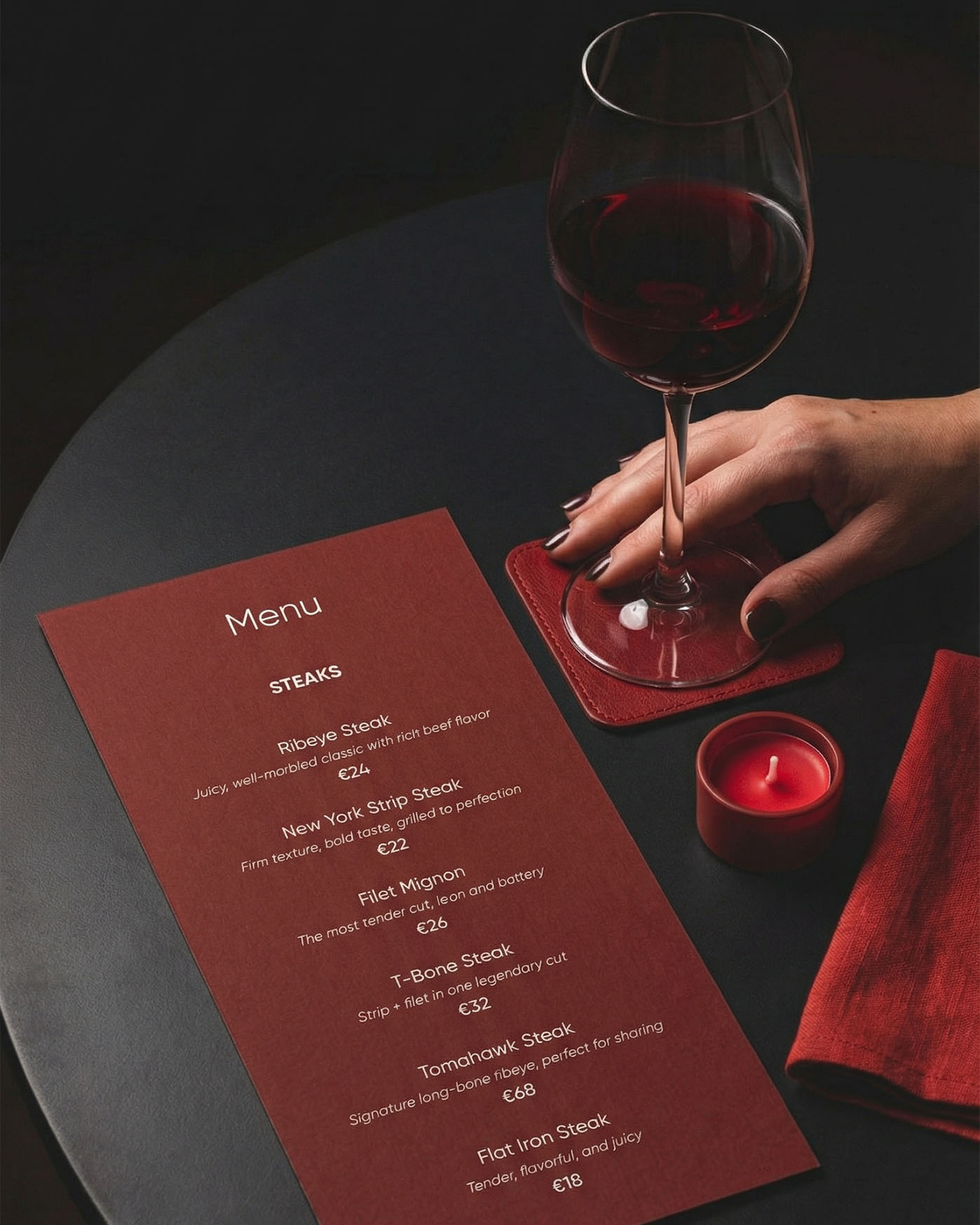
The menu comes in a deep burgundy that immediately sets a moody, evening tone — perfect for sipping red wine. We kept the typography clean and the layout sharp to let the steaks do the talking, from a classic Ribeye to the legendary Tomahawk. Each dish gets a quick breakdown of the meat's quality and the way it’s fired up.
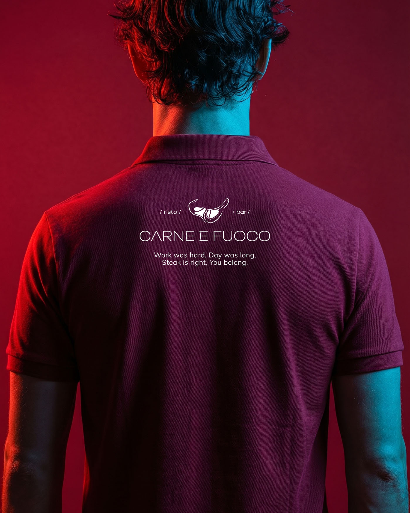
The staff uniform is a subtle detail that shapes the character of the space. We designed polo shirts in the brand’s signature colors, placing the logo and a short brand manifesto on the back: “Work was hard, Day was long, Steak is right, You belong.” This approach brings a relaxed feel while maintaining a professional tone. It reflects a balance of simplicity and confidence — respecting classic steakhouse traditions while embracing the ease of a modern bar.